4 Plots
4.1 Histograms
Consider some historical data on crime in the US
## ?USArrestsHistograms Summarize Distributions
hist(USArrests$Murder, xlab='Murder Arrests',
    main='Arrests per 100,000 across 50 US states in 1973')
Show data splits
## Urban Population above/below mean
u <- mean(USArrests$UrbanPop)
m1 <- USArrests[USArrests$UrbanPop<u,'Murder']
m2 <- USArrests[USArrests$UrbanPop>=u,'Murder']

xbks <-  seq(min(m1,m2), max(m1,m2), length.out=10)
hist(m1, col=rgb(0,0,1,.5), breaks=xbks, xlab='Murder Arrests', main='Split Data')
hist(m2, add=T, col=rgb(1,0,0,.5), breaks=xbks)
cols <- c(rgb(0,0,1,.5), rgb(1,0,0,.5))
legend('topright', col=cols, pch=15,
    title='% Urban Pop.', legend=c('Above Mean', 'Below Mean'))
4.1.1 Glue together
Combine plots together to convey more information all at once
par(mfrow=c(1,2))
## All Data
hist(USArrests$Murder, main='All Data', xlab='Murder Arrests')

## Split Data
xbks <-  seq(min(m1,m2), max(m1,m2), length.out=10)
cols <- c(rgb(0,0,1,.5), rgb(1,0,0,.5))
hist(m1, col=cols[1], breaks=xbks, xlab='Murder Arrests', main='Split Data')
hist(m2, add=T, col=cols[2], breaks=xbks)
legend('topright', col=cols, pch=15, bty='n',
    title='% Urban Pop.', legend=c('Above Mean', 'Below Mean'))
par(fig=c(0,1,0,0.5), new=F)
hist(USArrests$Murder, breaks=xbks, main='All Data', xlab='Murder Arrests')
par(fig=c(0,.5,0.5,1), new=TRUE)
hist(m1, breaks=xbks, col=rgb(0,0,1,.5), main='Urban Pop >= Mean',xlab='Murder Arrests')
par(fig=c(0.5,1,0.5,1), new=TRUE)
hist(m2,breaks=xbks, col=rgb(1,0,0,.5),  main='Urban Pop < Mean',xlab='Murder Arrests')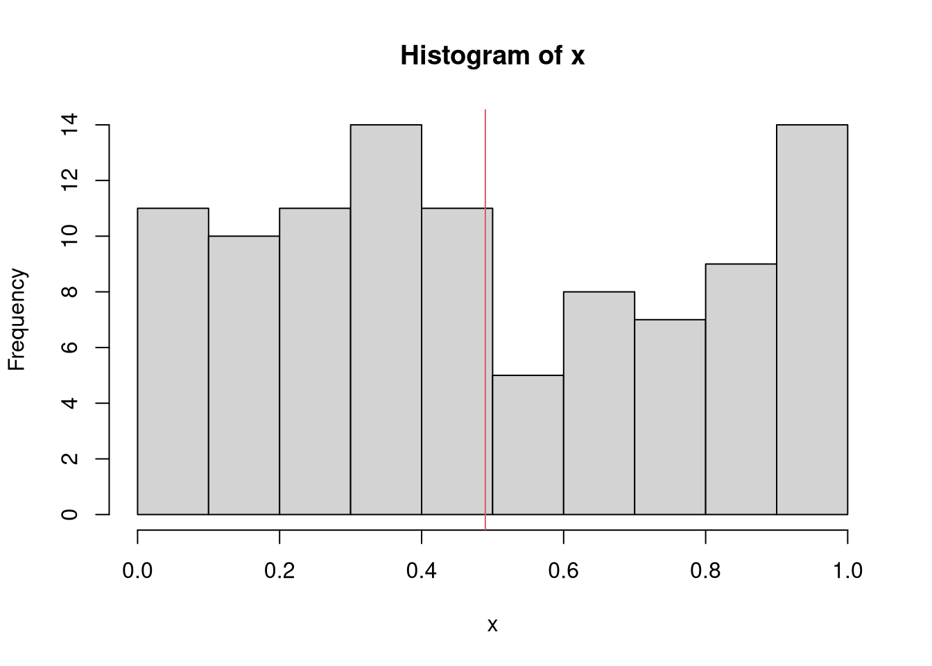
For more histogram visuals, see https://r-graph-gallery.com/histogram.html
4.2 Boxplots
All Data
boxplot(USArrests$Murder, main='All Data', ylab='Murder Arrests')
Split data into groups
## cut(USArrests$UrbanPop,2)
USArrests$UrbanPop_cut <- cut(USArrests$UrbanPop,4)
boxplot(Murder~UrbanPop_cut, USArrests, main='Split Data', xlab='Urban Population', ylab='Murder Arrests', col=hcl.colors(4,alpha=.5))
Glue together
par(mfrow=c(1,2))
boxplot(USArrests$Murder, main='All Data', ylab='Murder Arrests')
boxplot(Murder~UrbanPop_cut, USArrests, main='Split Data', xlab='Urban Population', ylab='Murder Arrests', col=hcl.colors(4,alpha=.5))
4.3 Scatterplots
plot(Murder~UrbanPop, USArrests, pch=16, col=rgb(0,0,0,.5))
par(fig=c(0,0.8,0,0.8), new=F)
plot(Murder~UrbanPop, USArrests, pch=16, col=rgb(0,0,0,.5))
par(fig=c(0,0.8,0.55,1), new=TRUE)
boxplot(USArrests$Murder, horizontal=TRUE, axes=FALSE)
par(fig=c(0.65,1,0,0.8),new=TRUE)
boxplot(USArrests$UrbanPop, axes=FALSE)
4.3.1 Example with simulated data
Create a simulated dataset
## Data Generating Process
x <- seq(1, 10, by=.0002)
e <- rnorm(length(x), mean=0, sd=1)
y <- .25*x + e

xy_dat <- data.frame(x=x, y=y)
head(xy_dat)
## x y
## 1 1.0000 0.5748906
## 2 1.0002 1.2265783
## 3 1.0004 1.5144384
## 4 1.0006 0.5556307
## 5 1.0008 0.5672396
## 6 1.0010 -2.6348463Plot the data and the line of best fit
## Data
plot(y~x, xy_dat, pch=16, col=rgb(0,0,0,.1), cex=.5)

## OLS Regression
reg <- lm(y~x, data=xy_dat)
## Add the line of best fit
abline(reg)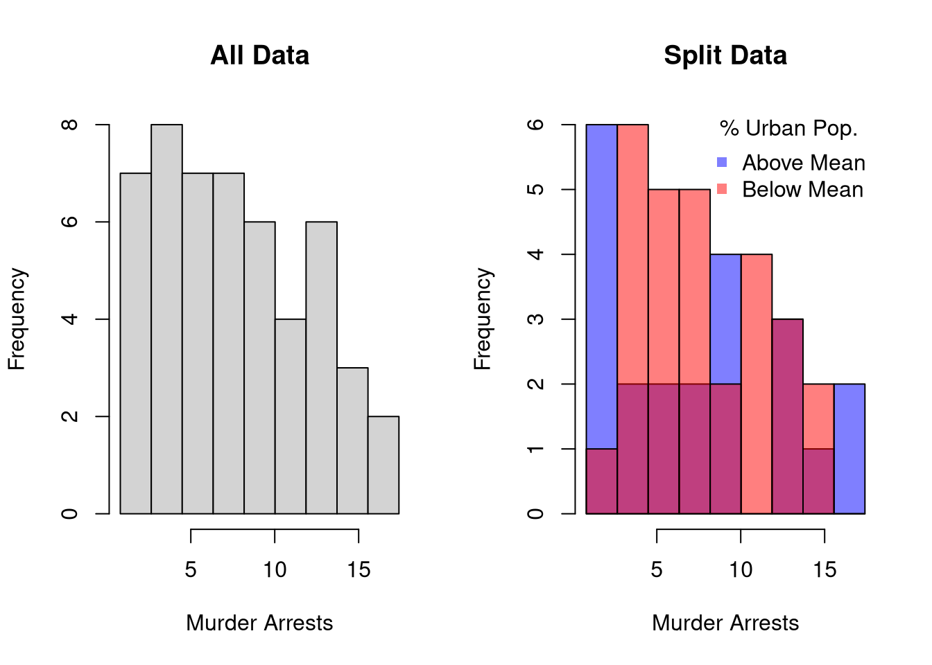
## Can Also Add Confidence Intervals
## https://rpubs.com/aaronsc32/regression-confidence-prediction-intervals
Polish the plot
## your first plot is pretty standard
## plot(y~x, xy_dat)


plot(y~x, xy_dat, pch=16, col=rgb(0,0,0,.1), cex=.5,
    xlab='', ylab='') ## Format Axis Labels Seperately
mtext( 'y=0.25 x + e\n e ~ standard-normal', 2, line=2)
mtext( expression(x%in%~'[0,10]'), 1, line=2)
abline(reg)
title('Plot with good features and excessive notation')
legend('topleft', legend='single data point',
    title='do you see the normal distribution?',
    pch=16, col=rgb(0,0,0,.1), cex=.5)
Can export figure with specific dimensions
pdf( 'Figures/plot_example.pdf', height=5, width=5)
## plot goes here
dev.off()
For plotting math, see https://astrostatistics.psu.edu/su07/R/html/grDevices/html/plotmath.html https://library.virginia.edu/data/articles/mathematical-annotation-in-r
For exporting options, see ?pdf.
For saving other types of files, see png("*.png"), tiff("*.tiff"), and jpeg("*.jpg")