# From "Basic Regression"
xy0 <- xy[order(xy$x),]
X0 <- unique(xy0$x)
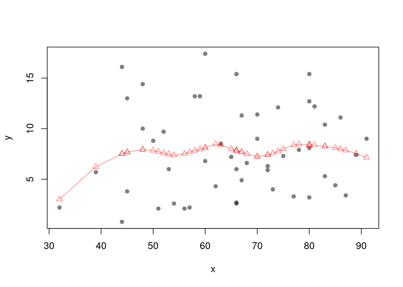
reg_lo <- loess(y~x, data=xy0, span=.8)
preds_lo <- predict(reg_lo, newdata=data.frame(x=X0))
# Jackknife CI
jack_lo <- sapply(1:nrow(xy), function(i){
xy_i <- xy[-i,]
reg_i <- loess(y~x, dat=xy_i, span=.8)
predict(reg_i, newdata=data.frame(x=X0))
})
boot_regs <- lapply(1:399, function(b){
b_id <- sample( nrow(xy), replace=T)
xy_b <- xy[b_id,]
reg_b <- lm(y~x, dat=xy_b)
})
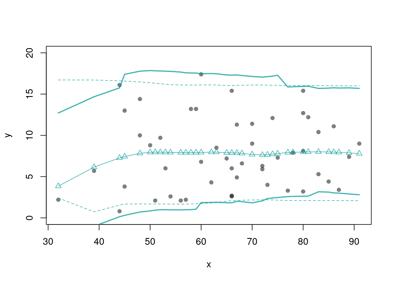
plot(y~x, pch=16, col=grey(0,.5),
dat=xy0, ylim=c(0, 20))
lines(X0, preds_lo,
col=hcl.colors(3,alpha=.75)[2],
type='o', pch=2)
# Estimate Residuals CI at design points
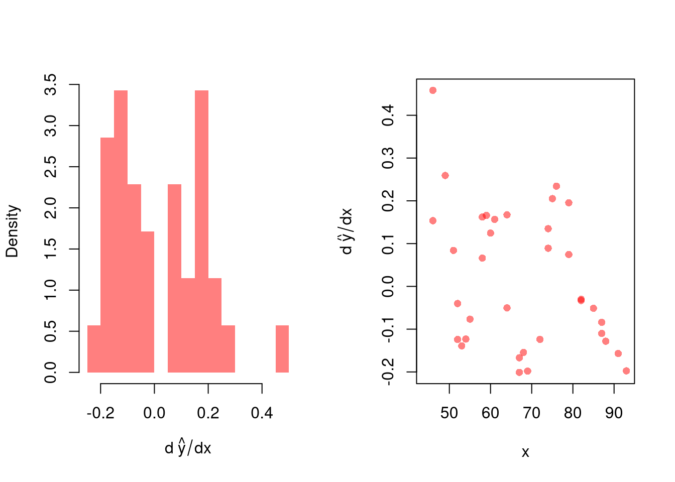
res_lo <- sapply(1:nrow(xy), function(i){
y_i <- xy[i,'y']
preds_i <- jack_lo[,i]
resids_i <- y_i - preds_i
})
res_cb <- apply(res_lo, 1, quantile,
probs=c(.025,.975), na.rm=T)
# Plot
lines( X0, preds_lo +res_cb[1,],
col=hcl.colors(3,alpha=.75)[2], lt=2)
lines( X0, preds_lo +res_cb[2,],
col=hcl.colors(3,alpha=.75)[2], lty=2)
# Smooth estimates
res_lo <- lapply(1:nrow(xy), function(i){
y_i <- xy[i,'y']
x_i <- xy[i,'x']
preds_i <- jack_lo[,i]
resids_i <- y_i - preds_i
cbind(e=resids_i, x=x_i)
})
res_lo <- as.data.frame(do.call(rbind, res_lo))
res_fun <- function(x0, h, res_lo){
# Assign equal weight to observations within h distance to x0
# 0 weight for all other observations
ki <- dunif(res_lo$x, x0-h, x0+h)
ei <- res_lo[ki!=0,'e']
res_i <- quantile(ei, probs=c(.025,.975), na.rm=T)
}
res_lo2 <- sapply(X0, res_fun, h=15, res_lo=res_lo)
lines( X0, preds_lo + res_lo2[1,],
col=hcl.colors(3,alpha=.75)[2], lty=1, lwd=2)
lines( X0, preds_lo + res_lo2[2,],
col=hcl.colors(3,alpha=.75)[2], lty=1, lwd=2)