Use expansion “packages” for less common procedures and more functionality
CRAN.
Most packages can be found on CRAN and can be easily installed
Code
# commonly used packagesinstall.packages("stargazer")install.packages("data.table")install.packages("plotly")# other statistical packagesinstall.packages("extraDistr")install.packages("twosamples")# install.packages("purrr")# install.packages("reshape2")
The most common tasks also have cheatsheets you can use.
For example, to generate ‘exotic’ probability distributions
To color terminal output on Linux systems, you can use the colorout package
Code
library(remotes)# Install https://github.com/jalvesaq/colorout# to .libPaths()[1]install_github('jalvesaq/colorout')library(colorout)
Base.
While additional packages can make your code faster, they also create dependancies that can lead to problems. So learn base R well before becoming dependant on other packages
The first step in data analysis is getting data into R. There are many ways to do this, depending on your data structure. Perhaps the most common case is reading in a csv file.
Code
# Read in csv (downloaded from online)# download source 'http://www.stern.nyu.edu/~wgreene/Text/Edition7/TableF19-3.csv'# download destination '~/TableF19-3.csv'read.csv('~/TableF19-3.csv')# Can read in csv (directly from online)# dat_csv <- read.csv('http://www.stern.nyu.edu/~wgreene/Text/Edition7/TableF19-3.csv')
Reading in other types of data can require the use of “packages”. For example, the “wooldridge” package contains datasets on crime. To use this data, we must first install the package on our computer. Then, to access the data, we must first load the package.
Code
# Install R Data Package and Load ininstall.packages('wooldridge') # only oncelibrary(wooldridge) # anytime you want to use the datadata('crime2') data('crime4')
We can use packages to access many different types of data. To read in a Stata data file, for example, we can use the “haven” package.
Code
# Read in stata data file from online#library(haven)#dat_stata <- read_dta('https://www.ssc.wisc.edu/~bhansen/econometrics/DS2004.dta')#dat_stata <- as.data.frame(dat_stata)# For More Introductory Econometrics Data, see # https://www.ssc.wisc.edu/~bhansen/econometrics/Econometrics%20Data.zip# https://pages.stern.nyu.edu/~wgreene/Text/Edition7/tablelist8new.htm# R packages: wooldridge, causaldata, Ecdat, AER, ....
Cleaning Data.
Data transformation is often necessary before analysis, so remember to be careful and check your code is doing what you want. (If you have large datasets, you can always test out the code on a sample.)
Code
# Function to Create Sample Datasetsmake_noisy_data <-function(n, b=0){# Simple Data Generating Process x <-seq(1,10, length.out=n) e <-rnorm(n, mean=0, sd=10) y <- b*x + e # Obervations xy_mat <-data.frame(ID=seq(x), x=x, y=y)return(xy_mat)}# Two simulated datasetsdat1 <-make_noisy_data(6)dat2 <-make_noisy_data(6)# Merging data in long formatdat_merged_long <-rbind(cbind(dat1,DF=1),cbind(dat2,DF=2))
Now suppose we want to transform into wide format
Code
# Merging data in wide format, First Attemptdat_merged_wide <-cbind( dat1, dat2)names(dat_merged_wide) <-c(paste0(names(dat1),'.1'), paste0(names(dat2),'.2'))# Merging data in wide format, Second Attempt# higher performancedat_merged_wide2 <-merge(dat1, dat2,by='ID', suffixes=c('.1','.2'))## CHECK they are the same.identical(dat_merged_wide, dat_merged_wide2)## [1] FALSE# Inspect any differences# Merging data in wide format, Third Attempt with dedicated package# (highest performance but with new type of object)library(data.table)dat_merged_longDT <-as.data.table(dat_merged_long)dat_melted <-melt(dat_merged_longDT, id.vars=c('ID', 'DF'))dat_merged_wide3 <-dcast(dat_melted, ID~DF+variable)## CHECK they are the same.identical(dat_merged_wide, dat_merged_wide3)## [1] FALSE
Often, however, we ultimately want data in long format
Code
# Merging data in long format, Second Attempt with dedicated package dat_melted2 <-melt(dat_merged_wide3, measure=c("1_x","1_y","2_x","2_y"))melt_vars <-strsplit(as.character(dat_melted2$variable),'_')dat_melted2$DF <-sapply(melt_vars, `[[`,1)dat_melted2$variable <-sapply(melt_vars, `[[`,2)dat_merged_long2 <-dcast(dat_melted2, DF+ID~variable)dat_merged_long2 <-as.data.frame(dat_merged_long2)## CHECK they are the same.identical( dat_merged_long2, dat_merged_long)## [1] FALSE# Further Inspectdat_merged_long2 <- dat_merged_long2[,c('ID','x','y','DF')]mapply( identical, dat_merged_long2, dat_merged_long)## ID x y DF ## TRUE TRUE TRUE FALSE
For more tips, see https://raw.githubusercontent.com/rstudio/cheatsheets/main/data-import.pdf and https://cran.r-project.org/web/packages/data.table/vignettes/datatable-reshape.html
8.3 Outputs
Polishing.
Your first figures are typically standard.
Code
# Random Datax <-seq(1, 10, by=.0002)e <-rnorm(length(x), mean=0, sd=1)y <- .25*x + e # First Drafts# qqplot(x, y)# plot(x, y)
Edit your plot to focus on the most useful information. For others to easily comprehend your work, you must also polish the plot.
Code
# Second Draft: Focus# (In this example: comparing shapes)xs <-scale(x)ys <-scale(y)# qqplot(xs, ys)# Third Draft: Polishqqplot(ys, xs, xlab=expression('['~X-bar(X)~'] /'~s[X]),ylab=expression('['~Y-bar(Y)~'] /'~s[Y]),pch=16, cex=.5, col=grey(0,.2))abline(a=0, b=1, lty=2)
When polishing, you must do two things
Add details that are necessary to understand the figure
# Another Examplexy_dat <-data.frame(x=x, y=y)par(fig=c(0,1,0,0.9), new=F)
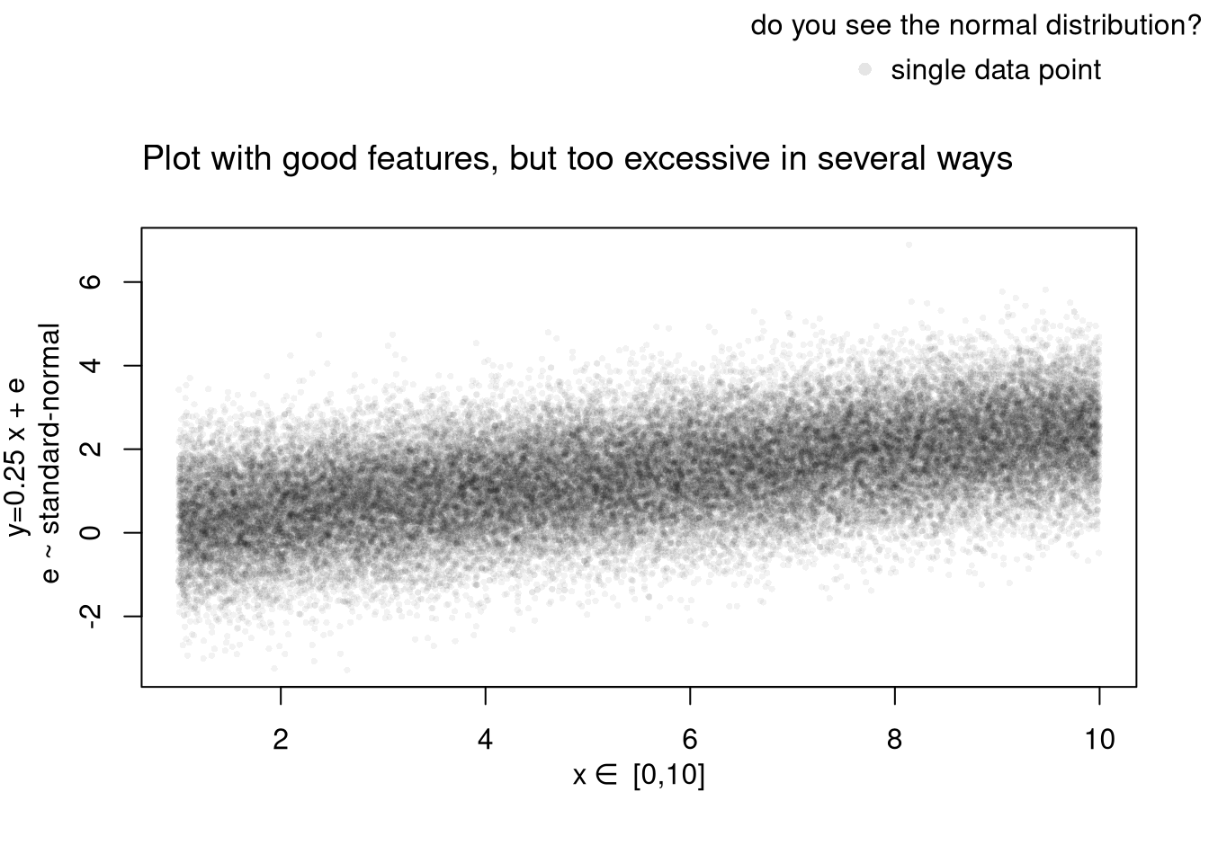
plot(y~x, xy_dat, pch=16, col=rgb(0,0,0,.05), cex=.5,xlab='', ylab='') # Format Axis Labels Seperatelymtext( 'y=0.25 x + e\n e ~ standard-normal', 2, line=2.2)mtext( expression(x%in%~'[0,10]'), 1, line=2.2)#abline( lm(y~x, data=xy_dat), lty=2)title('Plot with good features, but too excessive in several ways',adj=0, font.main=1)# Outer Legend (https://stackoverflow.com/questions/3932038/)outer_legend <-function(...) { opar <-par(fig=c(0, 1, 0, 1), oma=c(0, 0, 0, 0), mar=c(0, 0, 0, 0), new=TRUE)on.exit(par(opar))plot(0, 0, type='n', bty='n', xaxt='n', yaxt='n')legend(...)}outer_legend('topright', legend='single data point',title='do you see the normal distribution?',pch=16, col=rgb(0,0,0,.1), cex=1, bty='n')
For useful tips, see C. Wilke (2019) “Fundamentals of Data Visualization: A Primer on Making Informative and Compelling Figures” https://clauswilke.com/dataviz/
For plotting math, see https://astrostatistics.psu.edu/su07/R/html/grDevices/html/plotmath.html and https://library.virginia.edu/data/articles/mathematical-annotation-in-r
For exporting options, see ?pdf. For saving other types of files, see png("*.png"), tiff("*.tiff"), and jpeg("*.jpg")
For some things to avoid, see https://www.data-to-viz.com/caveats.html
Interactive Figures.
Histograms. See https://plotly.com/r/histograms/
Code
pop_mean <-mean(USArrests$UrbanPop)murder_lowpop <- USArrests[USArrests$UrbanPop< pop_mean,'Murder']murder_highpop <- USArrests[USArrests$UrbanPop>= pop_mean,'Murder']library(plotly)fig <-plot_ly(alpha=0.6, hovertemplate="%{y}")fig <- fig %>%add_histogram(murder_lowpop, name='Low Pop. (< Mean)')fig <- fig %>%add_histogram(murder_highpop, name='High Pop (>= Mean)')fig <- fig %>%layout(barmode="stack") # barmode="overlay"fig <- fig %>%layout(title="Crime and Urbanization in America 1975",xaxis =list(title='Murders Arrests per 100,000 People'),yaxis =list(title='Number of States'),legend=list(title=list(text='<b> % Urban Pop. </b>')))fig
Boxplots. See https://plotly.com/r/box-plots/
Code
USArrests$ID <-rownames(USArrests)fig <-plot_ly(USArrests,y=~Murder, color=~cut(UrbanPop,4),alpha=0.6, type="box",pointpos=0, boxpoints ='all',hoverinfo='text', text =~paste('<b>', ID, '</b>',"<br>Urban :", UrbanPop,"<br>Assault:", Assault,"<br>Murder :", Murder)) fig <-layout(fig,showlegend=FALSE,title='Crime and Urbanization in America 1975',xaxis =list(title ='Percent of People in an Urban Area'),yaxis =list(title ='Murders Arrests per 100,000 People'))fig
Scatterplots. See https://plotly.com/r/bubble-charts/
Code
# Simple Scatter Plot#plot(Assault~UrbanPop, USArrests, col=grey(0,.5), pch=16,# cex=USArrests$Murder/diff(range(USArrests$Murder))*2,# main='US Murder arrests (per 100,000)')# Scatter PlotUSArrests$ID <-rownames(USArrests)fig <-plot_ly( USArrests, x =~UrbanPop, y =~Assault,mode='markers',type='scatter',hoverinfo='text',text =~paste('<b>', ID, '</b>',"<br>Urban :", UrbanPop,"<br>Assault:", Assault,"<br>Murder :", Murder),color=~Murder,marker=list(size=~Murder,opacity=0.5,showscale=T, colorbar =list(title='Murder Arrests (per 100,000)')))fig <-layout(fig,showlegend=F,title='Crime and Urbanization in America 1975',xaxis =list(title ='Percent of People in an Urban Area'),yaxis =list(title ='Assault Arrests per 100,000 People'))fig
If you have many point, you can also use a 2D histogram instead. https://plotly.com/r/2D-Histogram/.
Code
fig <-plot_ly( USArrests, x =~UrbanPop, y =~Assault)fig <-add_histogram2d(fig, nbinsx=25, nbinsy=25)fig
Tables.
You can also export tables in a variety of formats, for other software programs to easily read
Code
library(stargazer)# summary statisticsstargazer(USArrests,type='html', summary=T,title='Summary Statistics for USArrests')
Summary Statistics for USArrests
Statistic
N
Mean
St. Dev.
Min
Max
Murder
50
7.788
4.356
0.800
17.400
Assault
50
170.760
83.338
45
337
UrbanPop
50
65.540
14.475
32
91
Rape
50
21.232
9.366
7.300
46.000
You can create a basic interactive table to explore raw data.
Many of the best plots are custom made (see https://www.r-graph-gallery.com/). Here are some ones that I have made over the years.
8.4 R-Markdown Reports
We will use R Markdown for communicating results to each other. Note that R and R Markdown are both languages. R studio interprets R code make statistical computations and interprets R Markdown code to produce pretty documents that contain both writing and statistics. Altogether, your project will use
R: does statistical computations
R Markdown: formats statistical computations for sharing
Rstudio: graphical user interface that allows you to easily use both R and R Markdown.
Homework reports are probably the smallest document you can create. These little reports are almost entirely self-contained (showing both code and output). To make them, you will need to
# Packages for Rmarkdowninstall.packages("knitr")install.packages("rmarkdown")# Other packages frequently used#install.packages("plotly") #for interactive plots#install.packages("sf") #for spatial data
We will create simple reproducible reports via R Markdown.
Change the name and title to your own, make other edits
Use the console to run
Code
rmarkdown::render('DataScientism.Rmd')
Example 2: Homework Assignment.
Below is a template of what homework questions (and answers) look like. Create a new .Rmd file from scratch and produce a .html file that looks similar to this:
Problem: Simulate 100 random observations of the form \(y=x\beta+\epsilon\) and plot the relationship. Plot and explore the data interactively via plotly, https://plotly.com/r/line-and-scatter/. Then play around with different styles, https://www.r-graph-gallery.com/13-scatter-plot.html, to best express your point.
Solution: I simulate \(400\) observations for \(\epsilon \sim 2\times N(0,1)\) and \(\beta=4\), as seen in this single chunk. Notice an upward trend.