Code
# Bivariate Data from USArrests
xy <- USArrests[,c('Murder','UrbanPop')]
colnames(xy) <- c('y','x')

# Inspect Dataset
# head(xy)
# summary(xy)
plot(y~x, xy, col=grey(0,.5), pch=16)
title('Murder and Urbanization in America 1975', font.main=1)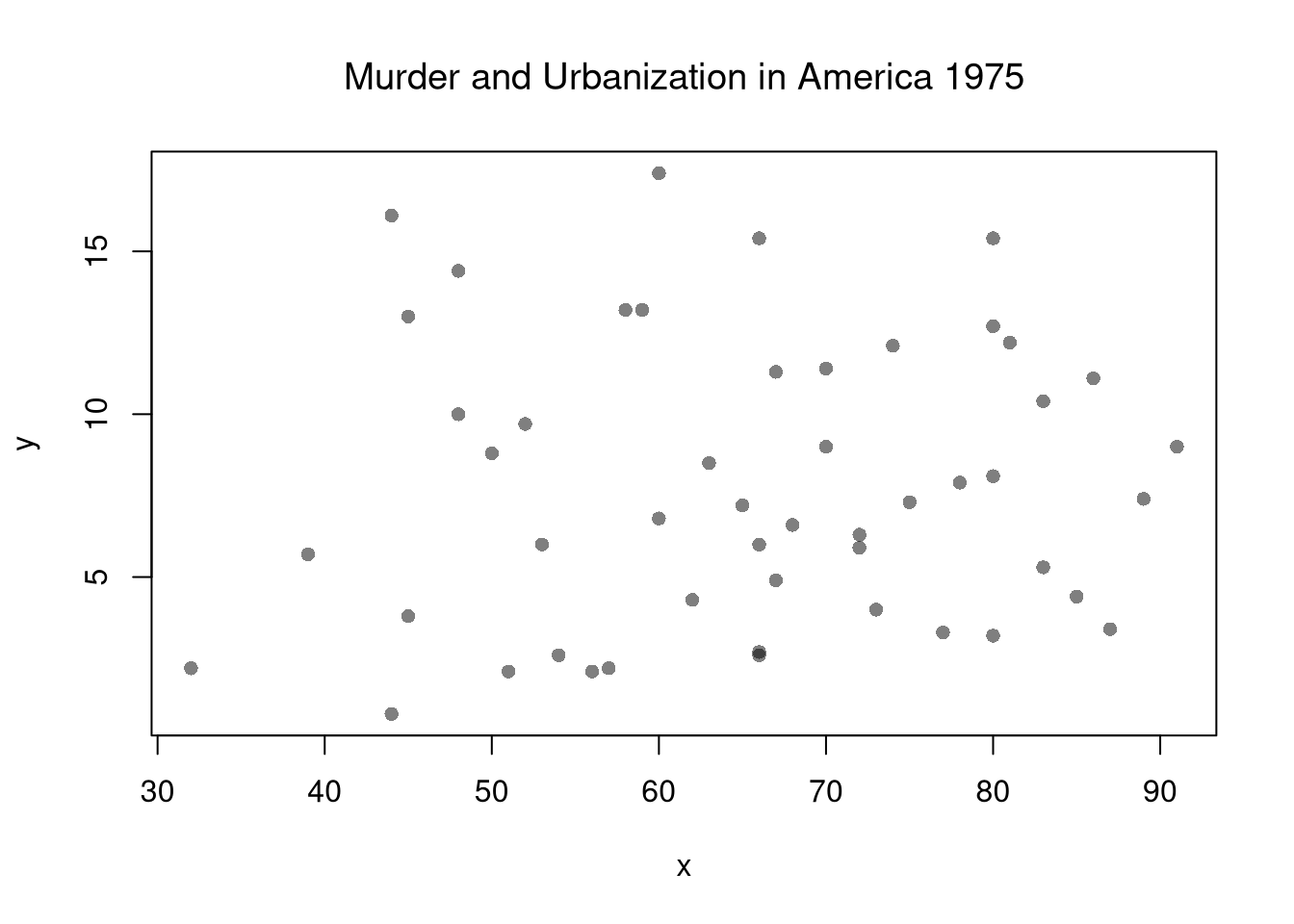
Suppose we have some bivariate data. First, we inspect it as in Part I.
# Bivariate Data from USArrests
xy <- USArrests[,c('Murder','UrbanPop')]
colnames(xy) <- c('y','x')
# Inspect Dataset
# head(xy)
# summary(xy)
plot(y~x, xy, col=grey(0,.5), pch=16)
title('Murder and Urbanization in America 1975', font.main=1)
Now we will assess the association between variables by fitting a line through the data points using a “regression”.
This refers to fitting a linear model to bivariate data. Specifically, our model is \[ y_i=\beta_{0}+\beta_{1} x_i+\epsilon_{i} \] and our objective function is \[ min_{\beta_{0}, \beta_{1}} \sum_{i=1}^{N} \left( \epsilon_{i} \right)^2 = min_{\beta_{0}, \beta_{1}} \sum_{i=1} \left( y_i - [\beta_{0}+\beta_{1} x_i] \right). \] Minimizing the sum of squared errors yields parameter estimates \[ \hat{\beta_{0}}=\bar{Y}-\hat{\beta_{1}}\bar{X} \\ \hat{\beta_{1}}=\frac{\sum_{i}^{}(x_i-\bar{x})(y_i-\bar{y})}{\sum_{i}^{}(x_i-\bar{x})^2} = \frac{C_{XY}}{V_{X}} \] and predictions \[ \hat{y}_i=\hat{\beta_{0}}+\hat{\beta}x_i\\ \hat{\epsilon}_i=y_i-\hat{y}_i \]
# Run a Regression Coefficients
reg <- lm(y~x, dat=xy)
# predict(reg)
# resid(reg)
# coef(reg)First, we qualitatively analyze the ‘’Goodness of fit’’ of our model, we plot our predictions for a qualitative analysis
# Plot Data and Predictions
library(plotly)
xy$ID <- rownames(USArrests)
xy$pred <- predict(reg)
xy$resid <- resid(reg)
fig <- plotly::plot_ly(
  xy, x=~x, y=~y,
  mode='markers',
  type='scatter',
  hoverinfo='text',
  marker=list(color=grey(0,.25), size=10),
  text=~paste('<b>', ID, '</b>',
              '<br>Urban  :', x,
              '<br>Murder :', y,
              '<br>Predicted Murder :', round(pred,2),
              '<br>Residual :', round(resid,2)))
# Add Legend
fig <- plotly::layout(fig,
          showlegend=F,
          title='Crime and Urbanization in America 1975',
          xaxis = list(title='Percent of People in an Urban Area'),
          yaxis = list(title='Homicide Arrests per 100,000 People'))
# Plot Model Predictions
add_trace(fig, x=~x, y=~pred,
    inherit=F, hoverinfo='none',
    mode='lines+markers', type='scatter',
    color=I('black'),
    line=list(width=1/2),
    marker=list(symbol=134, size=5))
For a quantitative summary, we can also compute the linear correlation between the predictions and the data \[ R = Cor( \hat{y}_i, y) \] With linear models, we typically compute \(R^2\), known as the “coefficient of determination”, using the sums of squared errors (Total, Explained, and Residual) \[ \underbrace{\sum_{i}(y_i-\bar{y})^2}_\text{TSS}=\underbrace{\sum_{i}(\hat{y}_i-\bar{y})^2}_\text{ESS}+\underbrace{\sum_{i}\hat{\epsilon_{i}}^2}_\text{RSS}\\ R^2 = \frac{ESS}{TSS}=1-\frac{RSS}{TSS} \]
# Manually Compute R2
Ehat <- resid(reg)
RSS  <- sum(Ehat^2)
Y <- xy$y
TSS  <- sum((Y-mean(Y))^2)
R2 <- 1 - RSS/TSS
R2
## [1] 0.00484035

# Check R2
summary(reg)$r.squared
## [1] 0.00484035

# Double Check R2
R <- cor(xy$y, predict(reg))
R^2
## [1] 0.00484035A regression coefficient is a statistic. And, just like all statistics, we can calculate
Note that values reported by your computer do not necessarily satisfy this definition. To calculate these statistics, we will estimate variability using data-driven methods. (For some theoretical background, see, e.g., https://www.sagepub.com/sites/default/files/upm-binaries/21122_Chapter_21.pdf.)
We first consider the simplest, the jackknife. In this procedure, we loop through each row of the dataset. And, in each iteration of the loop, we drop that observation from the dataset and reestimate the statistic of interest. We then calculate the standard deviation of the statistic across all ``subsamples’’.
# Jackknife Standard Errors for OLS Coefficient
jack_regs <- lapply(1:nrow(xy), function(i){
    xy_i <- xy[-i,]
    reg_i <- lm(y~x, dat=xy_i)
})
jack_coefs <- sapply(jack_regs, coef)['x',]
jack_se <- sd(jack_coefs)
# classic_se <- sqrt(diag(vcov(reg)))[['x']]


# Jackknife Sampling Distribution
hist(jack_coefs, breaks=25,
    main=paste0('SE est. = ', round(jack_se,4)),
    font.main=1, border=NA,
    xlab=expression(beta[-i]))
# Original Estimate
abline(v=coef(reg)['x'], lwd=2)
# Jackknife Confidence Intervals
jack_ci_percentile <- quantile(jack_coefs, probs=c(.025,.975))
abline(v=jack_ci_percentile, lty=2)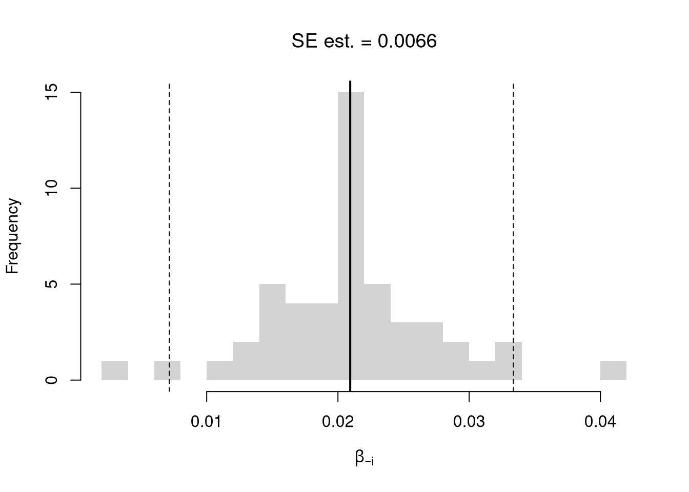
# Plot Normal Approximation
# jack_ci_normal <- jack_mean+c(-1.96, +1.96)*jack_se
# abline(v=jack_ci_normal, col="red", lty=3)There are several resampling techniques. The other main one is the bootstrap, which resamples with replacement for an arbitrary number of iterations. When bootstrapping a dataset with \(n\) observations, you randomly resample all \(n\) rows in your data set \(B\) times. Random subsampling is one of many hybrid approaches that tries to combine the best of both worlds.
| Sample Size per Iteration | Number of Iterations | Resample | |
|---|---|---|---|
| Bootstrap | \(n\) | \(B\) | With Replacement |
| Jackknife | \(n-1\) | \(n\) | Without Replacement |
| Random Subsample | \(m < n\) | \(B\) | Without Replacement |
# Bootstrap
boot_regs <- lapply(1:399, function(b){
    b_id <- sample( nrow(xy), replace=T)
    xy_b <- xy[b_id,]
    reg_b <- lm(y~x, dat=xy_b)
})
boot_coefs <- sapply(boot_regs, coef)['x',]
boot_se <- sd(boot_coefs)

hist(boot_coefs, breaks=25,
    main=paste0('SE est. = ', round(boot_se,4)),
    font.main=1, border=NA,
    xlab=expression(beta[b]))
boot_ci_percentile <- quantile(boot_coefs, probs=c(.025,.975))
abline(v=boot_ci_percentile, lty=2)
abline(v=coef(reg)['x'], lwd=2)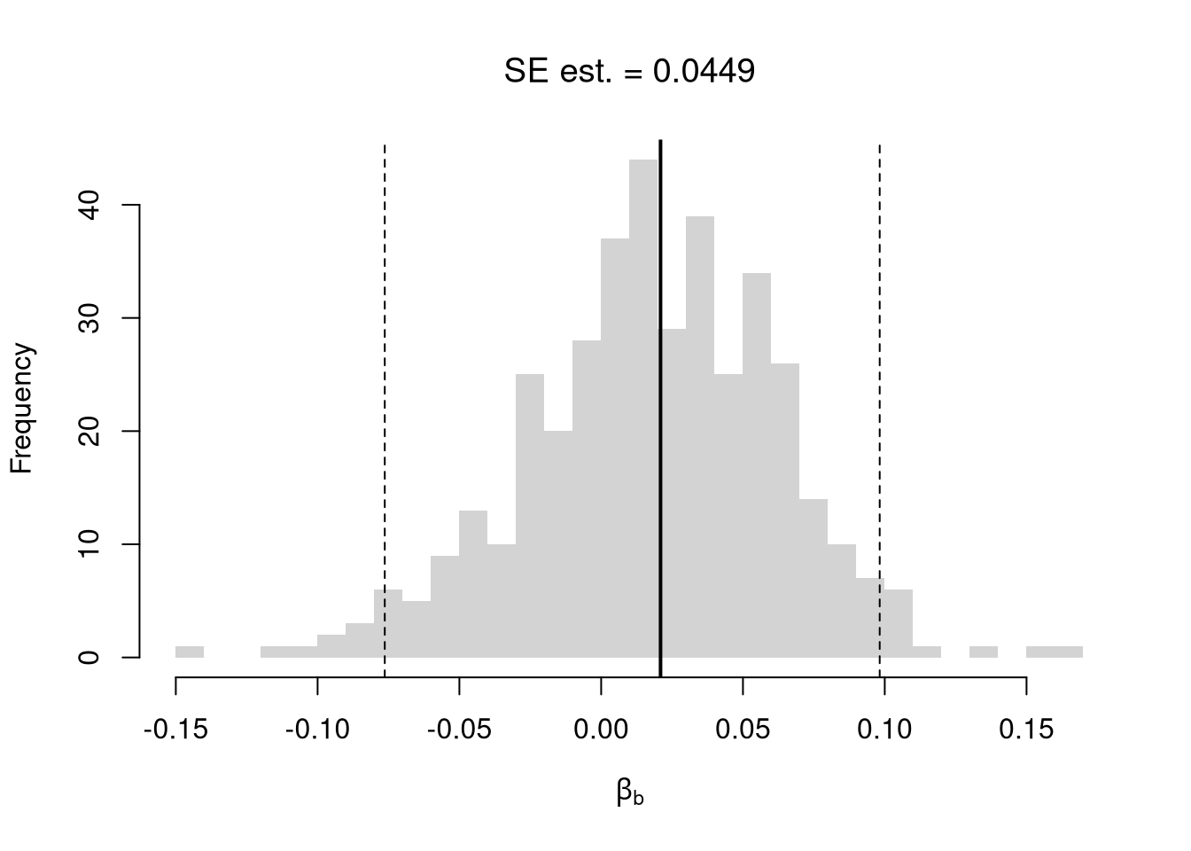
# Random Subsamples
rs_regs <- lapply(1:399, function(b){
    b_id <- sample( nrow(xy), nrow(xy)-10, replace=F)
    xy_b <- xy[b_id,]
    reg_b <- lm(y~x, dat=xy_b)
})
rs_coefs <- sapply(rs_regs, coef)['x',]
rs_se <- sd(rs_coefs)

hist(rs_coefs, breaks=25,
    main=paste0('SE est. = ', round(rs_se,4)),
    font.main=1, border=NA,
    xlab=expression(beta[b]))
abline(v=coef(reg)['x'], lwd=2)
rs_ci_percentile <- quantile(rs_coefs, probs=c(.025,.975))
abline(v=rs_ci_percentile, lty=2)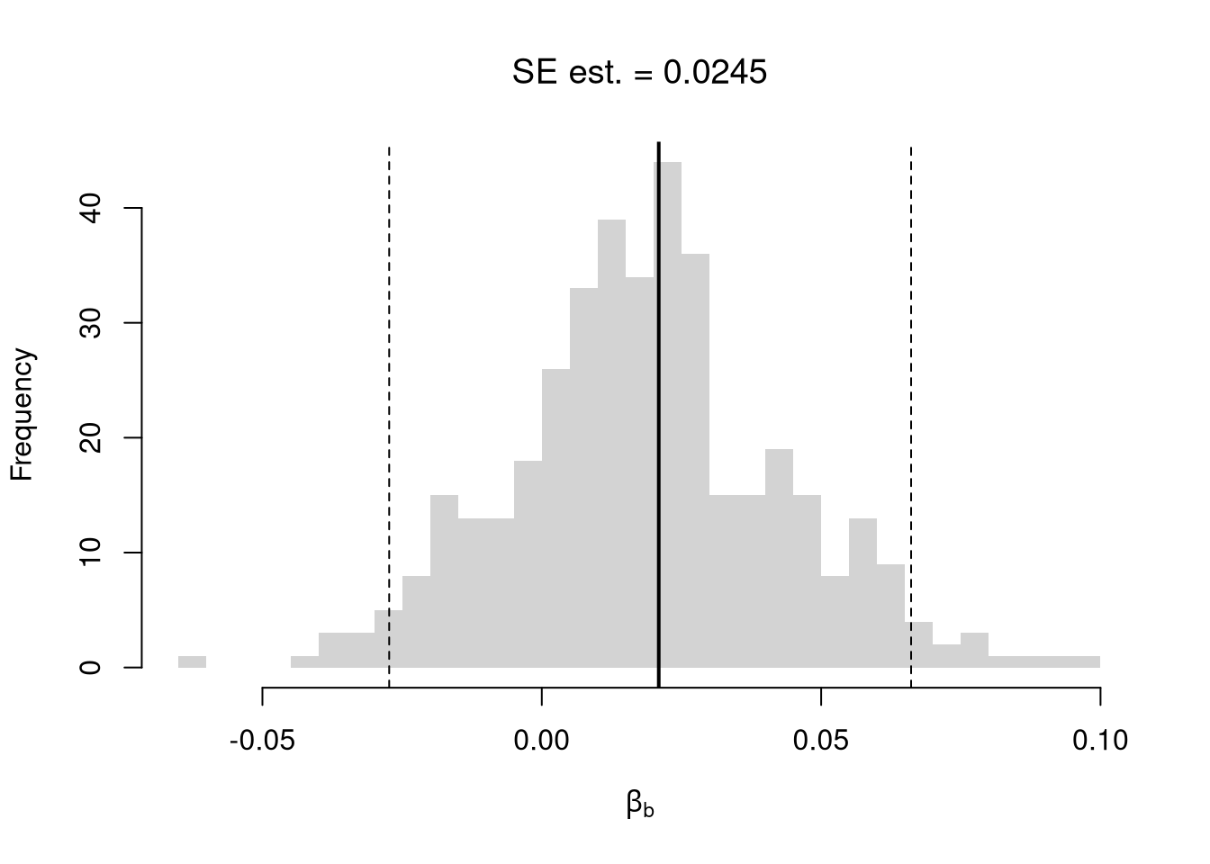
We can also bootstrap other statistics, such as a t-statistic or \(R^2\). We do such things to test a null hypothesis, which is often ``no relationship’’. We are rarely interested in computing standard errors and conducting hypothesis tests for two variables. However, we work through the ideas in the two-variable case to better understand the multi-variable case.
One main way to conduct hypothesis tests is to examine whether a confidence interval contains a hypothesized value. Does the slope coefficient equal \(0\)? For reasons we won’t go into in this class, we typically normalize the coefficient by its standard error: \[ \hat{t} = \frac{\hat{\beta}}{\hat{\sigma}_{\hat{\beta}}} \]
tvalue <- coef(reg)['x']/jack_se

jack_t <- sapply(jack_regs, function(reg_b){
    # Data
    xy_b <- reg_b$model
    # Coefficient
    beta_b <- coef(reg_b)[['x']]
    t_hat_b <- beta_b/jack_se
    return(t_hat_b)
})

hist(jack_t, breaks=25,
    main='Jackknife t Density',
    font.main=1, border=NA,
    xlab=expression(hat(t)[b]),
    xlim=range(c(0, jack_t)) )
abline(v=quantile(jack_t, probs=c(.025,.975)), lty=2)
abline(v=0, col="red", lwd=2)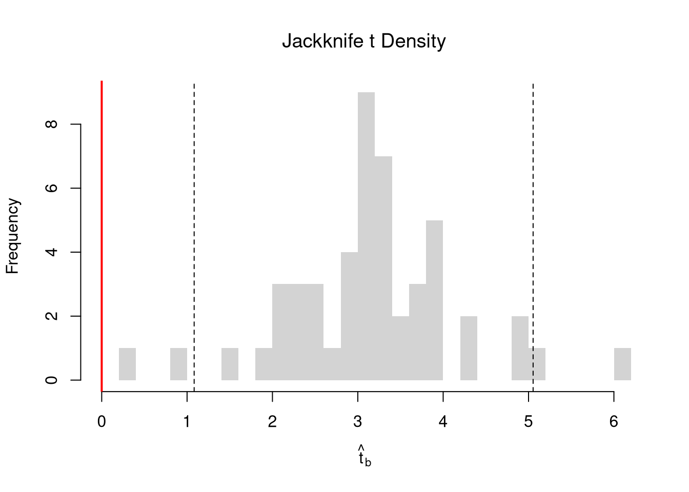
We can also compute a null distribution. We focus on the simplest: bootstrap simulations that each impose the null hypothesis and re-estimate the statistic of interest. Specifically, we compute the distribution of t-values on data with randomly reshuffled outcomes (imposing the null), and compare how extreme the observed value is.
# Null Distribution for Beta
boot_t0 <- sapply( 1:399, function(b){
    xy_b <- xy
    xy_b$y <- sample( xy_b$y, replace=T)
    reg_b <- lm(y~x, dat=xy_b)
    beta_b <- coef(reg_b)[['x']]
    t_hat_b <- beta_b/jack_se
    return(t_hat_b)
})

# Null Bootstrap Distribution
boot_ci_percentile0 <- quantile(boot_t0, probs=c(.025,.975))
hist(boot_t0, breaks=25,
    main='Null Bootstrap Density',
    font.main=1, border=NA,
    xlab=expression(hat(t)[b]),
    xlim=range(boot_t0))
abline(v=boot_ci_percentile0, lty=2)
abline(v=tvalue, col="red", lwd=2)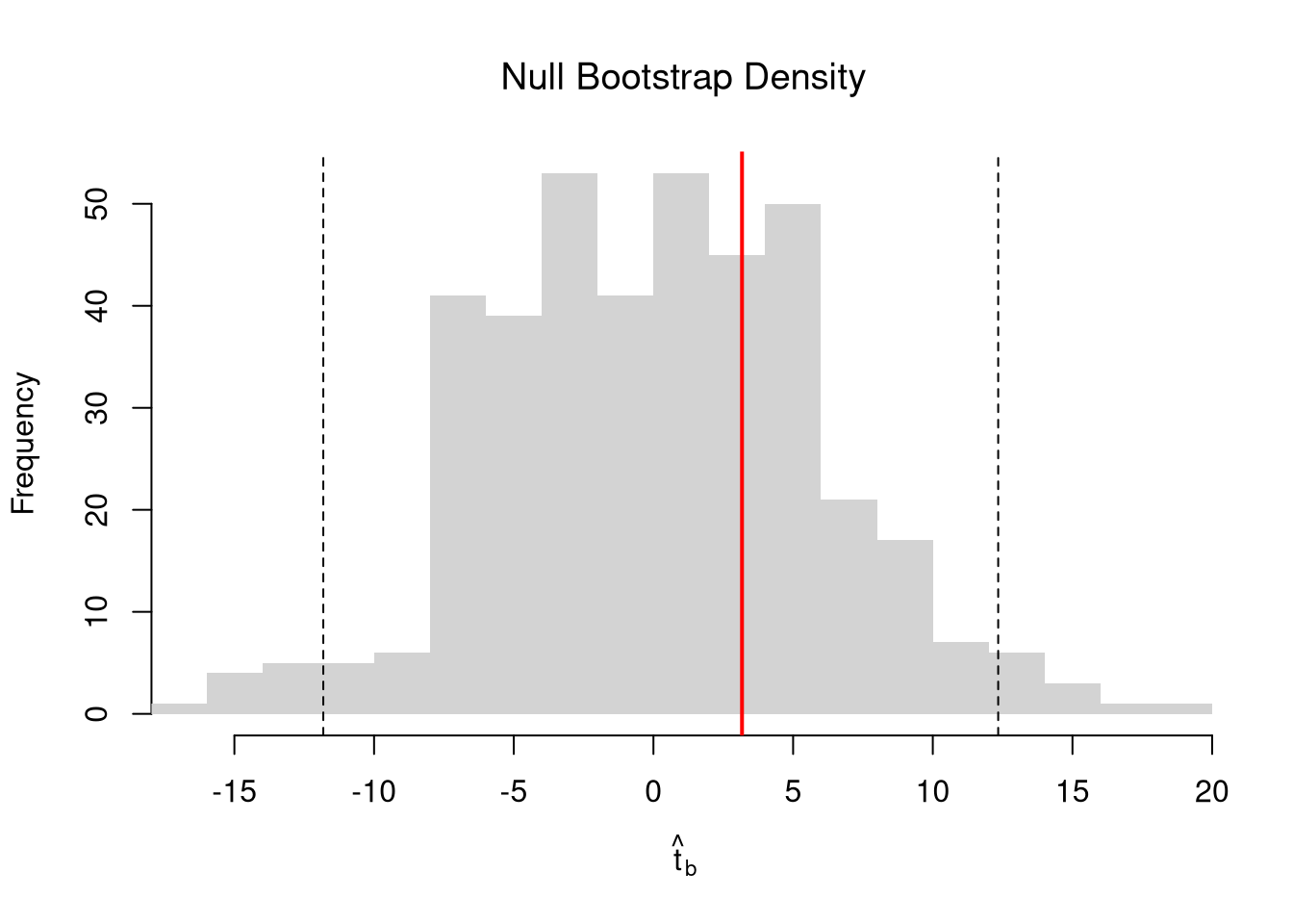
Alternatively, you can impose the null by recentering the sampling distribution around the theoretical value; \[\hat{t} = \frac{\hat{\beta} - \beta_{0} }{\hat{\sigma}_{\hat{\beta}}}.\] Under some assumptions, the null distribution follows a t-distribution. (For more on parametric t-testing based on statistical theory, see https://www.econometrics-with-r.org/4-lrwor.html.)
In any case, we can calculate a p-value: the probability you would see something as extreme as your statistic under the null (assuming your null hypothesis was true). We can always calculate a p-value from an explicit null distribution.
# One Sided Test for P(t > boot_t | Null) = 1 - P(t < boot_t | Null)
That_NullDist1 <- ecdf(boot_t0)
Phat1  <- 1-That_NullDist1(jack_t)

# Two Sided Test for P(t > jack_t or t < -jack_t | Null)
That_NullDist2 <- ecdf(abs(boot_t0))
plot(That_NullDist2, xlim=range(boot_t0, jack_t),
    xlab=expression( abs(hat(t)[b]) ),
    main='Null Bootstrap Distribution', font.main=1)
abline(v=tvalue, col='red')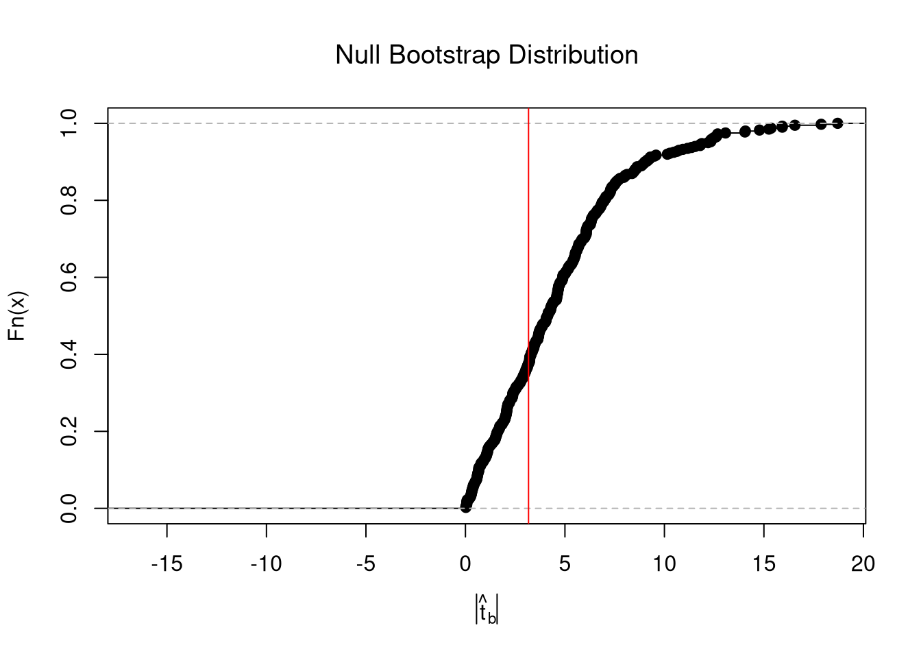
Phat2  <-  1-That_NullDist2( abs(tvalue))
Phat2
## [1] 0.6441103