In contrast to marginal and joint distributions, conditional distributions describe how the distribution of one variable changes when we restrict attention to a subgroup defined by another variable. Formally, if \(\hat{p}_{xy}\) denotes the empirical joint distribution, then the empirical conditional distribution of \(Y_{i}\) given \(X_{i}=x\) is \[\begin{eqnarray}
\hat{p}_{y \mid x} = \frac{\hat{p}_{xy}}{\hat{p}_x},
\end{eqnarray}\] where \(\hat{p}_{x} = \sum_y \hat{p}_{xy}\).
For example, suppose we observe a sample of \(n=13\) students with two discrete variables:
\(X_{i}\) depicts years of education, taking values in \(\{12, 14\}\)
\(Y_{i}\) depicts sex, where \(y=1\) means female and \(y=0\) means male
Assume the count data are summarized by the following frequency table:
We will compute the conditional distribution of \(Y_{i}\) given \(X_{i}=x\). For \(x=12\), we compute \[\begin{eqnarray}
\hat{p}_{y=0 \mid x=12}
&=& \frac{\hat{p}_{x=12, y=0}}{\hat{p}_{x=12}}
= \frac{4/13}{7/13}
= \frac{4}{7}
\approx 0.57. \\
\hat{p}_{y=1\mid x=12}
&=& \frac{\hat p_{x=12, y=1}}{\hat{p}_{x=12}}
= \frac{3/13}{7/13}
= \frac{3}{7}
\approx 0.43.
\end{eqnarray}\] Similarly, for \(x=14\), we compute \[\begin{eqnarray}
\hat{p}_{y=0 \mid x=14}
&=& \frac{\hat{p}_{x=14, y=0}}{\hat{p}_{x=14}}
= \frac{1/13}{6/13}
= \frac{1}{6}
\approx 0.17. \\
\hat{p}_{y=1\mid x=14}
&=& \frac{\hat p_{x=14, y=1}}{\hat{p}_{x=14}}
= \frac{5/13}{6/13}
= \frac{5}{6}
\approx 0.83.
\end{eqnarray}\]
In this example, we say that
conditional on students having \(12\) years of education, \(\approx 57\%\) are male and \(\approx 43\%\) are female.
conditional on students having \(14\) years of education, \(\approx 17\%\) are male and \(\approx 83\%\) are female.
We can also compute the conditional distribution of \(X_{i}\) given \(Y_{i}=x\), just as we did above.
Tip
Continuing the example above, show that
among male students, \(\approx 80\%\) have 12 years of education.
among female students, \(\approx 38\%\) have 12 years of education.
Try programming the results, especially if you are stuck or uncertain
Code
# Counts implied by the table:# X=12: 4 male, 3 female# X=14: 1 male, 5 femaleX <-c(rep(12,7), rep(14,6))Y <-c(rep(0,4), rep(1,3),rep(0,1), rep(1,5))dat <-data.frame(educ=X, female=Y)tab <-table(dat)tab## female## educ 0 1## 12 4 3## 14 1 5# Joint distributionround(prop.table(tab), 3)## female## educ 0 1## 12 0.308 0.231## 14 0.077 0.385# Conditional distribution of Y given Xround(prop.table(tab, 1), 3)## female## educ 0 1## 12 0.571 0.429## 14 0.167 0.833# Conditional distribution of X given Yround(prop.table(tab, 2), 3)## female## educ 0 1## 12 0.800 0.375## 14 0.200 0.625
Conditional distributions change the unit of analysis:
\(\hat{p}_{y=1 \mid x=14}\) answers “what fraction of student are female within the subgroup with 14 years of education?”
\(\hat{p}_{x=14 \mid y=1}\) answers “what fraction of students have 14 years of education within the subgroup that is female?”
Simpson’s Paradox.
Frequency tables can be tricky, especially when using percents, so take your time making and interpreting them. Remember that a ratio can change due changes in either the numerator or the denominator.
Consider the following example, which shows that \(400\) men and \(400\) women applied to university and that only a share were accepted in each department (English or Engineering). If you computed percents for each sex within each cell, you would find men have a higher overall acceptance rate, but women have higher acceptance rates within each department! This counterintuitive phenomena is known as Simpson’s Paradox, and the example is part of a real debate about discrimination (http://homepage.stat.uiowa.edu/~mbognar/1030/Bickel-Berkeley.pdf).
Even if women have higher admission rates within both departments, women can still have a lower overall admission rate if women disproportionately apply to the more selective department (English) and men disproportionately apply to the less selective department (Engineering). The same issue is relevant for a variety of labor market issues, such as the gender pay gap, and a great many other social issues, such as why are some countries rich and others poor.
School Applicants (Admitted), by Sex and Department
Department
Men
Women
Total
English
100 (40, \(40\%\))
350 (150, \(43\%\))
450 (190, \(42\%\))
Engineering
300 (160, \(53\%\))
50 (30, \(60\%\))
350 (190, \(54\%\))
Total
400 (200, \(50\%\))
400 (180, \(45\%\))
800 (380, \(48\%\))
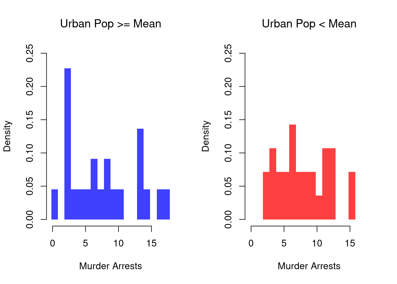
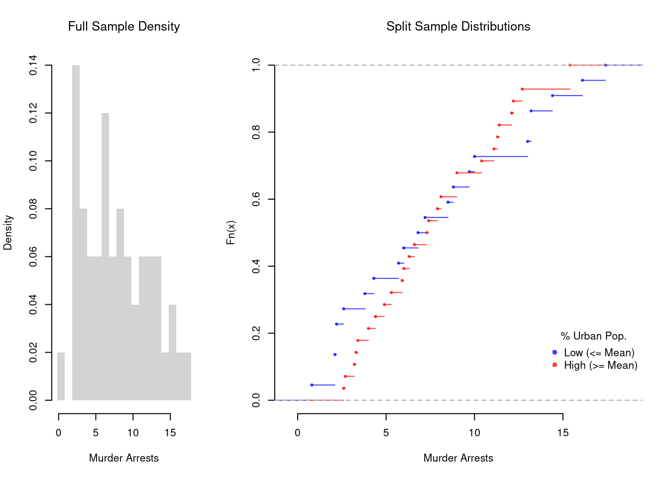
Continuous Data.
These describe the relationship between \(\hat{Y}_{i}\) and \(\hat{X}_{i}\). We show how distribution or density of \(Y\) changes according to \(X\). When \(X\) is continuous, as it often is, we split it into distinct bins and convert it to a factor variable. E.g.,
Code
# Split Data by Urban Population above/below meanpop_mean <-mean(USArrests[,'UrbanPop'])pop_cut <- USArrests[,'UrbanPop']< pop_meanmurder_lowpop <- USArrests[pop_cut,'Murder']murder_highpop <- USArrests[!pop_cut,'Murder']cols <-c(low=rgb(0,0,1,.75), high=rgb(1,0,0,.75))# Common Histogram ylim <-c(0,.25)xbks <-seq(min(USArrests[,'Murder'])-1, max(USArrests[,'Murder'])+1, by=1)par(mfrow=c(1,2))hist(murder_lowpop,breaks=xbks, col=cols[1],main='Urban Pop >= Mean', font.main=1,xlab='Murder Arrests', freq=F,border=NA, ylim=ylim)hist(murder_highpop,breaks=xbks, col=cols[2],main='Urban Pop < Mean', font.main=1,xlab='Murder Arrests', freq=F,border=NA, ylim=ylim)
It is sometimes it is preferable to show the ECDF instead. And you can glue various combinations together to convey more information all at once
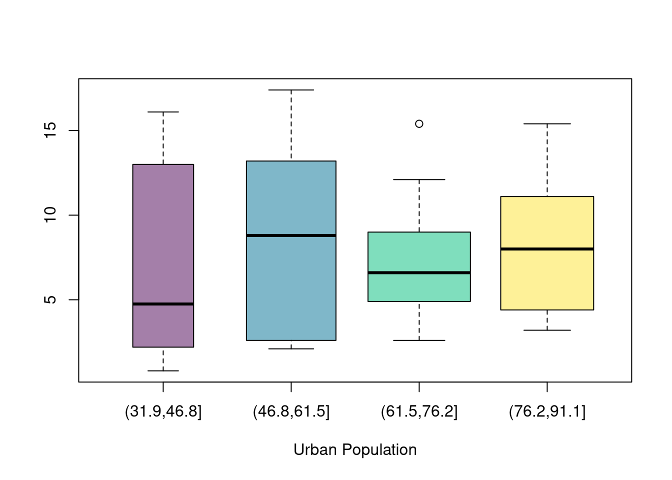
You can also split data into more than two groups. For more than three groups, boxplots are often more effective than histograms or ECDF’s.
Code
# K Groups with even spacing (not even counts)K <-4USArrests[,'UrbanPop_Kcut'] <-cut(USArrests[,'UrbanPop'],K)table(USArrests[,'UrbanPop_Kcut'] )## ## (31.9,46.8] (46.8,61.5] (61.5,76.2] (76.2,91.1] ## 6 13 17 14# Full sample#boxplot(USArrests[,'Murder'], main='',# xlab='All Data', ylab='Murder Arrests')# Boxplots for each groupKcols <-hcl.colors(K,alpha=.5)boxplot(Murder~UrbanPop_Kcut, USArrests,main='', col=Kcols, varwidth=T, #show number of obs. per groupxlab='Urban Population', ylab='')
Code
# 4 Groups with equal numbers of observations#Qcuts <- c(# '0%'=min(USArrests[,'UrbanPop'])-10*.Machine[['double.eps']],# quantile(USArrests[,'UrbanPop'], probs=c(.25,.5,.75,1)))#USArrests[,'UrbanPop']_cut <- cut(USArrests[,'UrbanPop'], Qcuts)#boxplot(Murder~UrbanPop_cut, USArrests, col=hcl.colors(4,alpha=.5))
11.2 Group Differences
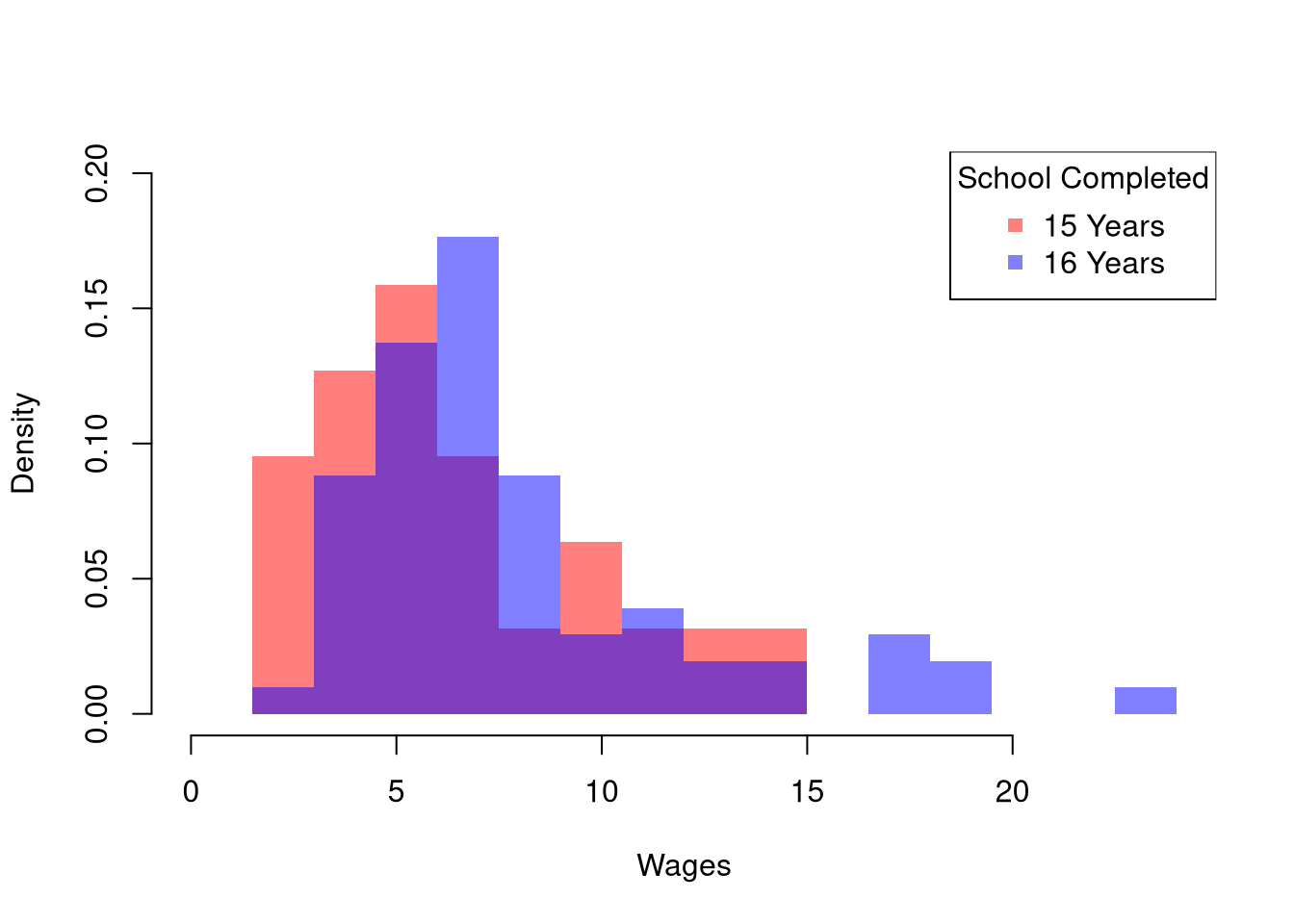
For mixed data, \(\hat{Y}_{i}\) is a cardinal variable and \(\hat{X}_{i}\) is a factor variable (typically unordered). For such “grouped data”, we analyze associations via group comparisons. The basic idea is best seen in a comparison of two samples, which corresponds to an \(\hat{X}_{i}\) with two categories. For example, the heights of men and women in Canada or the homicide rates in two different American states. For another example, the wages for people with and without completing a degree.
There may be several differences between groups. Often, the first statistic we investigate is the difference in means.
Mean Differences.
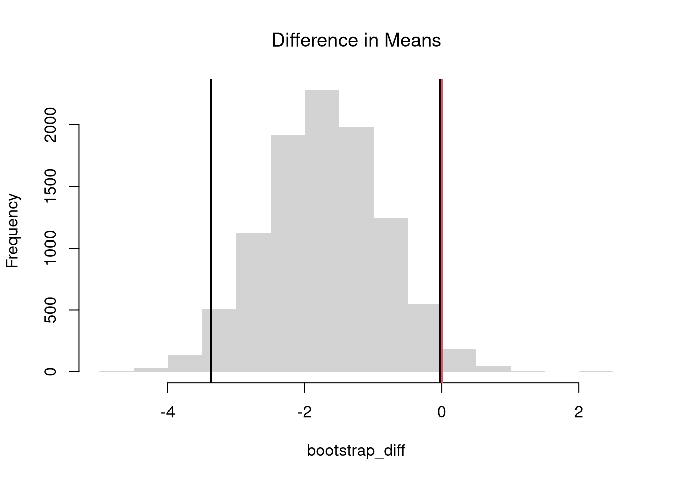
We often want to know if the means of different sample are different. To test this hypothesis, we compute the means separately for each sample and then examine the differences term \[\begin{eqnarray}
\hat{D} = \hat{M}_{Y1} - \hat{M}_{Y2},
\end{eqnarray}\] with a null hypothesis that there is no difference in the population means.
Just as with one sample tests, we can compute a standardized differences, where \(D\) is converted into a \(t\) statistic. Note, however, that we have to compute the standard error for the difference statistic, which is a bit more complicated. However, this allows us to easily conduct one or two sided hypothesis tests using a standard normal approximation.
Tip
Code
se_hat <-sqrt(var(Y1)/n1 +var(Y2)/n2);t_obs <- d/se_hatt_2sample <-function(Y1, Y2){# Differences between means m1 <-mean(Y1) m2 <-mean(Y2) d <- (m1-m2)# SE estimate n1 <-length(Y1) n2 <-length(Y2) s1 <-var(Y1) s2 <-var(Y2) s <- ((n1-1)*s1 + (n2-1)*s2)/(n1+n2-2) d_se <-sqrt(s*(1/n1+1/n2))# t stat t_stat <- d/d_sereturn(t_stat)}tstat <-twosam(data[,'male'], data[,'female'])tstat
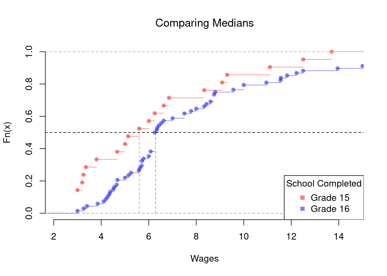
Quantile Differences.
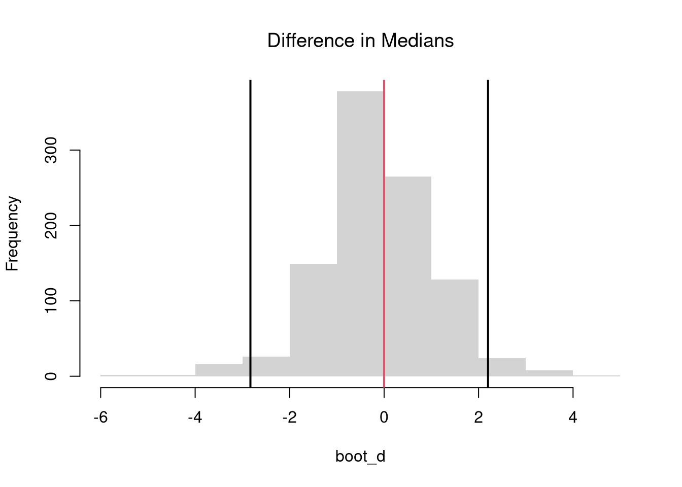
The above procedure generalized from differences in means to other quantiles statistics like medians.
# Bootstrap Distribution Functionboot_quant <-function(Y1, Y2, B=9999, prob=0.5, ...){ bootstrap_diff <-vector(length=B)for(b inseq(bootstrap_diff)){ Y1_b <-sample(Y1, replace=T) Y2_b <-sample(Y2, replace=T) q1_b <-quantile(Y1_b, probs=0.5, ...) q2_b <-quantile(Y2_b, probs=0.5, ...) d_b <- q1_b - q2_b bootstrap_diff[b] <- d_b }return(bootstrap_diff)}# 2-Sided Test for Median Differences# d <- median(Y2) - median(Y1)boot_d <-boot_quant(Y1, Y1, B=999, prob=0.5)hist(boot_d, border=NA, font.main=1,main='Difference in Medians')abline(v=quantile(boot_d, probs=c(.025, .975)), lwd=2)abline(v=0, lwd=2, col=2)
Code
1-ecdf(boot_d)(0)## [1] 0.4264264
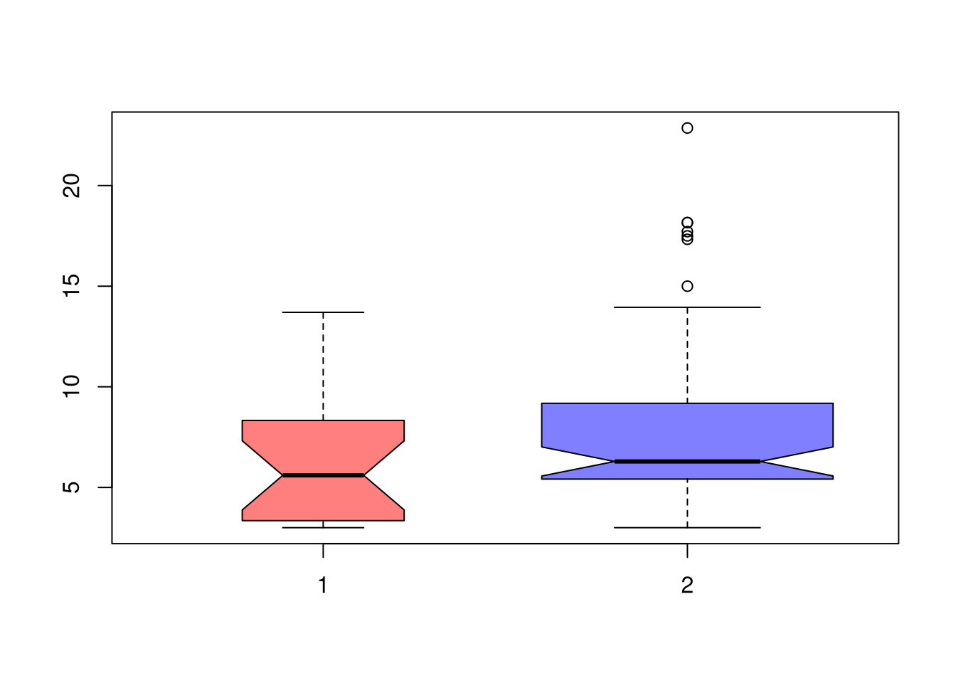
If we want to test for the differences in medians across groups with independent observations, we can also use notches in the boxplot. If the notches of two boxes do not overlap, then there is rough evidence that the difference in medians is statistically significant. The square root of the sample size is also shown as the bin width in each boxplot.1
Code
boxplot(Y1, Y2,col=cols,notch=T,varwidth=T)
Note that bootstrap tests can perform poorly with highly unequal variances or skewed data. To see this yourself, make a simulation with skewed data and unequal variances.
In principle, we can also examine whether there are differences in spread or shape statistics such as sd and IQR, or skew and kurtosis. More often, however, we examine whether there are any differences in the distributions.
Tip
Here is an example to look at differences in “spread”
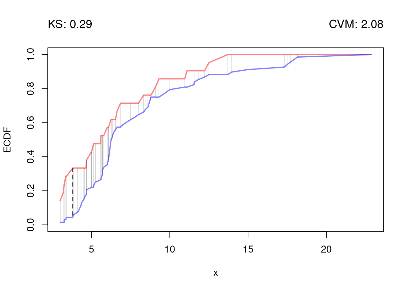
We can also examine whether there are any differences between the entire distributions. We typically start by plotting the data using ECDF’s or a boxplot, and then calculate a statistic for hypothesis testing. Which plot and test statistic depends on how many groups there are.
Two groups.
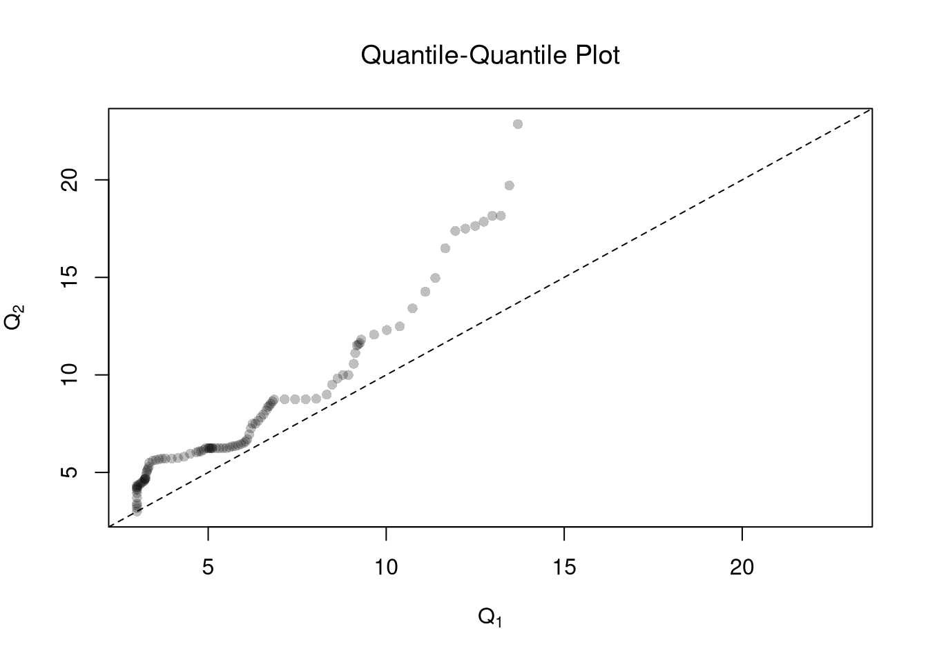
One useful visualization for two groups is to plot the quantiles against one another: a quantile-quantile plot. I.e., the first data point on the bottom left shows the first quantile for both distributions.
The starting point for hypothesis testing is the Kolmogorov-Smirnov Statistic: the maximum absolute difference between two CDF’s over all sample data \(y \in \{Y_1\} \cup \{Y_2\}\). \[\begin{eqnarray}
\hat{KS} &=& \max_{y} |\hat{F}_{1}(y)- \hat{F}_{2}(y)|^{p},
\end{eqnarray}\] where \(p\) is an integer (typically 1). An intuitive alternative is the Cramer-von Mises Statistic: the sum of absolute differences (raised to an integer, typically 2) between two CDF’s. \[\begin{eqnarray}
\hat{CVM} &=& \sum_{y} | \hat{F}_{1}(y)- \hat{F}_{2}(y)|^{p}.
\end{eqnarray}\]
Just as before, you use bootstrapping for hypothesis testing.
Code
twosamples::ks_test(Y1, Y2)## Test Stat P-Value ## 0.2892157 0.0970000twosamples::cvm_test(Y1, Y2)## Test Stat P-Value ## 2.084253 0.089000
Tip
Compare the distribution of arrests for two different counties, each with data over time.
Code
library(wooldridge)countymurders
Multiple groups.
With multiple groups, you will want to begin with a summary figure (such as a boxplot). We can also tests the equality of all distributions (whether at least one group is different). The Kruskal-Wallis test examines \(H_0:\; F_1 = F_2 = \dots = F_G\) versus \(H_A:\; \text{at least one } F_g \text{ differs}\), where \(F_g\) is the continuous distribution of group \(g=1,...G\). This test does not tell us which group is different.
To conduct the test, first denote individuals \(i=1,...n\) with overall ranks \(\hat{r}_1,....\hat{r}_{n}\). Each individual belongs to group \(g=1,...G\), and each group \(g\) has \(n_{g}\) individuals with average rank \(\bar{r}_{g} = \sum_{i} \hat{r}_{i} /n_{g}\). The Kruskal Wallis statistic is \[\begin{eqnarray}
\hat{KW} &=& (N-1) \frac{\sum_{g=1}^{G} n_{g}( \bar{r}_{g} - \bar{r} )^2 }{\sum_{i=1}^{n} ( \hat{r}_{i} - \bar{r} )^2},
\end{eqnarray}\] where \(\bar{r} = \frac{n+1}{2}\) is the grand mean rank.
In the special case with only two groups, \(G=2\), the Kruskal Wallis test reduces to the Mann–Whitney U test (also known as the Wilcoxon rank-sum test). In this case, we can write the hypotheses in terms of individual outcomes in each group, \(Y_i\) in one group \(Y_j\) in the other; \(H_0: Prob(Y_i > Y_j)=Prob(Y_i > Y_i)\) versus \(H_A: Prob(Y_i > Y_j) \neq Prob(Y_i > Y_j)\). The corresponding test statistic is \[\begin{eqnarray}
\hat{U} &=& \min(\hat{U}_1, \hat{U}_2) \\
\hat{U}_g &=& \sum_{i\in g}\sum_{j\in -g}
\Bigl[\mathbf 1( \hat{Y}_{i} > \hat{Y}_{j}) + \tfrac12\mathbf 1(\hat{Y}_{i} = \hat{Y}_{j})\Bigr].
\end{eqnarray}\]
Code
library(AER)data(CASchools)CASchools[,'stratio'] <- CASchools[,'students']/CASchools[,'teachers']# Do student/teacher ratio differ for at least 1 county?# Single test of multiple distributionskruskal.test(CASchools[,'stratio'], CASchools[,'county'])## ## Kruskal-Wallis rank sum test## ## data: CASchools[, "stratio"] and CASchools[, "county"]## Kruskal-Wallis chi-squared = 161.18, df = 44, p-value = 2.831e-15# Multiple pairwise tests# pairwise.wilcox.test(CASchools[,'stratio'], CASchools[,'county'])
Let each group \(g\) have median \(\tilde{M}_{g}\), interquartile range \(\hat{IQR}_{g}\), observations \(n_{g}\). We can compute standard deviation of the median as \(\tilde{S}_{g}= \frac{1.25 \hat{IQR}_{g}}{1.35 \sqrt{n_{g}}}\). As a rough guess, the interval \(\tilde{M}_{g} \pm 1.7 \tilde{S}_{g}\) is the historical default and displayed as a notch in the boxplot. See also https://www.tandfonline.com/doi/abs/10.1080/00031305.1978.10479236.↩︎