Code
statistic <- function(X, f){
    y <- f(X)
    return(y)
}

X <- c(0, 1, 3, 10, 6) # Data
statistic(X, sum)
## [1] 20We often summarize distributions with statistics: functions of data. We will go through some specific examples mathematically below, but can intuitively understand that they are generally computed as statistic <- function(x){ .... }. This chapter covers measures of center (mean, median, mode), spread (variance, IQR, MAD), and shape (skewness, kurtosis), and finishes with data transformations and Jensen’s inequality.
The most basic way to compute statistics is with summary, which reports multiple values that can all be calculated individually.
# A random sample (real data)
X <- USArrests[, 'Murder']
summary(X)
##    Min. 1st Qu.  Median    Mean 3rd Qu.    Max.
##   0.800   4.075   7.250   7.788  11.250  17.400

# A random sample (computer simulation)
X <-  runif(1000)
summary(X)
##     Min.  1st Qu.   Median     Mean  3rd Qu.     Max.
## 0.001866 0.237270 0.464825 0.483040 0.718639 0.999741

# Another random sample (computer simulation)
X <- rnorm(1000)
summary(X)
##      Min.   1st Qu.    Median      Mean   3rd Qu.      Max.
## -2.989374 -0.694920 -0.005839  0.002540  0.726136  3.061772
Together, the sample mean and variance statistics summarize the central tendency and dispersion of a distribution. In some special cases, such as with the normal distribution, they completely describe the distribution. Other distributions are better described with other statistics, either as an alternative or in addition to the mean and variance. After discussing those other statistics, we will return to the two most basic statistics in theoretical detail.
The mean and variance are the two most basic statistics that summarize the center and how spread apart the values are for data in your sample. As before, we represent data as vector \(\hat{X}=(\hat{X}_{1}, \hat{X}_{2}, ....\hat{X}_{n})\), where there are \(n\) observations and \(\hat{X}_{i}\) is the value of the \(i\)th one.
The first step in describing a sample is to reduce its center to a single number.
The mean (also called the sample mean or empirical mean) is the simplest and most commonly reported single-number summary of a sample, and the natural measure of central tendency when the data are roughly symmetric. The mean is useful when totals matter: total income across a population equals the mean income times the number of people, a relation that does not hold for the median or other rank-based summaries. Because every observation contributes equally to the sum, a single extreme value can pull the mean substantially in its direction.
# compute the mean of a random sample
X1 <- USArrests[, 'Murder']
X1_mean <- mean(X1)
X1_mean
## [1] 7.788

# visualize on a histogram
hist(X1, border=NA, main=NA, freq=FALSE)
abline(v=X1_mean, col=rgb(1, 0, 0, .8), lwd=2)
title(paste0('mean= ', round(X1_mean, 2)), font.main=1)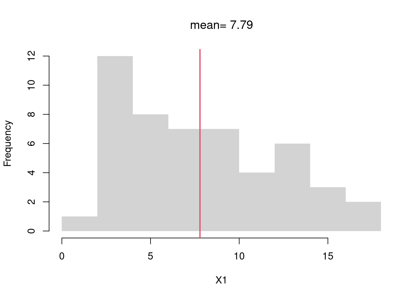
Once we know where the data are centered, the next question is how widely they vary around that center.
The variance and standard deviation are the second-most-common single-number summaries of a sample. They tell us how concentrated or spread out the data are around the mean: a small variance means the observations cluster tightly, a large variance means they fan out. The standard deviation in particular is useful because it sits in the original units of the data, making sentences like “monthly returns averaged \(0.6\%\) with a standard deviation of \(4\%\)” interpretable at a glance. Squaring the deviations also means a few extreme values can dominate the result, which is one reason the median absolute deviation (below) is often preferred for heavy-tailed data.
X1_s <- sd(X1) # sqrt(var(X))
hist(X1, border=NA, main=NA, freq=FALSE)
X1_s_lh <- c(X1_mean - X1_s,  X1_mean + X1_s)
abline(v=X1_mean, col=rgb(1, 0, 0, .8), lwd=2) #mean
abline(v=X1_s_lh, col=rgb(0, 0, 1, .8)) # +- sd
text(X1_s_lh, -.02,
    c( expression(bar(X)-s[X]), expression(bar(X)+s[X])),
    col=rgb(0, 0, 1, .8), adj=0)
title(paste0('sd= ', round(X1_s, 2)), font.main=1)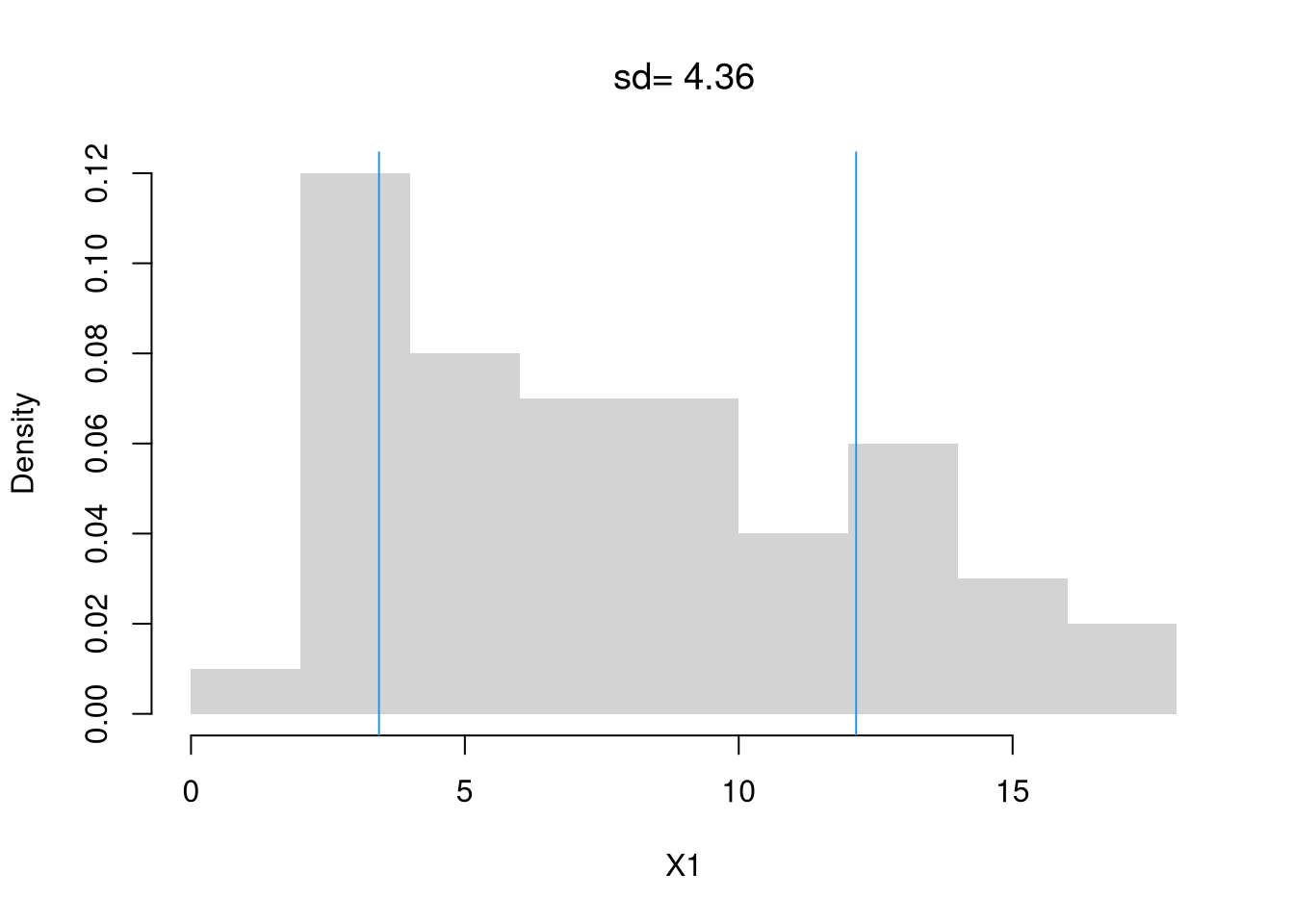
A general rule of applied statistics is that there are multiple ways to measure something. Mean and Variance are measurements of Center and Spread, but there are others that have different theoretical properties and may be better suited for your dataset.
When the data are skewed or contain outliers, statistics built from quantiles often give a more representative summary of center and spread than the mean and variance.
These three statistics share a common rationale: by using ranks rather than arithmetic averages, they resist the influence of extreme values. A single outlier can pull the mean by an arbitrary amount, but moves the median by at most one position; the \(IQR\) and \(\text{MAD}\) inherit the same protection because they are built from medians and quantiles (recall the \(p\)-th quantile from the previous chapter). Reach for these robust summaries when the distribution is skewed or contains values you cannot trust to be typical: income, house prices, response times, and similar heavy-tailed quantities where a small fraction of large values would swamp the mean.
X1 <- USArrests[, 'Murder']
median(X1)
## [1] 7.25
quantile(X1, prob=0.5)
##  50%
## 7.25The \(IQR\) corresponds to the box in the boxplot, and the \(\text{MAD}\) uses the same robust idea but measures distances from the median directly rather than reading off quartile cut-offs.
IQR(X1)
## [1] 7.175
mad(X1)
## [1] 5.41149The mean generalizes to a weighted mean: an average where different values contribute to the final result with varying levels of importance. For each outcome \(x\) we have a weight \(W_{x}\) and compute \[\begin{eqnarray} \hat{M} &=& \frac{\sum_{x} x W_{x}}{\sum_{x} W_{x}} = \sum_{x} x w_{x}, \end{eqnarray}\] where \(w_{x}=\frac{W_{x}}{\sum_{x'} W_{x'}}\) is normalized version of \(W_{x}\) that implies \(\sum_{x}w_{x}=1\).
When data are discrete, we can also compute the mean using “probability weights” \(w_{x} = \hat{p}_{x}=\sum_{i=1}^{n}\mathbf{1}\left(\hat{X}_{i}=x\right)/n\).
In principle, we can also compute other weighted statistics such as a weighted median.
Sometimes, none of the above work well. With categorical data, for example, distributions are easier to describe with other statistics. The sample mode is the most common observation: the value with the highest observed frequency. We can also measure the spread of the frequencies or concentration at the mode vs elsewhere.
Here is an example of the mode. In the data below, \(A\) appears three times, \(C\) twice, and \(B\) once, so the mode is \(A\). Notice the mode is not the alphabetically middle letter, \(B\).
X <- c('A', 'B', 'A', 'C', 'C', 'A')
proportions <- table(X)/length(X)
plot(proportions, col=grey(0, 0.5))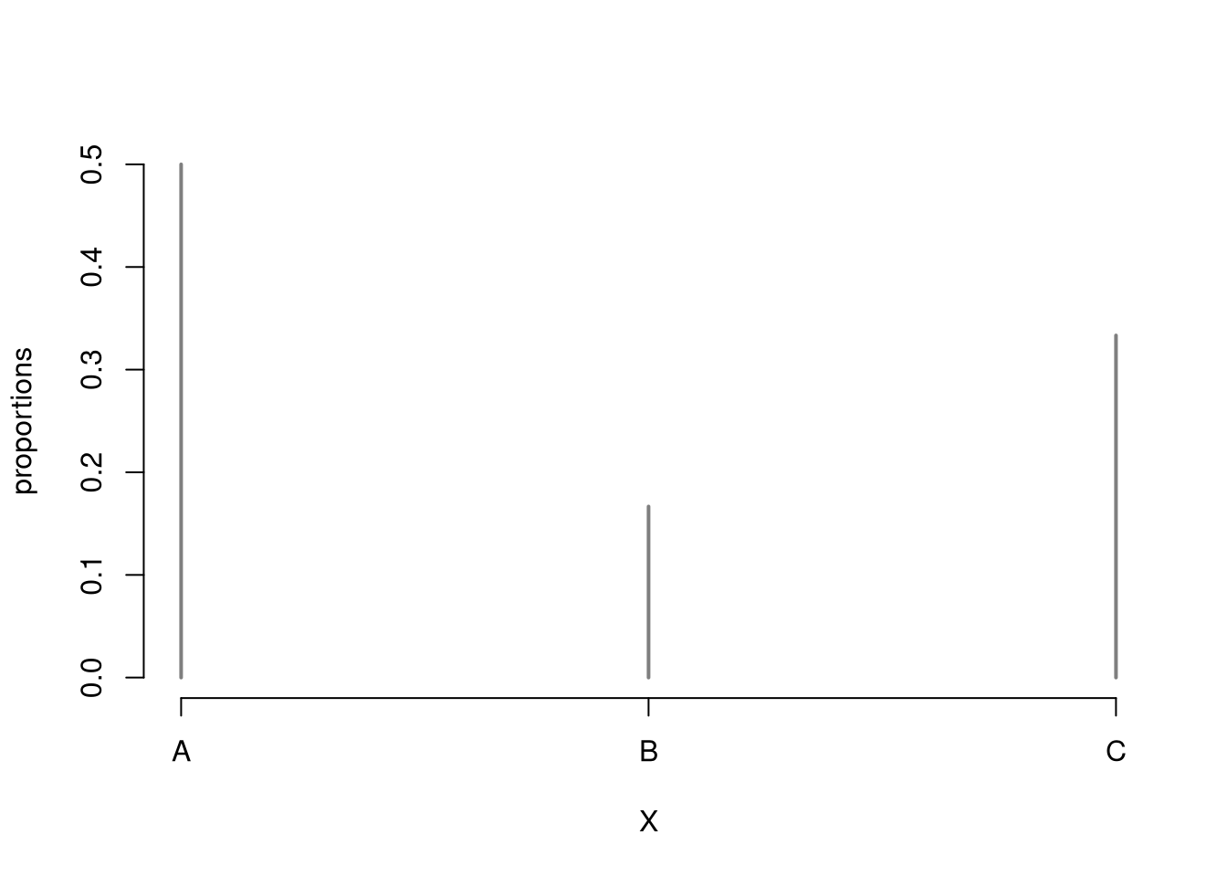
# mode(s)
mode_id <- which(proportions==max(proportions))
names(proportions)[ mode_id ]
## [1] "A"
Here is an example of spread for categorical data.
# freq. spreads
sd(proportions)
## [1] 0.1666667
sum(proportions^2)
## [1] 0.3888889

# freq. concentration at mode
max(proportions)/mean(proportions)
## [1] 1.5Central tendency and dispersion are often insufficient to describe a distribution. To further describe shape, we can compute sample skew and kurtosis to measure asymmetry and extreme values.
There are many other statistics we could compute on an ad-hoc basis. However, shape is often best understood with graphical descriptions: histogram, ECDF, Boxplot. These should be made before numerical descriptions: skewness and kurtosis statistics.
Center and spread alone leave open whether the distribution is symmetric; the first shape question asks whether one tail extends further than the other.
Cubing the deviations preserves their sign: positive deviations stay positive and negative deviations stay negative. The numerator is therefore close to zero when the data are roughly balanced around the mean, and large in absolute value when one tail is much longer than the other. Dividing by the cubed standard deviation makes skewness dimensionless, so the values are comparable across datasets measured in different units. Skewness is useful for flagging whether the mean and median will agree closely (low skew) or diverge sharply (high skew), and for deciding whether a log or square-root transformation might tame the distribution before further analysis.
X <- USArrests[, 'Murder']
hist( X^2, border=NA,
    xlab='[Murder Rate]^2',
    main=NA, freq=FALSE, breaks=20)
skewness <-  function(X){
 X_mean <- mean(X)
 m3 <- mean((X - X_mean)^3)
 s3 <- sd(X)^3
 skew <- m3/s3
 return(skew)
}

skewness( X^2 )
## [1] 1.078254
skewness( X^3 )
## [1] 1.658012
We can automatically compare against the normal distribution, which has a skew of 0.
A second shape question, independent of asymmetry, asks how much of the variability comes from a few far-from-center observations rather than from the typical bulk.
Where skewness uses the cube (and so can be negative), kurtosis uses the fourth power, which forces every term to be positive and disproportionately amplifies the largest deviations. A handful of far-from-the-mean values can drive kurtosis up substantially even when the bulk of the distribution looks unremarkable, which is why it is often described as a “tail-heaviness” measure. Kurtosis is useful for distinguishing distributions that look similar in their bulk but differ in how often extreme values occur: daily stock returns, for example, have moderate variance but kurtosis well above \(3\), reflecting occasional crashes that a Normal model would treat as vanishingly rare.
Some authors further subtract \(3\) to explicitly compare against the normal distribution (the normal distribution has a kurtosis of \(3\)).
Boxplot whiskers are a great way to examine kurtosis, with more circle ``outliers’’ indicating more kurtosis. You can also see skew in the boxplot when one quartile is much further from the median than the other.
X1 <- X^1/mean(X^1)
X2 <- X^2/mean(X^2)
X3 <- X^3/mean(X^3)
X4 <- X^4/mean(X^4)
boxplot(X1, X2, X3, X4,
    names=c(1, 2, 3, 4), xlab='Data Transformations',
    main=NA)
kurtosis <- function(X){
 X_mean <- mean(X)
 m4 <- mean((X - X_mean)^4)
 s4 <- sd(X)^4
 kurt <- m4/s4
 return(kurt)
 # use instead to compare against normal
 # excess_kurt <- kurt - 3
}

kurtosis( X1 )
## [1] 2.05077
kurtosis( X2 )
## [1] 3.247877
kurtosis( X3 )
## [1] 5.166225
kurtosis( X4 )
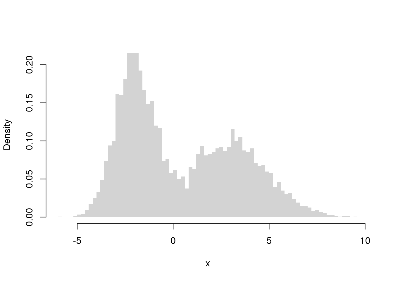
## [1] 7.511867You can also describe distributions in terms of how clustered the values are, including the number of modes (peaks), bunching, and many other statistics. A gap is a range with few or no observations, and a cluster is a group of values bunched together. A distribution with one peak is unimodal, and one with two peaks is bimodal. The two histograms below are each bimodal: two clusters of values separated by a gap. The mean and variance alone would miss this structure, since two very different distributions can share the same mean and variance. So remember that “a picture is worth a thousand words”: plot your data before summarizing it numerically.

Transformations can stabilize variance, reduce skewness, and make model errors closer to Gaussian.
Perhaps the most common examples are power transformations: \(y= x^\lambda\), which includes \(\sqrt{x}\) and \(x^2\).
Other examples include the exponential transformation: \(y=\exp(x)\) for any \(x\in (-\infty, \infty)\) and logarithmic transformation: \(y=\log(x)\) for any \(x>0\).
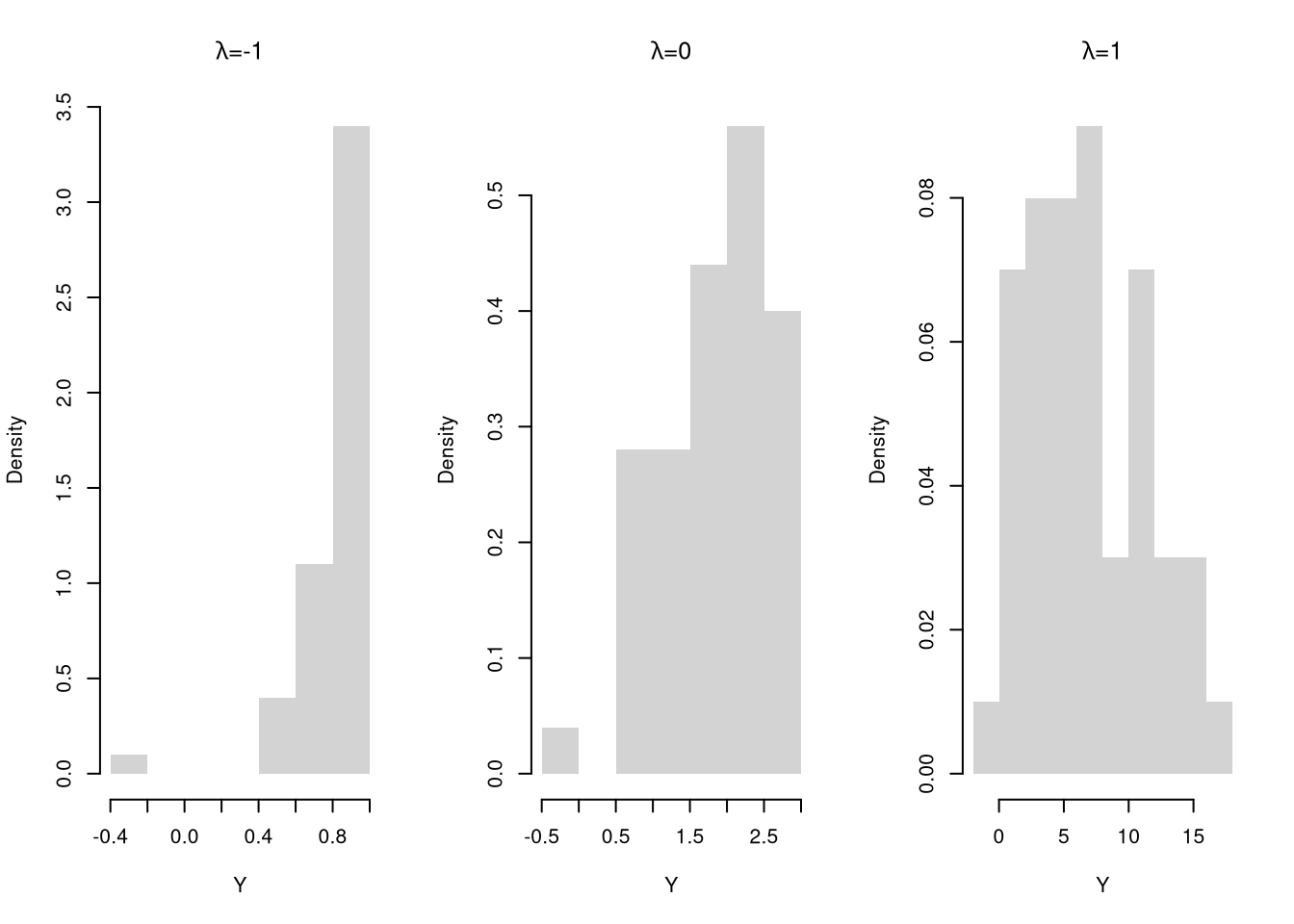
The Box–Cox Transform nests many cases used by statisticians. For \(x>0\) and parameter \(\lambda\), \[\begin{eqnarray} y=\begin{cases} \dfrac{x^\lambda-1}{\lambda}, & \lambda\neq 0,\\ \log\left(x\right) & \lambda=0. \end{cases} \end{eqnarray}\] This function is continuous over \(\lambda\).
# Box–Cox transform and inverse
bc_transform <- function(x, lambda) {
  if (any(x <= 0)) stop('Box-Cox requires x > 0')
  if (abs(lambda) < 1e-8) log(x) else (x^lambda - 1)/lambda
}
bc_inverse <- function(t, lambda) {
  if (abs(lambda) < 1e-8) exp(t) else (lambda*t + 1)^(1/lambda)
}

X <- USArrests[, 'Murder']
hist(X, main=NA, border=NA, freq=FALSE)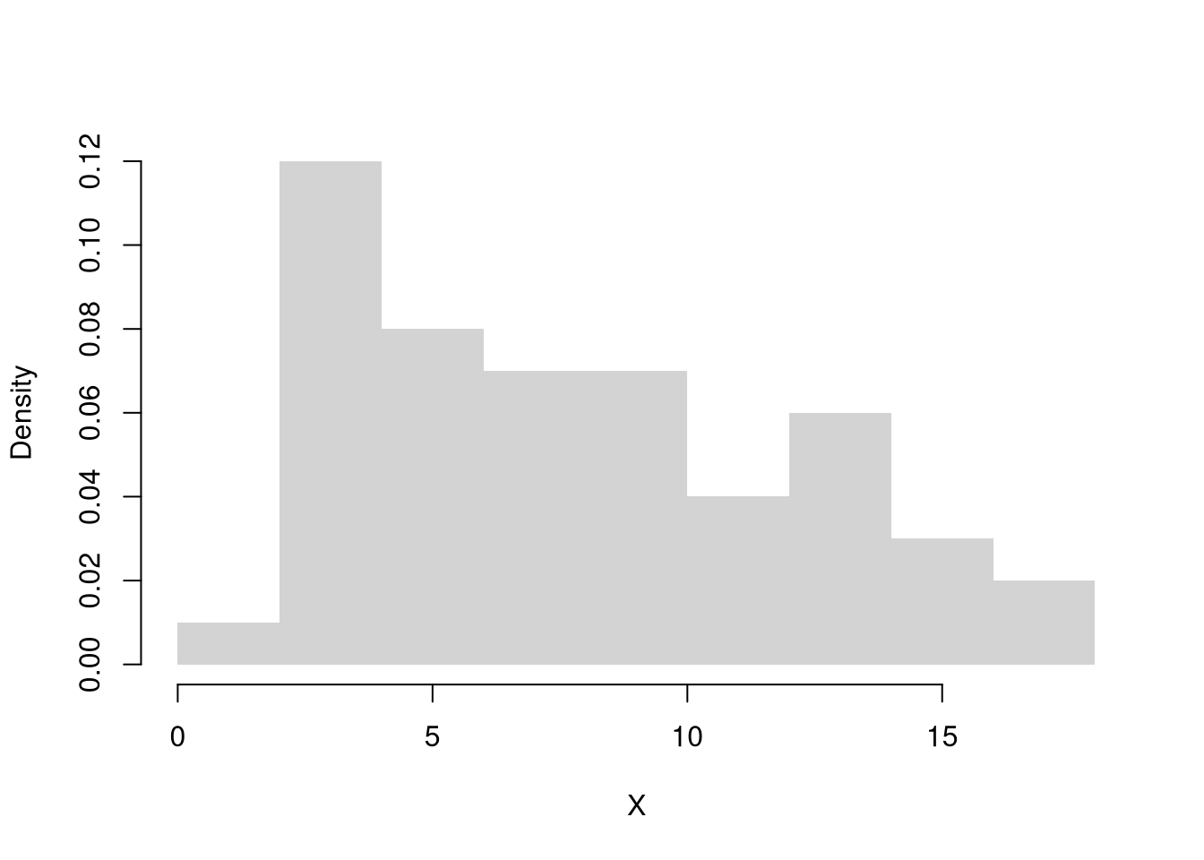
par(mfrow=c(1, 3))
for(lambda in c(-1, 0, 1)){
    Y <- bc_transform(X, lambda)
    hist(Y,
        main=NA,
        border=NA, freq=FALSE)
    title(bquote(paste(lambda, '=', .(lambda))), font.main=1)
}
Be careful about transforming your data, as the interpretation can be harder.
The mean of transformed data is not equivalent to transforming the mean, for example, which is one reason why you want to first summarize your data before transforming it.
We can actually say more about how the mean of transformed data is not equivalent to transforming the mean. To do that, we define two types of functions:
Let \(\hat{Y}_{i}=g( \hat{X}_{i})\), and denote the mean as \(\hat{M}_{Y}\).
If \(g\) is a concave function, then \(g( \hat{M}_{X} ) \geq \hat{M}_{Y}\).
If \(g\) is a convex function, then the inequality reverses: \(g( \hat{M}_{X}) \leq \hat{M}_{Y}\).
mean( exp(x) )
## [1] 10.06429
exp( mean(x) )
## [1] 7.389056Comment the script you wrote for this chapter, then restart R and check that it runs from a clean session, then check the script with AI as explained in Working with AI. Write three sentences from memory on the main statistical idea of this chapter, and ask the assistant what is wrong, vague, or missing. Finish with your own questions about whatever you found hardest.
Explain in your own words why the median is more robust to extreme values than the mean. Give a concrete example with a small dataset where adding one outlier changes the mean substantially but barely moves the median.
Using the dataset \(\{2, 5, 5, 8, 12\}\), compute by hand: (a) the sample mean \(\hat{M}\), (b) the sample variance \(\hat{V}\), (c) the sample standard deviation \(\hat{S}\), and (d) the \(IQR\). Show your work for each step.
Load USArrests in R. Compute the mean, standard deviation, and MAD (with constant=1) of the Assault variable. Then apply a log transformation with log(USArrests[,'Assault']) and compute the skewness of both the original and transformed data using the skewness function defined in the chapter. Which version is less skewed?
This chapter compressed a distribution into single numbers: the mean and variance (and standard deviation) for center and spread, the median, IQR, and MAD as robust alternatives, and the skewness and kurtosis for shape. The running five-point dataset \(\{0, 1, 2, 3, 9\}\) tied the shape statistics together: its mean is \(3\), its cubed deviations average to \(36\) giving a skewness of about \(0.81\) (long right tail), and its quartic deviations give a kurtosis of about \(1.78\) (both driven by the single outlier at \(9\)). On real data such as USArrests[, 'Murder'], a histogram plus the mean and standard deviation already reveal most of the shape; the median, MAD, skew, and kurtosis fill in what symmetry assumptions hide. In the next chapter we flip the script: instead of computing statistics from observed data, we generate data from a known random-variable model.