Code
# Install R Data Package and Load in
install.packages('wooldridge') # only once
library('wooldridge') # anytime you want to use the data

data(crime2) # use a crime dataset
head(crime2)

data(crime4) # use another crime dataset
head(crime4)First, revist https://jadamso.github.io/Rbooks/00_01_FirstSteps.html#why-program-in-r. Then consider the counterfactual below. Future economists should also read https://core.ac.uk/download/pdf/300464894.pdf.
First Steps…
Step 1: Some ideas and data about how variable \(X_{1}\) affects variable \(Y_{1}\), which we denote as \(X_{1}\to Y_{1}\)
Step 2: Pursuing the lead for a week or two
A Little Way Down the Road …
1 month later: someone asks about another factor: \(X_{2} \to Y\).
4 months later: someone asks about yet another factor: \(X_{3}\to Y_{1}\).
6 months later: you want to explore another outcome: \(X_{2} \to Y_{2}\).
2 years later: your boss wants you to replicate your work: \(X_{1}, X_{2}, X_{3} \to Y_{1}\).
Suppose you decided to code what you did beginning with Step 2.
It does not take much time to update or replicate your results.
Your results are transparent and easier to build on.
As part of a data analysis pipeline, we will often use expansion “packages” that allow for more functionality (either codes or datasets). We will discuss these first, before moving to the data analysis pipeline.
Most packages can be easily installed from the internet via CRAN.
You have already accessed “wage1” dataset from the “wooldridge” package. This package also contains datasets on crime. To use this data, we must first install the package on our computer (which we already did). Then, to use the datasets, we load the package.
# Install R Data Package and Load in
install.packages('wooldridge') # only once
library('wooldridge') # anytime you want to use the data
data(crime2) # use a crime dataset
head(crime2)
data(crime4) # use another crime dataset
head(crime4)For some packages, you will need to have other software installed on your computer. For example, the “extraDistr” package lets us generate exotic probability distributions. To install it, we must first install some software compilation tools.
You only need to install a package and it’s pre-requisites once. You load the package via library every time you want the extended functionality.
# install.packages("extraDistr") # once ever
library(extraDistr) # every time you need it

par(mfrow=c(1,2))
for(p in c(-.5,0)){
    x <- rgev(2000, mu=0, sigma=1, xi=p)
    hist(x, breaks=50, border=NA, main=NA, freq=F)
}
title('GEV densities', outer=T, line=-1)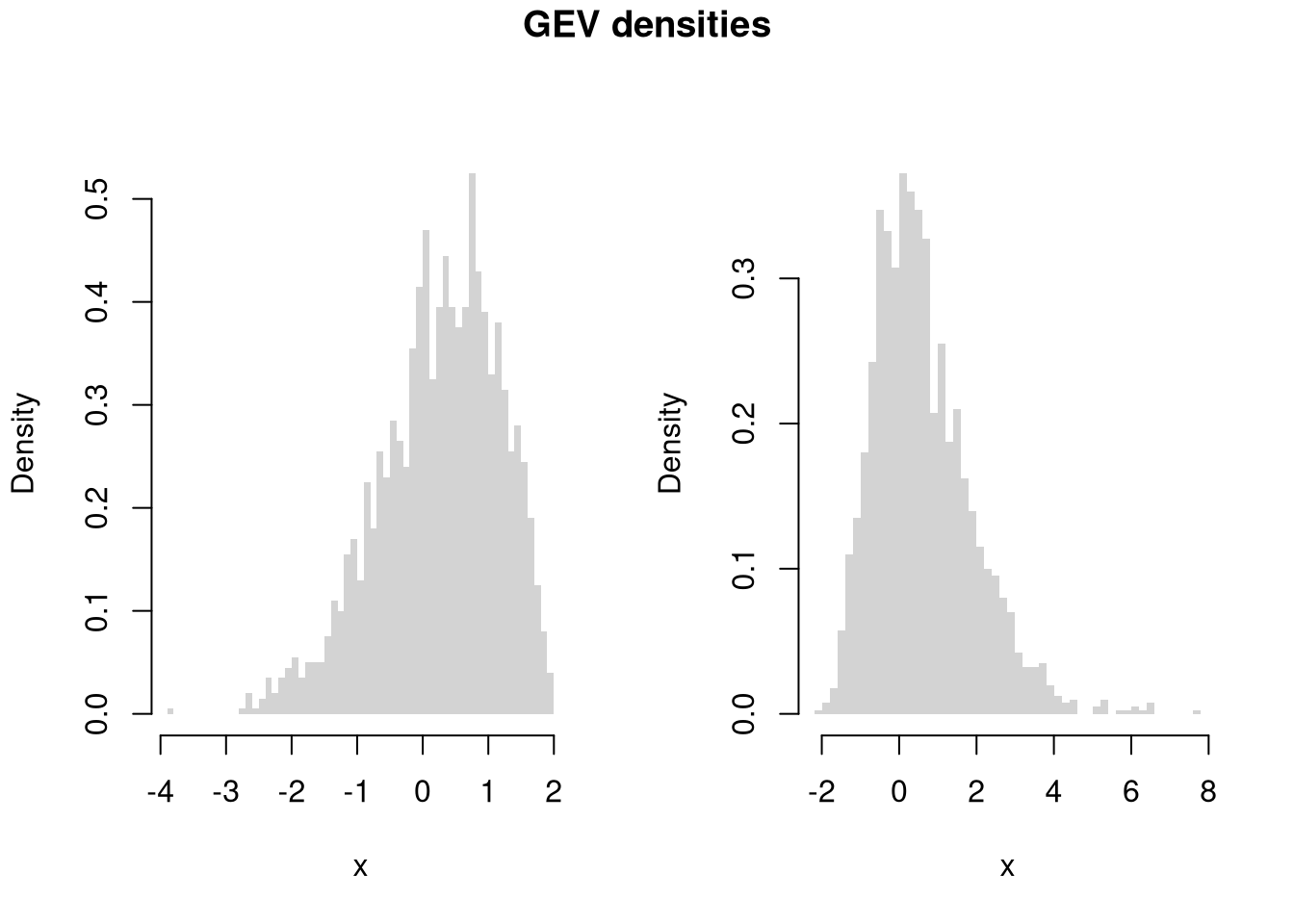
library(extraDistr)

par(mfrow=c(1,3))
for(p in c(-1, 0,2)){
    x <- rtlambda(2000, p)
    hist(x, breaks=100, border=NA, main=NA, freq=F)
}
title('Tukey-Lambda densities', outer=T, line=-1)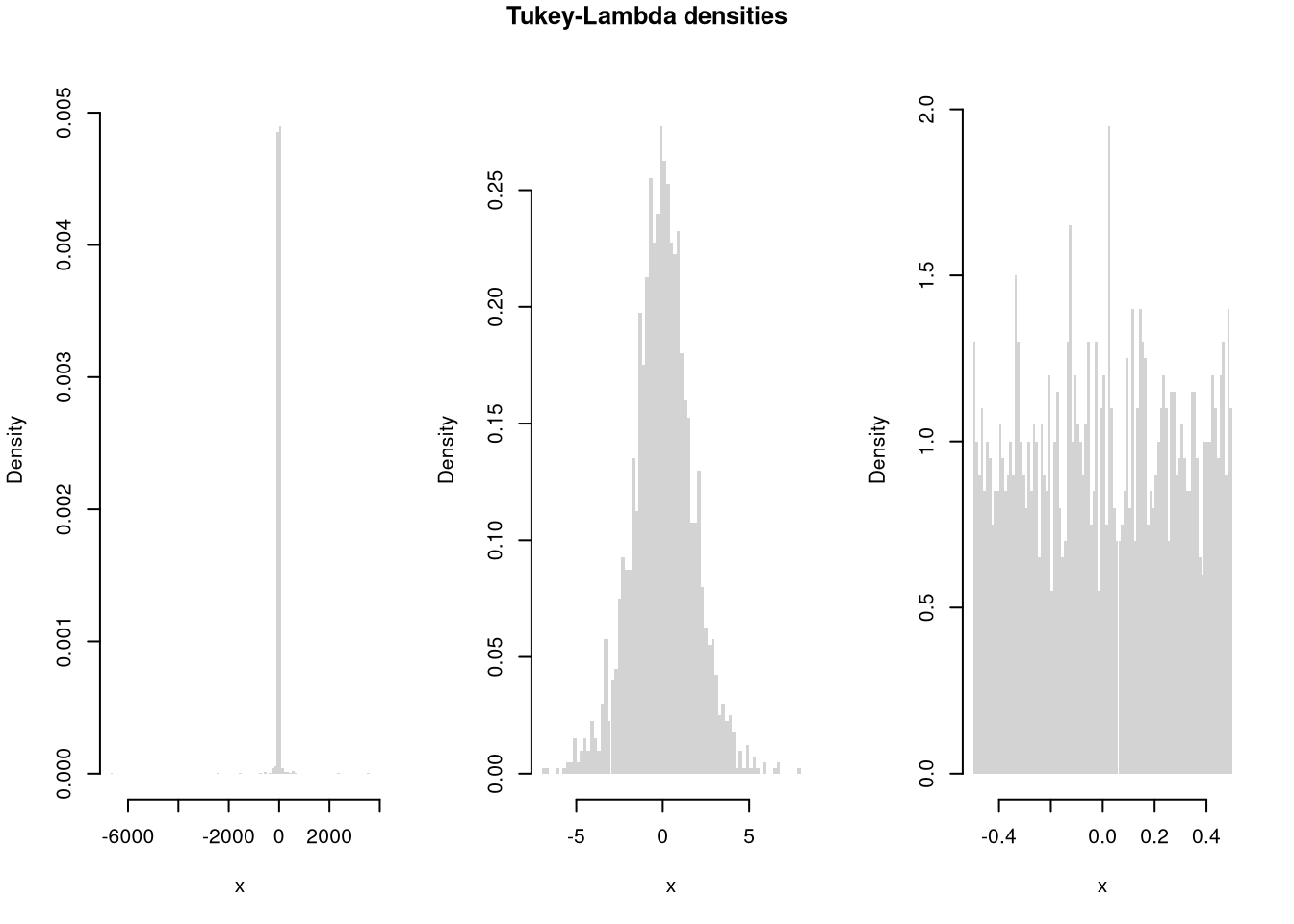
The most common packages we use are below. Many of the most common packages also have cheatsheets you can use.
# common packages for tables/figures
install.packages("plotly")
install.packages("stargazer")

# common packages for data/teaching
install.packages("Ecdat")
install.packages("wooldridge")

# other packages for statistics and data handling
# (requires Rtools)
install.packages("extraDistr")
install.packages("twosamples")
install.packages("data.table")While additional packages can make your code faster, they also create dependencies that can lead to problems. So learn base R well before becoming dependent on other packages
Sometimes you will want to install a package from GitHub. For this, you can use devtools or its light-weight version remotes
To color terminal output on Linux systems, for example, you can use install the “colorout” package using “devtools”
# install.packages("remotes")
library(remotes)

# Install <https://github.com/jalvesaq/colorout
# to .libPaths()[1]
install_github('jalvesaq/colorout')
library(colorout)Make sure R and your packages are up to date. The current version of R and any packages used can be found (and recorded) with
sessionInfo()To update your R packages, use
update.packages()After updating R, you can update all packages stored on your computer (in all .libPaths())
update.packages(checkBuilt=T, ask=F)
# install.packages(old.packages(checkBuilt=T)[,"Package"])The first step in data analysis is getting data into R. There are many ways to do this, depending on your data structure. Perhaps the most common case is reading in a csv file.
# Read in csv (downloaded from online)
# download source "https://pages.stern.nyu.edu/~wgreene/Text/Edition7/TableF19-3.csv"
# download destination '~/TableF19-3.csv'
read.csv('~/TableF19-3.csv')

# Can read in csv (directly from online)
# dat_csv <- read.csv("https://pages.stern.nyu.edu/~wgreene/Text/Edition7/TableF19-3.csv")
We can use packages to access many different types of data. To read in a Stata data file, for example, we can use the “haven” package.
# Read in stata data file from online
#library(haven)
#dat_stata <- read_dta("https://users.ssc.wisc.edu/~bhansen/econometrics/DS2004.dta")
#dat_stata <- as.data.frame(dat_stata)

# For More Introductory Econometrics Data, see
# https://users.ssc.wisc.edu/~bhansen/econometrics/Econometrics%20Data.zip
# https://pages.stern.nyu.edu/~wgreene/Text/Edition7/tablelist8new.htm
# R packages: wooldridge, causaldata, Ecdat, AER, ....Data transformation is often necessary before analysis, so remember to be careful and check your code is doing what you want. (If you have large datasets, you can always test out the code on a sample.)
# Function to Create Sample Datasets
make_noisy_data <- function(n, b=0){
    # Simple Data Generating Process
    x <- seq(1,10, length.out=n)
    e <- rnorm(n, mean=0, sd=10)
    y <- b*x + e
    # Obervations
    xy_mat <- data.frame(ID=seq(x), x=x, y=y)
    return(xy_mat)
}

# Two simulated datasets
dat1 <- make_noisy_data(6)
dat2 <- make_noisy_data(6)

# Merging data in long format
dat_merged_long <- rbind(
    cbind(dat1,DF=1),
    cbind(dat2,DF=2))
Now suppose we want to transform into wide format
# Merging data in wide format, First Attempt
dat_merged_wide <- cbind( dat1, dat2)
names(dat_merged_wide) <- c(paste0(names(dat1),'.1'), paste0(names(dat2),'.2'))

# Merging data in wide format, Second Attempt
# higher performance
dat_merged_wide2 <- merge(dat1, dat2,
    by='ID', suffixes=c('.1','.2'))
## CHECK they are the same.
identical(dat_merged_wide, dat_merged_wide2)
## [1] FALSE
# Inspect any differences

# Merging data in wide format, Third Attempt with dedicated package
# (highest performance but with new type of object)
library(data.table)
dat_merged_longDT <- as.data.table(dat_merged_long)
dat_melted <- melt(dat_merged_longDT, id.vars=c('ID', 'DF'))
dat_merged_wide3 <- dcast(dat_melted, ID~DF+variable)

## CHECK they are the same.
identical(dat_merged_wide, dat_merged_wide3)
## [1] FALSE
Often, however, we ultimately want data in long format
# Merging data in long format, Second Attempt with dedicated package
dat_melted2 <- melt(dat_merged_wide3, measure=c("1_x","1_y","2_x","2_y"))
melt_vars <- strsplit(as.character(dat_melted2[['variable']]),'_')
dat_melted2[,'DF'] <- sapply(melt_vars, `[[`,1)
dat_melted2[,'variable'] <- sapply(melt_vars, `[[`,2)
dat_merged_long2 <- dcast(dat_melted2, DF+ID~variable)
dat_merged_long2 <- as.data.frame(dat_merged_long2)

## CHECK they are the same.
identical( dat_merged_long2, dat_merged_long)
## [1] FALSE

# Further Inspect
dat_merged_long2 <- dat_merged_long2[,c('ID','x','y','DF')]
mapply( identical, dat_merged_long2, dat_merged_long)
##    ID     x     y    DF
## TRUE TRUE TRUE FALSEYou can find a value by a particular criterion
y <- 1:10

# Return Y-value with minimum absolute difference from 3
abs_diff_y <- abs( y - 3 )
abs_diff_y # is this the luckiest number?
##  [1] 2 1 0 1 2 3 4 5 6 7

min(abs_diff_y)
## [1] 0
which.min(abs_diff_y)
## [1] 3
y[ which.min(abs_diff_y) ]
## [1] 3
There are also some useful built in functions for standardizing data
m <- matrix(c(1:3,2*(1:3)),byrow=TRUE,ncol=3)
m
##      [,1] [,2] [,3]
## [1,]    1    2    3
## [2,]    2    4    6

# normalize rows
m/rowSums(m)
##           [,1]      [,2] [,3]
## [1,] 0.1666667 0.3333333  0.5
## [2,] 0.1666667 0.3333333  0.5

# normalize columns
t(t(m)/colSums(m))
##           [,1]      [,2]      [,3]
## [1,] 0.3333333 0.3333333 0.3333333
## [2,] 0.6666667 0.6666667 0.6666667

# de-mean rows
sweep(m,1,rowMeans(m), '-')
##      [,1] [,2] [,3]
## [1,]   -1    0    1
## [2,]   -2    0    2

# de-mean columns
sweep(m,2,colMeans(m), '-')
##      [,1] [,2] [,3]
## [1,] -0.5   -1 -1.5
## [2,]  0.5    1  1.5
You can also easily bin and aggregate data
x <- 1:10
cut(x, 4)
##  [1] (0.991,3.25] (0.991,3.25] (0.991,3.25] (3.25,5.5]   (3.25,5.5]
##  [6] (5.5,7.75]   (5.5,7.75]   (7.75,10]    (7.75,10]    (7.75,10]
## Levels: (0.991,3.25] (3.25,5.5] (5.5,7.75] (7.75,10]
split(x, cut(x, 4))
## $`(0.991,3.25]`
## [1] 1 2 3
##
## $`(3.25,5.5]`
## [1] 4 5
##
## $`(5.5,7.75]`
## [1] 6 7
##
## $`(7.75,10]`
## [1] 8 9 10xs <- split(x, cut(x, 4))
sapply(xs, mean)
## (0.991,3.25] (3.25,5.5] (5.5,7.75] (7.75,10]
## 2.0 4.5 6.5 9.0
# shortcut
aggregate(x, list(cut(x,4)), mean)
## Group.1 x
## 1 (0.991,3.25] 2.0
## 2 (3.25,5.5] 4.5
## 3 (5.5,7.75] 6.5
## 4 (7.75,10] 9.0See also https://bookdown.org/rwnahhas/IntroToR/logical.html
Notably, histograms, boxplots, and scatterplots
library(plotly) #install.packages("plotly")
USArrests[,'ID'] <- rownames(USArrests)

# Scatter Plot
fig <- plot_ly(
    USArrests, x = ~UrbanPop, y = ~Assault,
    mode='markers',
    type='scatter',
    hoverinfo='text',
    marker=list( color='rgba(0, 0, 0, 0.5)'),
    text = ~paste('<b>', ID, '</b>',
        "<br>Urban  :", UrbanPop,
        "<br>Assault:", Assault))
fig <- layout(fig,
    showlegend=F,
    title='Crime and Urbanization in America 1975',
    xaxis = list(title = 'Percent of People in an Urban Area'),
    yaxis = list(title = 'Assault Arrests per 100,000 People'))
fig# Box Plot
fig <- plot_ly(USArrests,
y=~Murder, color=~cut(UrbanPop,4),
alpha=0.6, type="box",
pointpos=0, boxpoints = 'all',
hoverinfo='text',
text = ~paste('<b>', ID, '</b>',
"<br>Urban :", UrbanPop,
"<br>Assault:", Assault,
"<br>Murder :", Murder))
fig <- layout(fig,
showlegend=FALSE,
title='Crime and Urbanization in America 1975',
xaxis = list(title = 'Percent of People in an Urban Area'),
yaxis = list(title = 'Murders Arrests per 100,000 People'))
figpop_mean <- mean(USArrests[,'UrbanPop'])
pop_cut <- USArrests[,'UrbanPop'] < pop_mean
murder_lowpop <- USArrests[ pop_cut,'Murder']
murder_highpop <- USArrests[ !pop_cut,'Murder']
# Overlapping Histograms
fig <- plot_ly(alpha=0.6, hovertemplate="%{y}")
fig <- add_histogram(fig, murder_lowpop, name='Low Pop. (< Mean)',
histnorm = "probability density",
xbins = list(start=0, size=2))
fig <- add_histogram(fig, murder_highpop, name='High Pop (>= Mean)',
histnorm = "probability density",
xbins = list(start=0, size=2))
fig <- layout(fig,
barmode="overlay",
title="Crime and Urbanization in America 1975",
xaxis = list(title='Murders Arrests per 100,000 People'),
yaxis = list(title='Density'),
legend=list(title=list(text='<b> % Urban Pop. </b>')) )
fig
# Possible, but less preferable, to stack histograms
# barmode="stack", histnorm="count"
Note that many plots can be made interactive via https://plotly.com/r/. For more details, see examples and then applications.
If you have many points, for example, you can make a 2D histogram.
library(plotly)
fig <- plot_ly(
    USArrests, x = ~UrbanPop, y = ~Assault)
fig <- add_histogram2d(fig, nbinsx=25, nbinsy=25)
figYou can create an interactive table to explore raw data.
data("USArrests")
library(reactable)
reactable(USArrests, filterable=T, highlight=T)
You can create an interactive table that summarizes the data too.
# Compute summary statistics
vars <- names(USArrests)
stats_list <- lapply(vars, function(v) {
  x <- USArrests[[v]]
  c(
    Variable = v,
    N       = sum(!is.na(x)),
    Mean    = mean(x, na.rm = TRUE),
    SD      = sd(x, na.rm = TRUE),
    Min     = min(x, na.rm = TRUE),
    Q1      = as.numeric(quantile(x, 0.25, na.rm = TRUE)),
    Median  = median(x, na.rm = TRUE),
    Q3      = as.numeric(quantile(x, 0.75, na.rm = TRUE)),
    Max     = max(x, na.rm = TRUE)
  )
})

# Convert list to data frame with numeric columns
stats_df <- as.data.frame(do.call(rbind, stats_list), stringsAsFactors = FALSE)
num_cols <- setdiff(names(stats_df), "Variable")
stats_df[num_cols] <- lapply(stats_df[num_cols], function(i){
    round(as.numeric(i), 3)
})

# Display interactively
reactable(stats_df)Your first figures are typically standard, and probably not as good as they should be. Edit your plot to focus on the most useful information. For others to easily comprehend your work, you must also polish the plot. When polishing, you must do two things:
# Random Data
x <- seq(1, 10, by=.0002)
e <- rnorm(length(x), mean=0, sd=1)
y <- .25*x + e

# First Draft
# plot(x, y)

# Second Draft: Focus
# (In this example: relationship magnitude)
xs <- scale(x)
ys <- scale(y)
plot(ys, xs,
    xlab='', ylab='',
    pch=16, cex=.5, col=grey(0,.2))
mtext(expression('['~X[i]-hat(M)[X]~'] /'~hat(S)[X]), 1, line=2.5)
mtext(expression('['~Y[i]-hat(M)[Y]~'] /'~hat(S)[Y]), 2, line=2.5)
# Add a 45 degree line
abline(a=0, b=1, lty=2, col='red')
legend('topleft',
    legend=c('data point', '45 deg. line'),
    pch=c(16,NA), lty=c(NA,2), col=c(grey(0,.2), 'red'),
    bty='n')
title('Standardized Relationship')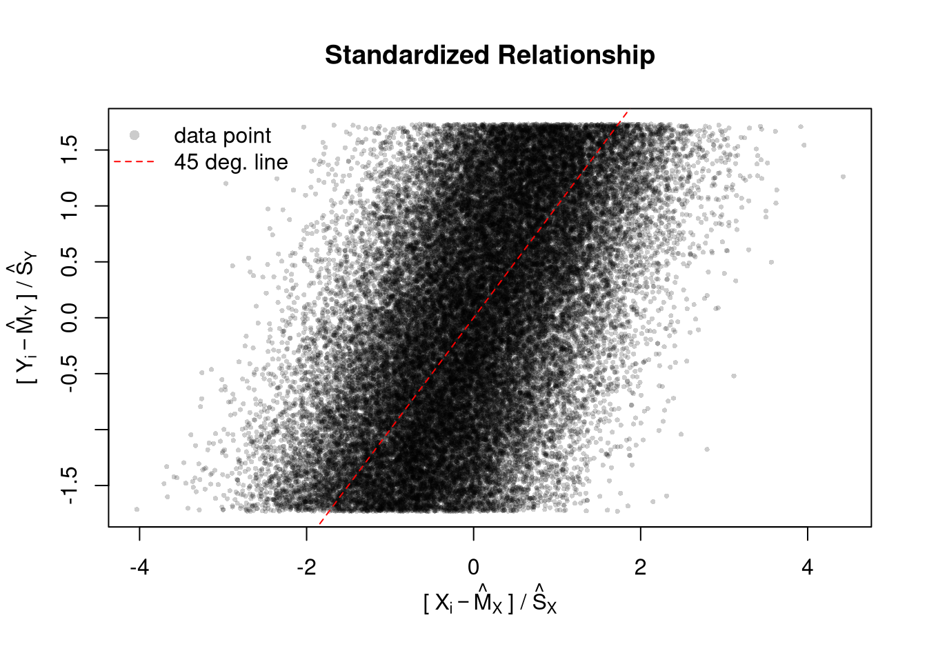
# Another Example
xy_dat <- data.frame(x=x, y=y)
par(fig=c(0,1,0,0.9), new=F)
plot(y~x, xy_dat, pch=16, col=rgb(0,0,0,.05), cex=.5,
    xlab='', ylab='') # Format Axis Labels Seperately
mtext( 'y=0.25 x + e\n e ~ standard-normal', 2, line=2.2)
mtext( expression(x%in%~'[0,10]'), 1, line=2.2)
#abline( lm(y~x, data=xy_dat), lty=2)
title('Plot with good features, but too excessive in several ways',
    adj=0, font.main=1)

# Outer Legend (https://stackoverflow.com/questions/3932038/)
outer_legend <- function(...) {
  opar <- par(fig=c(0, 1, 0, 1), oma=c(0, 0, 0, 0),
    mar=c(0, 0, 0, 0), new=TRUE)
  on.exit(par(opar))
  plot(0, 0, type='n', bty='n', xaxt='n', yaxt='n')
  legend(...)
}
outer_legend('topright', legend='single data point',
    title='do you see the normal distribution?',
    pch=16, col=rgb(0,0,0,.1), cex=1, bty='n')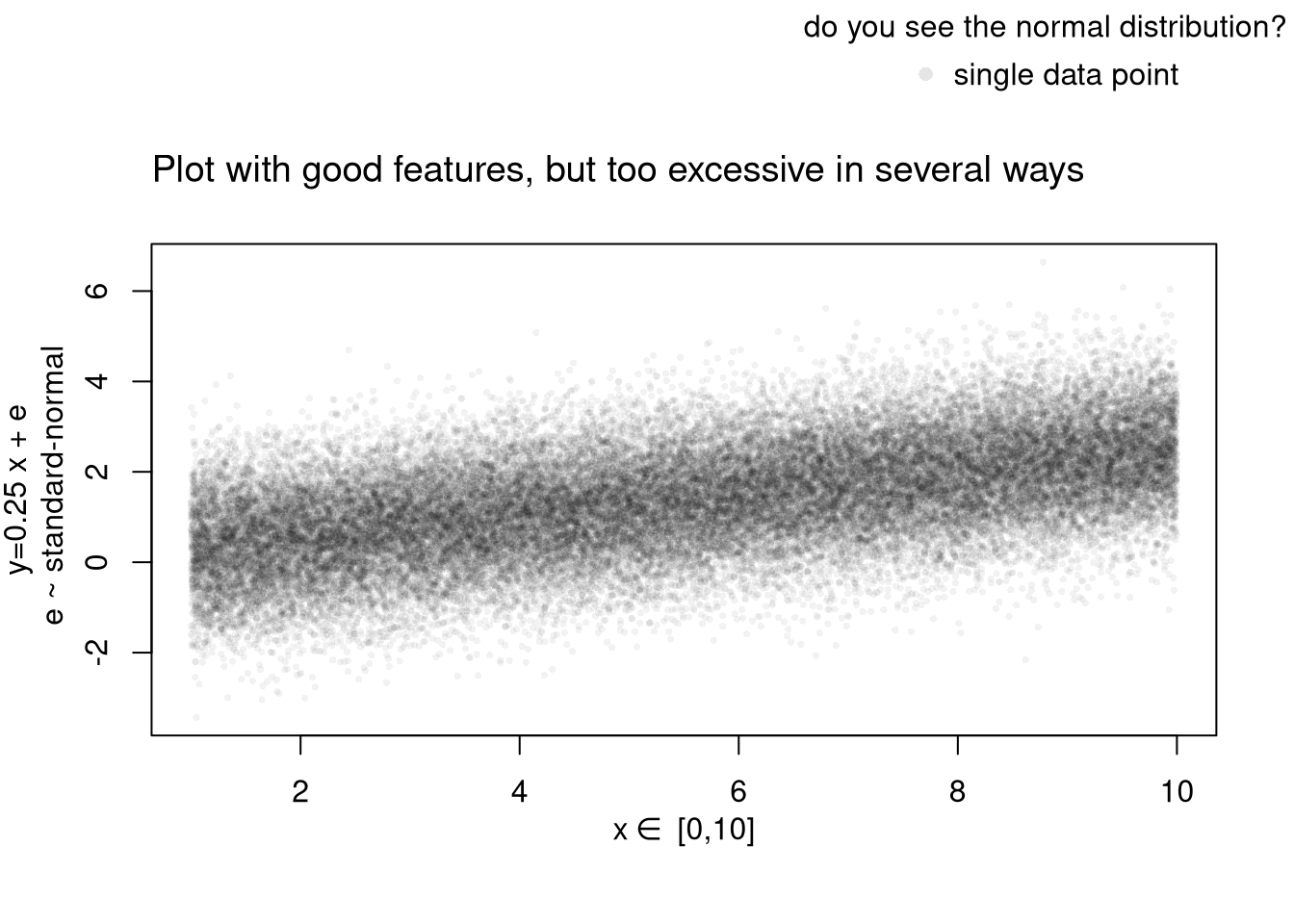
Learn to edit your figures:
Which features are most informative depends on what you want to show, and you can always mix and match. Be aware that each type has benefits and costs. E.g., see
For small datasets, you can plot individual data points with a strip chart. For datasets with spatial information, a map is also helpful. Sometime tables are better than graphs (see https://www.edwardtufte.com/notebook/boxplots-data-test). For useful tips, see C. Wilke (2019) “Fundamentals of Data Visualization: A Primer on Making Informative and Compelling Figures” https://clauswilke.com/dataviz/
For plotting math, which should be done very sparingly, see https://astrostatistics.psu.edu/su07/R/html/grDevices/html/plotmath.html and https://library.virginia.edu/data/articles/mathematical-annotation-in-r
You can export figures with specific dimensions
pdf( 'Figures/plot_example.pdf', height=5, width=5)
# plot goes here
dev.off()
For exporting options, see ?pdf. For saving other types of files, see png("*.png"), tiff("*.tiff"), and jpeg("*.jpg")
You can also export tables in a variety of formats, including many that other software programs can easily read
library(stargazer)
# summary statistics
stargazer(USArrests,
    type='html',
    summary=T,
title='Summary Statistics for USArrests')| Statistic | N | Mean | St. Dev. | Min | Max |
| Murder | 50 | 7.788 | 4.356 | 0.800 | 17.400 |
| Assault | 50 | 170.760 | 83.338 | 45 | 337 |
| UrbanPop | 50 | 65.540 | 14.475 | 32 | 91 |
| Rape | 50 | 21.232 | 9.366 | 7.300 | 46.000 |
Note that many of the best plots are custom made (see https://www.r-graph-gallery.com/). Here are some ones that I have made over the years.

We will use R Markdown for communicating results to each other. Note that R and R Markdown are both languages. RStudio interprets R code make statistical computations and interprets R Markdown code to produce pretty documents that contain both writing and statistics. Altogether, your project will use
Homework reports are probably the smallest document you can create. They are simple reproducible reports made via R Markdown, which are almost entirely self-contained (showing both code and output). To make them, you need an additional package and an additional software program on your computer
install.packages("rmarkdown")Start by opening RStudio, then
Now try each of the following steps, re-knitting the document after each step
reactable table for the raw dataFor more on data cleaning, see
For more guidance on how to create Rmarkdown documents, see
If you are still lost, try one of the many online tutorials (such as these)