Code
statistic <- function(x_hat, f){
    stat_hat <- f(x_hat)
    return(stat_hat)
}

x0_hat <- c(0, 1, 3, 10, 6) # Data
statistic(x0_hat, sum)
## [1] 20We often summarize distributions with statistics: functions of data. We will go through some specific examples mathematically below, but can intuitively understand that they are generally computed as statistic <- function(x){ .... }. This chapter covers measures of center (mean, median), spread (variance, IQR, MAD), and shape (skewness, kurtosis) for cardinal data. It then covers the statistics that remain meaningful for factor data: the mode, the Herfindahl index, and quantiles of ordered levels.
The most basic way to compute statistics is with summary, which reports multiple values that can all be calculated individually.
# A random sample (real data)
x_hat <- USArrests[, 'Murder'] # lab data: murder arrests per 100,000
summary(x_hat)
##    Min. 1st Qu.  Median    Mean 3rd Qu.    Max.
##   0.800   4.075   7.250   7.788  11.250  17.400
Together, the sample mean and variance statistics summarize the central tendency and dispersion of a distribution. In some special cases, such as with the normal distribution, they completely describe the distribution. Other distributions are better described with other statistics, either as an alternative or in addition to the mean and variance. After discussing those other statistics, we will return to the two most basic statistics in theoretical detail.
The mean and variance are the two most basic statistics that summarize the center and how spread apart the values are for data in your sample. As before, we represent data as vector \(\hat{x}=(\hat{x}_{1}, \hat{x}_{2}, ....\hat{x}_{n})\), where there are \(n\) observations and \(\hat{x}_{i}\) is the value of the \(i\)th one.
The first step in describing a sample is to reduce its center to a single number.
The mean (also called the sample mean or empirical mean) is the simplest and most commonly reported single-number summary of a sample, and the natural measure of central tendency when the data are roughly symmetric. The mean is useful when totals matter: total income across a population equals the mean income times the number of people, a relation that does not hold for the median or other rank-based summaries. Because every observation contributes equally to the sum, a single extreme value can pull the mean substantially in its direction.
Once we know where the data are centered, the next question is how widely they vary around that center.
The variance and standard deviation are the second-most-common single-number summaries of a sample. They tell us how concentrated or spread out the data are around the mean: a small variance means the observations cluster tightly, a large variance means they fan out. The standard deviation in particular is useful because it sits in the original units of the data, making sentences like “monthly returns averaged \(0.6\%\) with a standard deviation of \(4\%\)” interpretable at a glance. Squaring the deviations also means a few extreme values can dominate the result, which is one reason the median absolute deviation (below) is often preferred for heavy-tailed data.
# compute the mean and standard deviation of the lab data
m_hat <- mean(x_hat)
s1_hat <- sqrt(mean((x_hat - m_hat)^2)) # divides by n, as defined above; sd() divides by n-1
m1_sd_bounds <- c(m_hat - s1_hat,  m_hat + s1_hat)
m2_sd_bounds <- c(m_hat - 2*s1_hat,  m_hat + 2*s1_hat)
m2_sd_bounds
## [1] -0.8354694 16.4114694
range(x_hat) # smallest and largest observation
## [1]  0.8 17.4

# visualize on a histogram, widened to include both sets of bounds
hist(x_hat, breaks=15, border=NA, freq=FALSE, main=NA,
    xlim=range(c(x_hat, m2_sd_bounds)),
    xlab='Murder arrests (per 100k)')
rug(x_hat, col=grey(0, .5))
abline(v=m_hat, col=rgb(1, 0, 0, .8), lwd=2) # mean
abline(v=m1_sd_bounds, col=rgb(0, 0, 1, .8)) # mean +- sd
abline(v=m2_sd_bounds, col=rgb(0, 0, 1, .8), lty=2) # mean +- 2 sd
mtext(expression(hat(m)-2*hat(s), hat(m)-hat(s), hat(m), hat(m)+hat(s), hat(m)+2*hat(s)),
    side=3, at=c(m2_sd_bounds[1], m1_sd_bounds[1], m_hat, m1_sd_bounds[2], m2_sd_bounds[2]),
    col=c(rgb(0, 0, 1, .8), rgb(0, 0, 1, .8), rgb(1, 0, 0, .8), rgb(0, 0, 1, .8), rgb(0, 0, 1, .8)))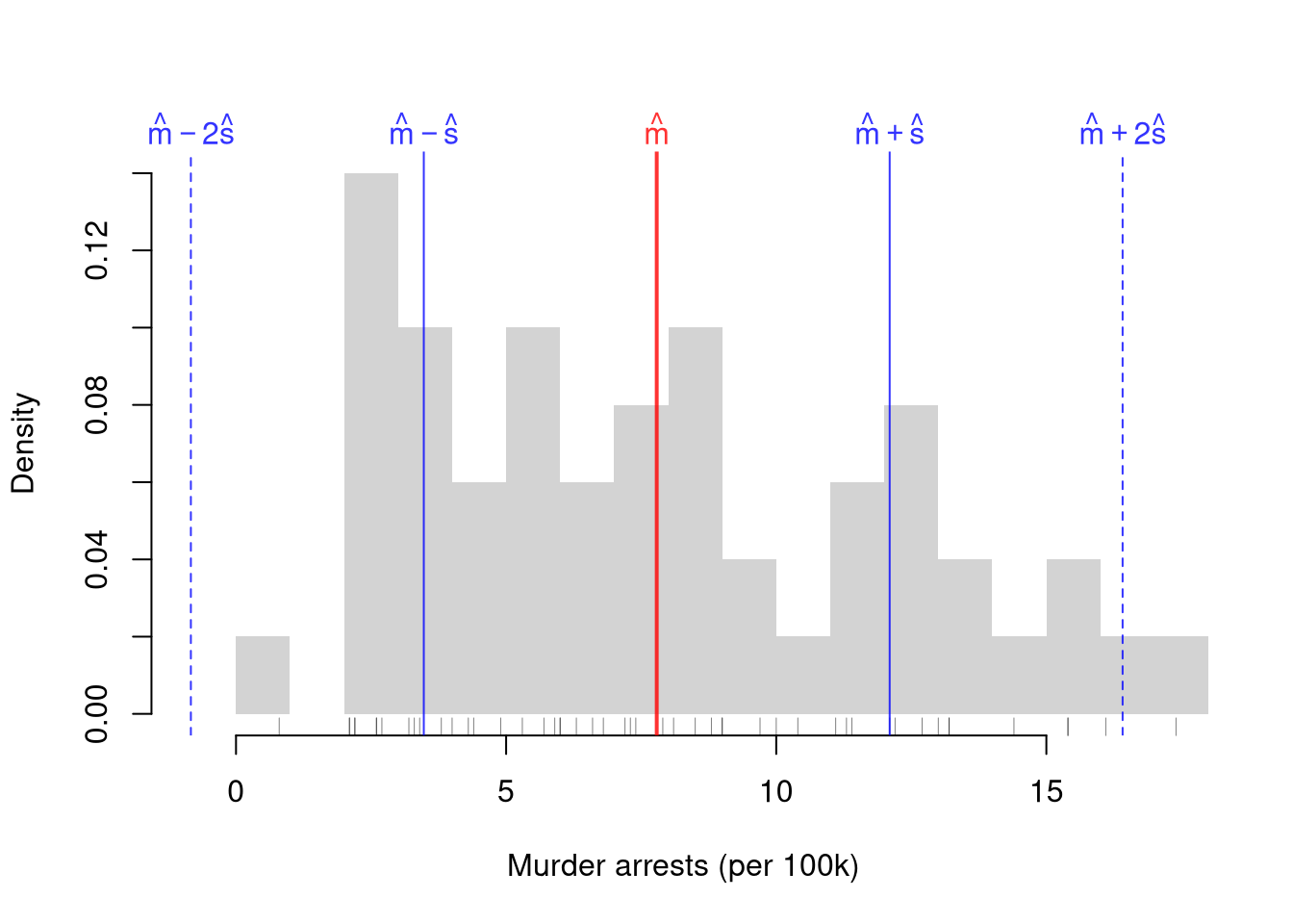
The upper bound \(\hat{m}+2\hat{s}\) lands inside the data, but the lower bound \(\hat{m}-2\hat{s}\) is about \(-0.8\). That is below the smallest observation, and below zero, which no arrest rate can be. The bounds are symmetric around the mean by construction, but murder arrests are not: they stop at zero on the left and stretch further to the right.
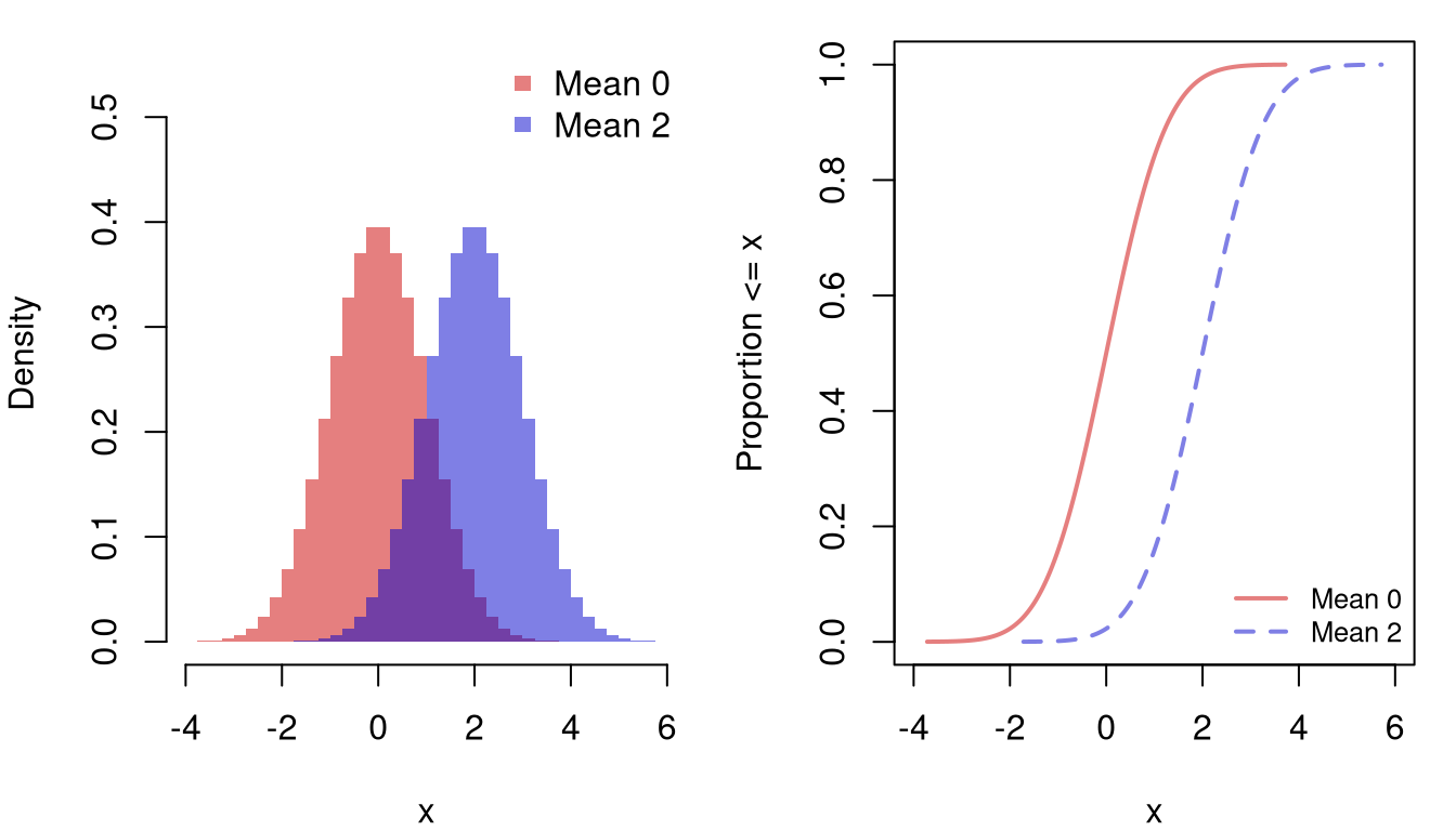
We can see how changing the mean or the variance alters a distribution. The figure below compares two normal distributions with the same standard deviation, \(1\), but different means, \(0\) and \(2\). Increasing the mean slides the whole distribution to the right without changing its shape. On the histogram, the bars keep the same heights and move over by \(2\). On the ECDF, the curve shifts right by \(2\) at every height.
The next figure compares two normal distributions with the same mean, \(0\), but different standard deviations, \(1\) and \(2\) (variances \(1\) and \(4\)). Increasing the variance spreads the distribution out on both sides of the mean. On the histogram, the distribution becomes wider and flatter, since the same total area covers a wider range. On the ECDF, the curve rises more slowly, but both curves still cross \(0.5\) at the mean.
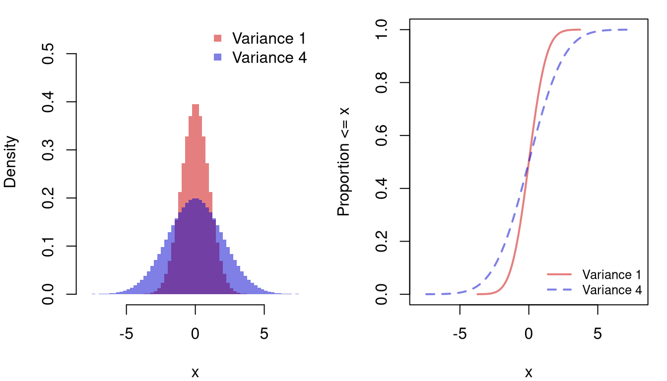
Note that the mean and standard deviation affect a histogram or an ECDF, but cannot be read directly from them. We have to compute them separately. This is unlike the median and \(\hat{\text{IQR}}\) below, which can be read directly from the ECDF.
A general rule of applied statistics is that there are multiple ways to measure something. Mean and Variance are measurements of Center and Spread, but there are others that have different theoretical properties and may be better suited for your dataset.
When the data are skewed or contain outliers, statistics built from quantiles often give a more representative summary of center and spread than the mean and variance. Every quantile lies between the smallest and largest observation, so a quantile-based range can never produce an impossible value like the negative \(\hat{m}-2\hat{s}\) for murder arrests above.
These three statistics share a common rationale: by using ranks rather than arithmetic averages, they resist the influence of extreme values. A single outlier can pull the mean by an arbitrary amount, but moves the median by at most one position; the \(\hat{\text{IQR}}\) and \(\hat{\text{MAD}}\) inherit the same protection because they are built from medians and quantiles (recall the \(p\)-th quantile from the previous chapter). Reach for these robust summaries when the distribution is skewed or contains values you cannot trust to be typical: income, house prices, response times, and similar heavy-tailed quantities where a small fraction of large values would swamp the mean.
median(x_hat)
## [1] 7.25
quantile(x_hat, prob=0.5)
##  50%
## 7.25The \(\hat{\text{IQR}}\) corresponds to the box in the boxplot, and the \(\hat{\text{MAD}}\) uses the same robust idea but measures distances from the median directly rather than reading off quartile cut-offs.
IQR(x_hat)
## [1] 7.175
mad(x_hat)
## [1] 5.41149
Unlike the mean and standard deviation, the median and \(\hat{\text{IQR}}\) can be read directly from the ECDF. The median is the value where \(\hat{F}\) crosses \(0.5\). The \(\hat{\text{IQR}}\) is the horizontal distance between where \(\hat{F}\) crosses \(0.25\) and where it crosses \(0.75\).
# median and quartiles
p <- c(.25, .5, .75)
q_hat <- quantile(x_hat, probs=p)

# visualize on the ECDF
F_hat <- ecdf(x_hat)
plot(F_hat, pch=16, col=grey(0, .5), main=NA,
    xlab='Murder arrests (per 100k)', ylab='Proportion <= x')
cols <- c(rgb(0, 0, 1, .8), rgb(1, 0, 0, .8), rgb(0, 0, 1, .8))
segments(q_hat, p, -10, p, col=cols, lwd=c(1, 2, 1)) # read across from p
segments(q_hat, p, q_hat, -1, col=cols, lwd=c(1, 2, 1)) # read down to the quantile
mtext(round(q_hat, 2), side=1, at=q_hat, col=cols)

# IQR is the distance between the quartiles
arrows(q_hat[1], .9, q_hat[3], .9, code=3, length=.1, col=rgb(0, 0, 1, .8))
text(mean(q_hat[c(1, 3)]), .9, 'IQR', pos=3, col=rgb(0, 0, 1, .8))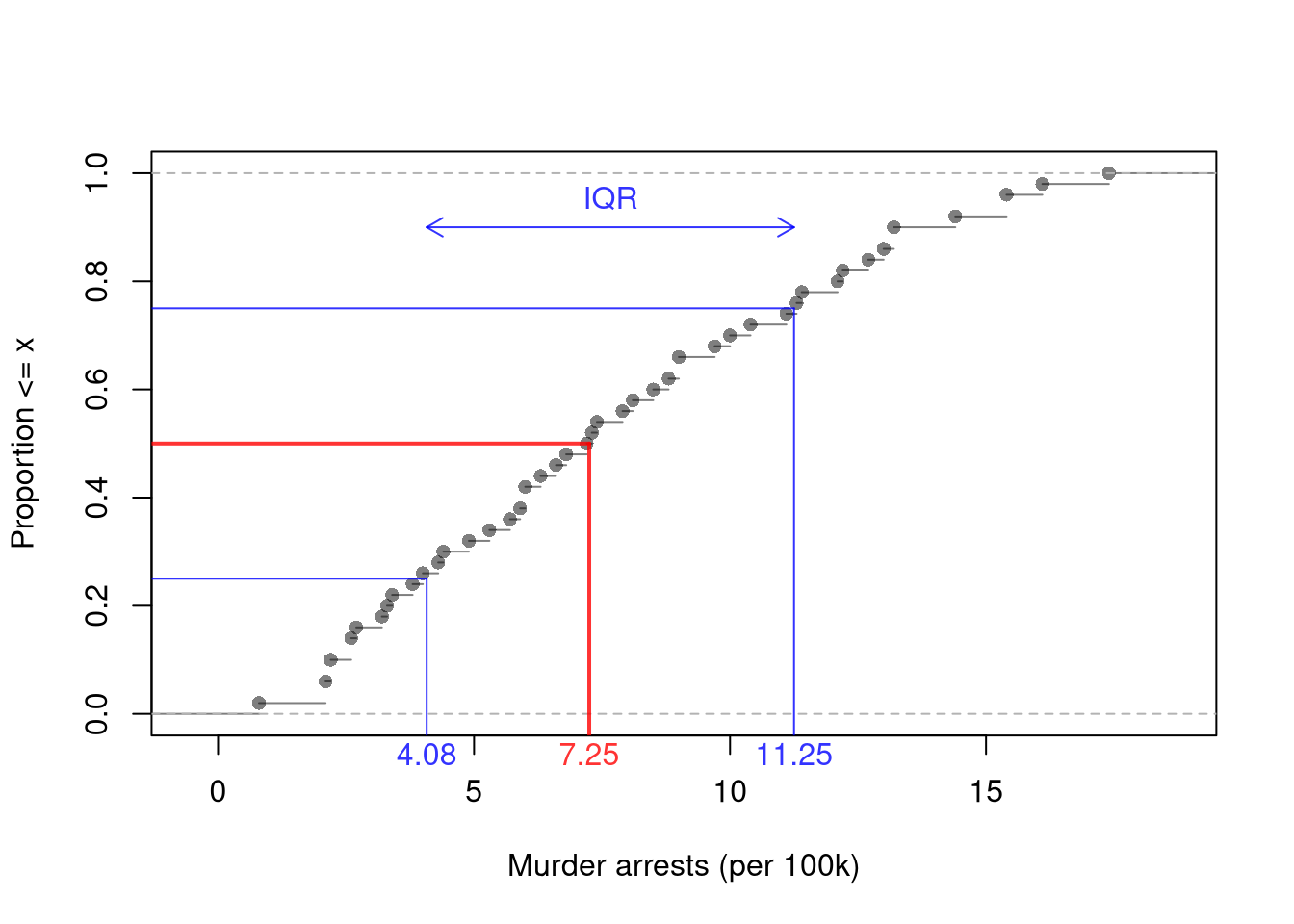
The mean generalizes to a weighted mean: an average where different values contribute to the final result with varying levels of importance. For each outcome \(x\) we have a weight \(W(x)\) and compute \[\begin{aligned} \hat{m} &= \frac{\sum_{x} x W(x)}{\sum_{x} W(x)} = \sum_{x} x w(x), \end{aligned}\] where \(w(x)=\frac{W(x)}{\sum_{x'} W(x')}\) is the normalized version of \(W(x)\), so that the weights of all unique values \(x'\) sum to unity, \(\sum_{x'}w(x')=1\). You have already seen the special case of “probability weights” when computing the mean above, with \(w(x)=\hat{p}(x)=\sum_{i=1}^{n}\mathbf{1}\left(\hat{x}_{i}=x\right)/n\).
Weights can also be given to individual observations rather than to unique values. For each observation \(i\) we have a weight \(W_{i}\) and compute \[\begin{aligned} \hat{m} &= \frac{\sum_{i=1}^{n} \hat{x}_{i} W_{i}}{\sum_{i=1}^{n} W_{i}} = \sum_{i=1}^{n} \hat{x}_{i} w_{i}, \end{aligned}\] where \(w_{i}=\frac{W_{i}}{\sum_{i'=1}^{n} W_{i'}}\) is the normalized weight, so that \(\sum_{i=1}^{n} w_{i}=1\). Equal weights, \(w_{i}=1/n\), give the ordinary mean. Adding up the weights of all observations with the same value gives the weight for that value, \(w(x)=\sum_{i=1}^{n} w_{i}\mathbf{1}\left(\hat{x}_{i}=x\right)\).
In principle, we can also compute other weighted statistics such as a weighted median.
Whether an observation is unusual depends on the center and spread of the data, not on its raw value alone. The standardized value of an observation is its deviation from the mean measured in standard deviations, \[\hat{z}_{i} = \frac{\hat{x}_{i} - \hat{m}}{\hat{s}}.\]
Standardized values are also called z-scores. A standardized value of \(2\) means the observation lies two standard deviations above the mean, and a value of \(-1\) means it lies one standard deviation below. The units of \(\hat{x}_{i}-\hat{m}\) and \(\hat{s}\) cancel, so standardized values have no units. Standardized values are useful for flagging observations that are far from the center of their own distribution, and for comparing observations across variables measured on different scales, such as a state’s murder and assault arrest rates.
# standardize the lab data, using the standard deviation that divides by n
m_hat <- mean(x_hat)
s_hat <- sqrt(mean((x_hat - m_hat)^2))
z_hat <- (x_hat - m_hat)/s_hat
# scale(x_hat) is similar, but divides by sd(), the n-1 version

# mean 0 and standard deviation 1, up to rounding error
mean(z_hat)
## [1] -7.512979e-17
sqrt(mean((z_hat - mean(z_hat))^2))
## [1] 1

# same shape, new units: standardize the bin edges too
f_hat <- hist(x_hat, breaks=15, plot=FALSE)
par(mfrow=c(1, 2), mar=c(4, 4, 1, 1))
hist(x_hat, breaks=f_hat[['breaks']], border=NA, freq=FALSE, main=NA,
    xlab='Murder arrests (per 100k)')
hist(z_hat, breaks=(f_hat[['breaks']] - m_hat)/s_hat, border=NA, freq=FALSE, main=NA,
    xlab='Standardized murder arrests')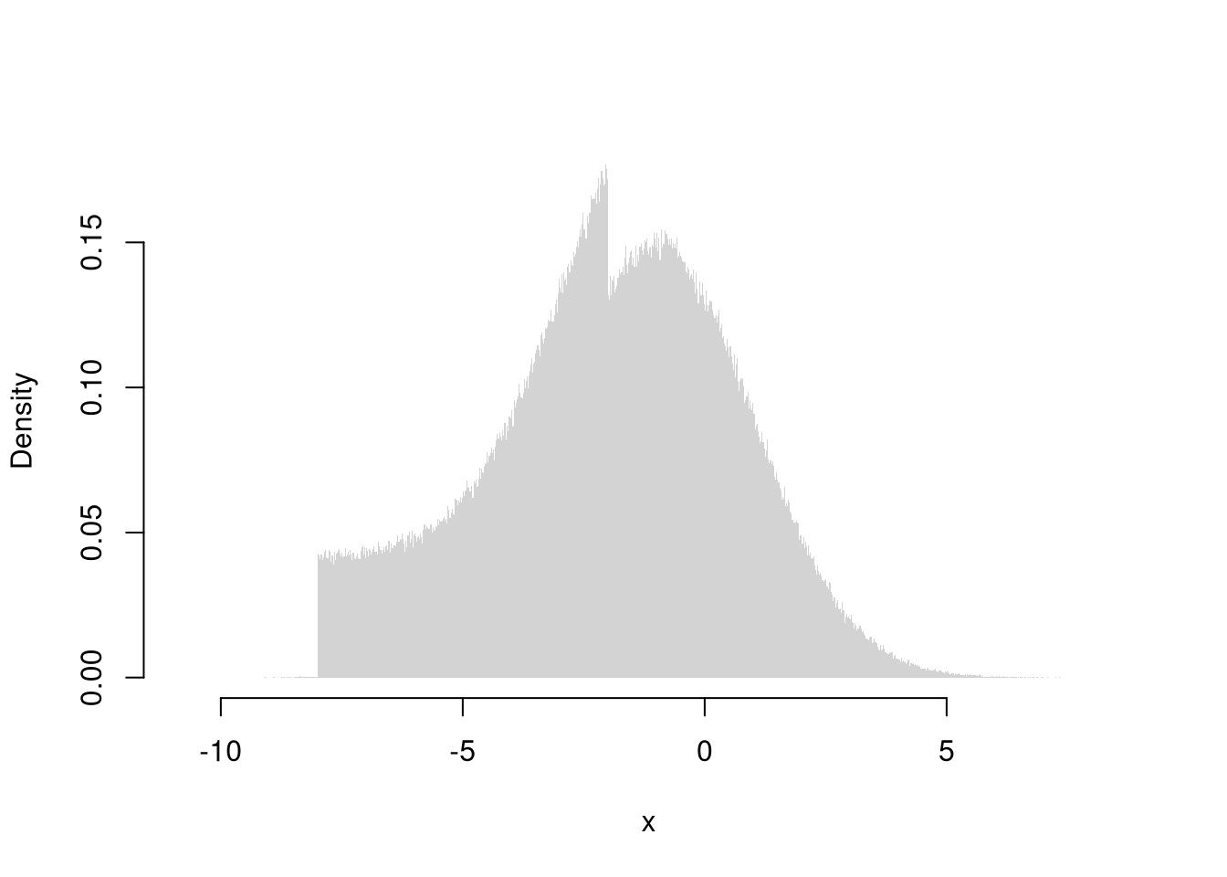
Standardizing moves the center to \(0\) and changes the units on the horizontal axis, but the two histograms have the same shape.
Standardizing also lets us compare variables measured on different scales. Georgia has the highest murder arrest rate of any state, and North Carolina has the highest assault arrest rate. Both rates are per \(100,000\) people, but assaults are far more common, so the raw numbers cannot be compared directly.
# a function that standardizes any variable
standardize <- function(x_hat){
    m_hat <- mean(x_hat)
    s_hat <- sqrt(mean((x_hat - m_hat)^2))
    z_hat <- (x_hat - m_hat)/s_hat
    return(z_hat)
}

# standardize two variables measured on different scales
z_arrests_hat <- data.frame(
    Murder=standardize(USArrests[, 'Murder']),
    Assault=standardize(USArrests[, 'Assault']),
    row.names=rownames(USArrests))

# raw and standardized values for two states
states <- c('Georgia', 'North Carolina')
USArrests[states, c('Murder', 'Assault')]
##                Murder Assault
## Georgia          17.4     211
## North Carolina   13.0     337
round(z_arrests_hat[states, ], 2)
##                Murder Assault
## Georgia          2.23    0.49
## North Carolina   1.21    2.02
Georgia’s murder rate is \(2.23\) standard deviations above the mean, but its assault rate is only \(0.49\) above. North Carolina is the reverse, with an assault rate \(2.02\) standard deviations above the mean and a murder rate \(1.21\) above.
Replacing the mean and standard deviation in the standardized value with the median and \(\hat{\text{MAD}}\) gives a robust z-score, \[\tilde{z}_{i} = \frac{\hat{x}_{i} - \tilde{m}}{\hat{\text{MAD}}},\] which a single extreme value cannot distort by inflating the spread.
Central tendency and dispersion are often insufficient to describe a distribution. To further describe shape, we can compute sample skew and kurtosis to measure asymmetry and extreme values.
There are many other statistics we could compute on an ad-hoc basis. However, shape is often best understood with graphical descriptions: histogram, ECDF, Boxplot. These should be made before numerical descriptions: skewness and kurtosis statistics.
Center and spread alone leave open whether the distribution is symmetric; the first shape question asks whether one tail extends further than the other.
Cubing the deviations preserves their sign: positive deviations stay positive and negative deviations stay negative. The numerator is therefore close to zero when the data are roughly balanced around the mean, and large in absolute value when one tail is much longer than the other. Dividing by the cubed standard deviation makes skewness dimensionless, so the values are comparable across datasets measured in different units. Skewness is useful for flagging whether the mean and median will agree closely (low skew) or diverge sharply (high skew), and for deciding whether a log or square-root transformation might tame the distribution before further analysis.
The figure below compares two distributions with the same mean and standard deviation. One is symmetric, and the other has a long right tail. On the histogram, the right-skewed distribution piles up just below the mean and stretches far to the right. On the ECDF, it rises steeply at first and then approaches \(1\) slowly.
skewness <- function(x_hat){
    z_hat <- standardize(x_hat)
    skew <- mean(z_hat^3) # average cubed standardized value
    return(skew)
}

# skewness of murder arrests
skewness(x_hat)
## [1] 0.3820378
Murder arrests have a small positive skew, so their right tail is slightly longer than their left.
A second shape question, independent of asymmetry, asks how much of the variability comes from a few far-from-center observations rather than from the typical bulk.
The sample kurtosis measures how heavy the tails are: the average fourth power of deviations from the mean, scaled by \(\hat{s}^4\), \[\hat{\text{kurt}} = \frac{\sum_{i=1}^{n}(\hat{x}_{i}-\hat{m})^4 / n}{\hat{s}^4}.\] The Normal distribution has kurtosis \(3\), so subtracting \(3\) gives a comparison-to-Normal version (excess kurtosis).
Where skewness uses the cube (and so can be negative), kurtosis uses the fourth power, which forces every term to be positive and disproportionately amplifies the largest deviations. Equivalently, kurtosis is the average fourth power of the standardized values, \(\sum_{i=1}^{n}\hat{z}_{i}^4/n\). A handful of far-from-the-mean values can drive kurtosis up substantially even when the bulk of the distribution looks unremarkable, which is why it is often described as a “tail-heaviness” measure. Kurtosis is useful for distinguishing distributions that look similar in their bulk but differ in how often extreme values occur: daily stock returns, for example, have moderate variance but kurtosis well above \(3\), reflecting occasional crashes that a Normal model would treat as vanishingly rare.
The figure below compares two symmetric distributions with the same median and \(\hat{\text{IQR}}\). The high-kurtosis distribution has more observations near the center and in the far tails, and fewer in between. On the ECDF, it approaches \(0\) and \(1\) much more slowly in the tails, and is still well above \(0\) and below \(1\) at the edges of the plot.
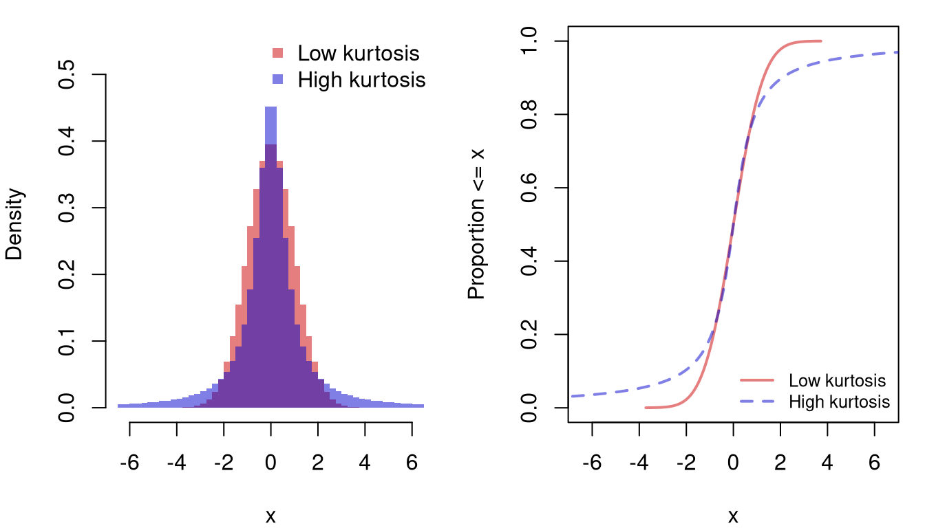
Some authors further subtract \(3\) to explicitly compare against the normal distribution (the normal distribution has a kurtosis of \(3\)).
Boxplot whiskers are a great way to examine kurtosis, with more circle “outliers” indicating more kurtosis. You can also see skew in the boxplot when one quartile is much further from the median than the other.
kurtosis <- function(x_hat){
    z_hat <- standardize(x_hat)
    kurt <- mean(z_hat^4) # average fourth power of standardized values
    return(kurt)
    # use instead to compare against normal
    # excess_kurt <- kurt - 3
}

# kurtosis of murder arrests
kurtosis(x_hat)
## [1] 2.135329
Murder arrests have a kurtosis below \(3\), so their tails are lighter than normal.
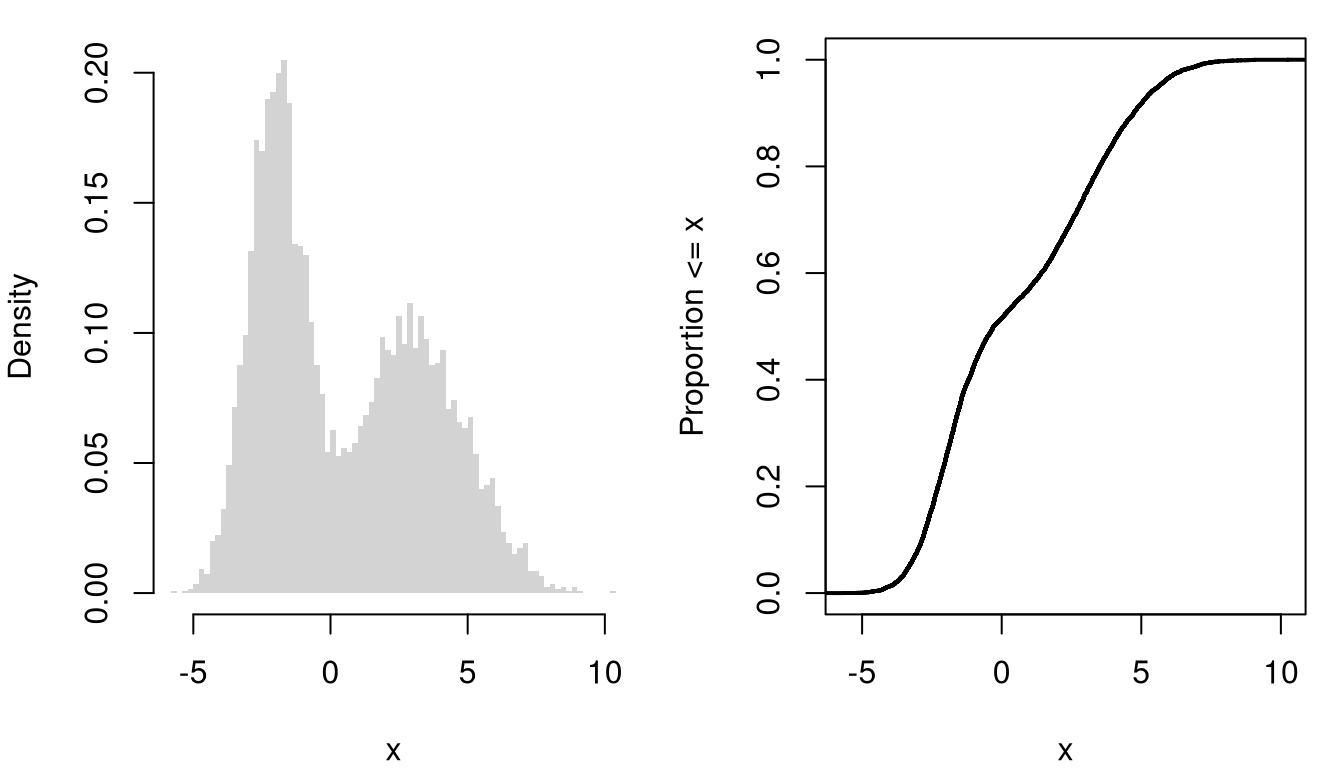
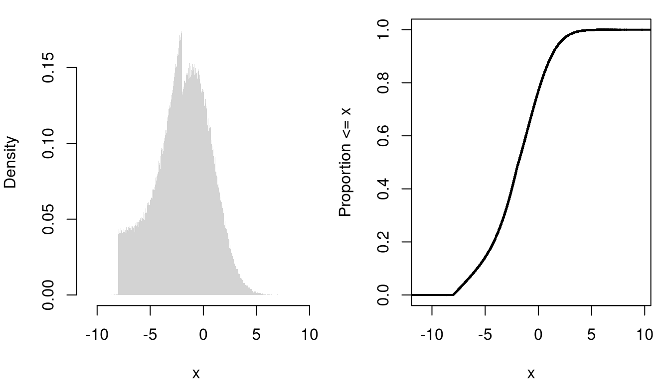
You can also describe distributions in terms of how clustered the values are, including the number of modes (peaks), bunching, and many other statistics. A gap is a range with few or no observations, and a cluster is a group of values bunched together. A distribution with one peak is unimodal, and one with two peaks is bimodal. The first figure below is bimodal: two clusters of values separated by a gap. The second has a single cluster, with a long flat shelf on its left that ends abruptly at \(-8\). Each pairs a histogram with the ECDF of the same values, where a cluster shows up as a steep rise and a gap as a flatter stretch. The mean and variance alone would miss this structure, since two very different distributions can share the same mean and variance. So remember that “a picture is worth a thousand words”: plot your data before summarizing it numerically.
The statistics above all add, subtract, or rank the observations, so they require cardinal data. For factor data, we instead start from the proportions \(\hat{p}(x)\) from the empirical mass function and summarize those. Which summaries make sense depends on whether the factor is ordered.
Ordered factors, such as letter grades or survey responses from strongly disagree to strongly agree, have a ranking but no meaningful distance between levels. The mode and Herfindahl index apply as before, since they only use the proportions. Because the levels can be sorted, the median and other quantiles also apply: the median is the middle level, and the quartiles bracket the middle half of the observations. Quantiles are useful for ordered factors because they only use the ordering: “half the class earned a \(B\) or better” is a statement the data can support. The mean and variance do not apply, because there is nothing to add. A grade point average gets around this by coding the levels as numbers, treating the gap between \(C\) and \(B\) as equal to the gap between \(B\) and \(A\), but that is an assumption imposed by the grader rather than a property of the data. Surveys often record a cardinal variable only in bands, such as income brackets, which turns it into an ordered factor.
Compute the median of the original USArrests[, 'UrbanPop'] and check which band it falls in. Then move the inner breaks from \(50\) and \(75\) to \(40\) and \(60\) and recompute the median band. Does the median band always contain the cardinal median?
Below, the urban share of each state’s population is recorded in three bands.
# urban population in bands, an ordered factor
urban_band <- cut(USArrests[, 'UrbanPop'], breaks=c(0, 50, 75, 100),
    labels=c('mostly rural', 'mixed', 'mostly urban'), ordered_result=TRUE)
p_hat <- table(urban_band)/length(urban_band)
plot(p_hat, col=grey(0, .5),
    xlab='Urban Population', ylab='Proportion of States')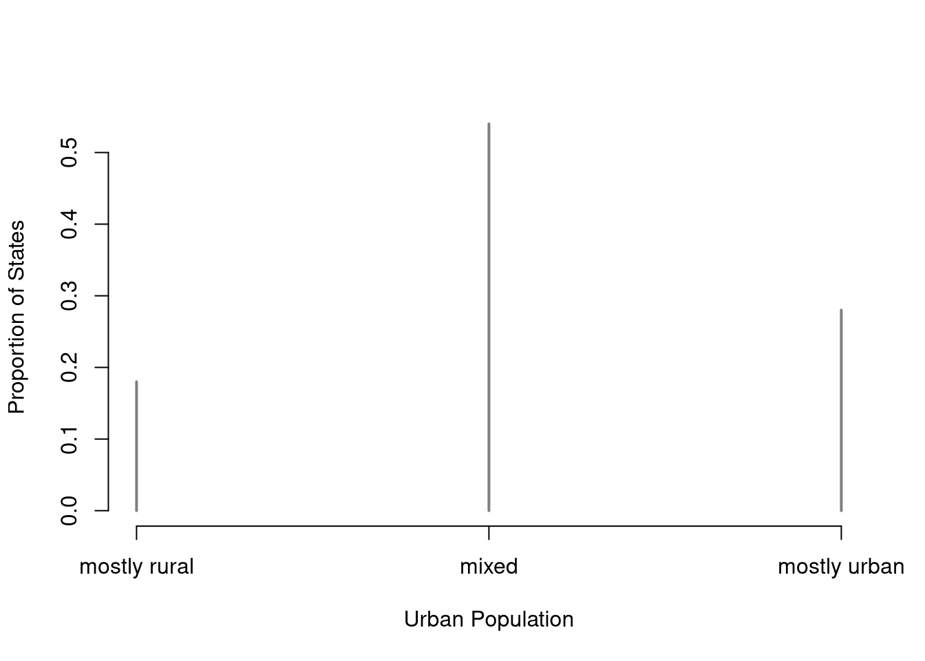
# mode and Herfindahl index
names(p_hat)[p_hat==max(p_hat)]
## [1] "mixed"
sum(p_hat^2)
## [1] 0.4024

# median and quartiles
quantile(urban_band, probs=c(.25, .5, .75), type=1)
##          25%          50%          75%
##        mixed        mixed mostly urban
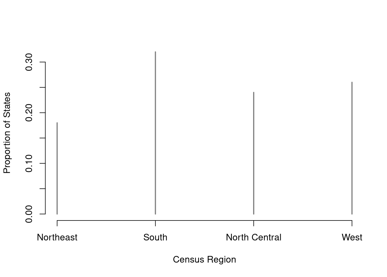
## Levels: mostly rural < mixed < mostly urbanFor categories with no natural order, such as regions or brands, the center of a distribution is simply the most common category. Categories have no distance between them, so for factor data spread instead means how evenly the observations divide across the categories.
The mode is useful when the question is “which category is typical?”: the most common region, the best-selling brand, the most frequent answer on a survey. It is the only measure of center that applies to unordered factors, since the categories can be neither averaged nor ranked. If several categories tie for the highest proportion, the data have more than one mode.
The Herfindahl index ranges from \(1/K\), when every category has the same proportion, up to \(1\), when every observation falls in a single category. It is useful for asking how dominated a distribution is by its largest categories. Economists use the same statistic, with market shares in place of proportions, to measure how concentrated an industry is, and antitrust agencies report it with shares in percentage points so that the scale runs to \(10{,}000\). The complement \(1-\hat{H}\) is sometimes reported instead so that larger values mean a more even spread, and after rescaling by \(K/(K-1)\) it is called the index of qualitative variation.
# census region of each state, an unordered factor
region <- state.region
p_hat <- table(region)/length(region)
plot(p_hat, col=grey(0, .5),
    xlab='Census Region', ylab='Proportion of States')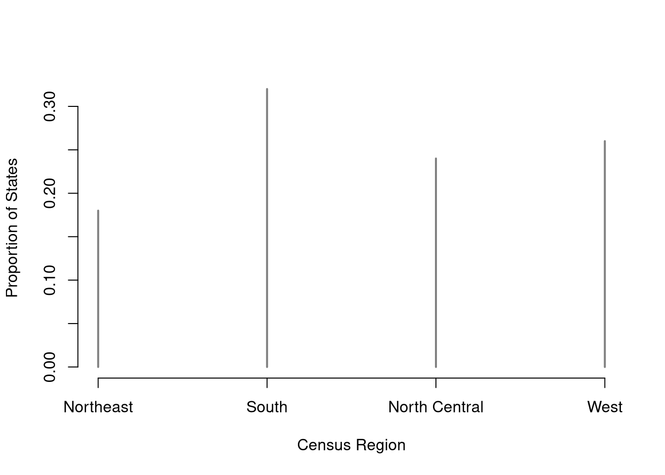
# mode
names(p_hat)[p_hat==max(p_hat)]
## [1] "South"

# Herfindahl index, compared to its minimum 1/K
K <- length(p_hat)
c(H_hat=sum(p_hat^2), H_min=1/K)
## H_hat H_min
## 0.26 0.25Each statistic in this chapter suits some data types and not others. Here is a table to help you recall which apply. Note that the mode and Herfindahl index need repeated values, so for continuous cardinal data we can describe proportions with a histogram instead (seeing the highest peak as the mode, for example).
| Statistic | Factor | Cardinal | |
|---|---|---|---|
| Mean, variance, skewness, kurtosis | No | Yes | |
| Median, quantiles, \(\hat{\text{IQR}}\) | Ordered only (not Unordered) | Yes | |
| Mode, Herfindahl index | Yes | Discrete only (not Continuous)* |
Comment the script you wrote for this chapter, then restart R and check that it runs from a clean session, then check the script with AI as explained in Working with AI. Write three sentences from memory on the main statistical idea of this chapter, and ask the assistant what is wrong, vague, or missing. Finish with your own questions about whatever you found hardest.
Explain in your own words why the median is more robust to extreme values than the mean. Give a concrete example with a small dataset where adding one outlier changes the mean substantially but barely moves the median.
Using the dataset \(\{2, 5, 5, 8, 12\}\), compute by hand: (a) the sample mean \(\hat{m}\), (b) the sample variance \(\hat{v}\), (c) the sample standard deviation \(\hat{s}\), and (d) the \(\hat{\text{IQR}}\). Show your work for each step.
Load USArrests in R. Compute the mean, standard deviation, and MAD (with constant=1) of the Assault variable. Then apply a log transformation with log(USArrests[,'Assault']) and compute the skewness of both the original and transformed data using the skewness function defined in the chapter. Which version is less skewed?
A survey asks \(12\) customers to rate a product on a five-level scale from poor to excellent, with responses \(\{\text{good}, \text{fair}, \text{excellent}, \text{good}, \text{poor}, \text{good}, \text{fair}, \text{excellent}, \text{good}, \text{very good}, \text{fair}, \text{good}\}\). Store the responses as an ordered factor in R, then report the proportions, the mode, the median, and the Herfindahl index. Explain why the median is a meaningful summary here but the mean of the numeric codes \(1\) to \(5\) requires an extra assumption.
This chapter compressed a distribution into single numbers: the mean and variance (and standard deviation) for center and spread, the median, IQR, and MAD as robust alternatives, and the skewness and kurtosis for shape. For factor data, where nothing can be added, the mode and the Herfindahl index \(\hat{H}\) took over: the four census regions in state.region have mode South and \(\hat{H}=0.26\), barely above the \(0.25\) floor for four equally common categories, and ordered factors such as letter grades also keep the median and quartiles. The running five-point dataset \(\{0, 1, 2, 3, 9\}\) tied the shape statistics together: its mean is \(3\), its cubed deviations average to \(36\) giving a skewness of about \(1.14\) (long right tail), and its quartic deviations give a kurtosis of about \(2.79\) (both driven by the single outlier at \(9\)). On real data such as USArrests[, 'Murder'], a histogram plus the mean and standard deviation already reveal most of the shape; the median, MAD, skew, and kurtosis fill in what symmetry assumptions hide.