A default R plot is rarely a good plot, and the gap between the two is mostly a handful of arguments. This appendix collects the choices the book makes and what each one is for, so you can apply them to figures the book never draws. They are house style, and the theme running through them is that ink should carry information, since borders, bold titles, and full-strength colors draw the eye without telling the reader anything.
Histograms of Data
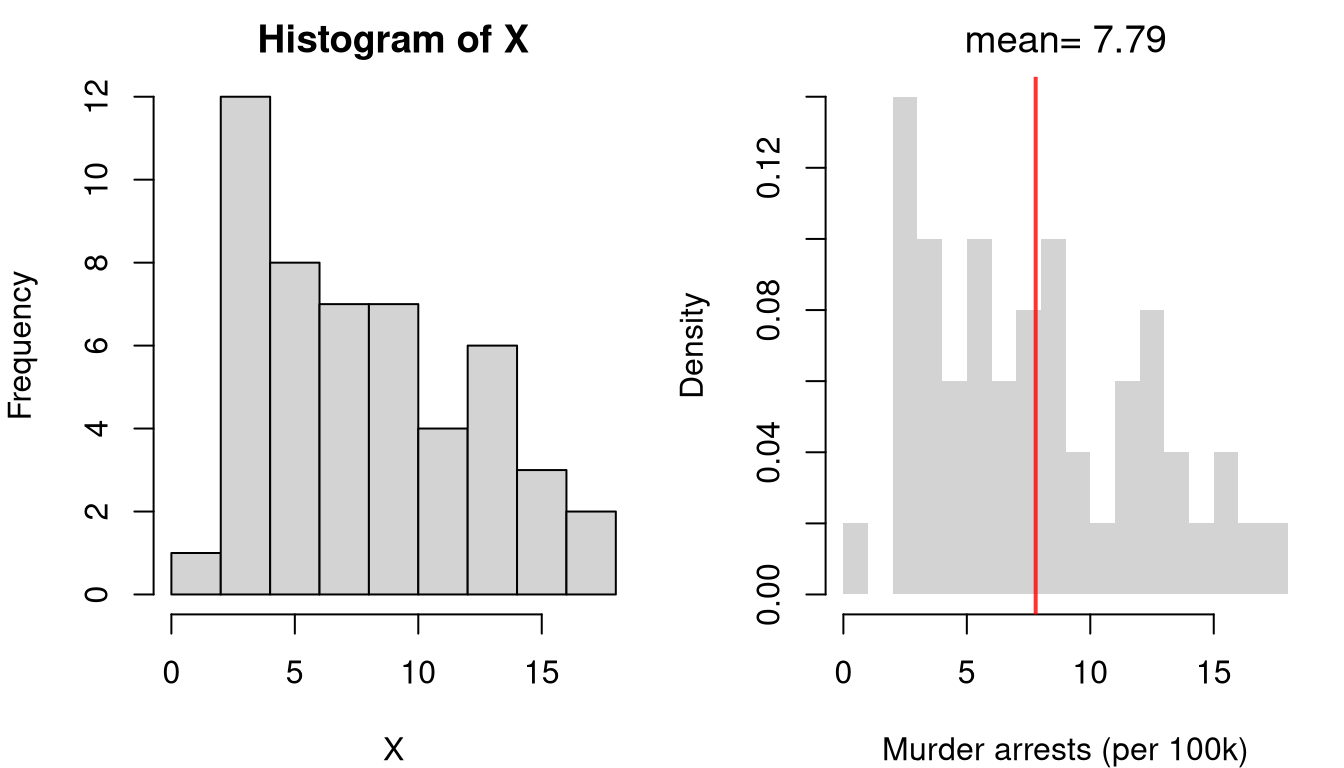
A histogram of data summarizes the \(n\) observations you actually have. The two panels below plot the same data with R’s defaults and with the book’s conventions.
Code
x_hat <- USArrests[,'Murder']
par(mfrow=c(1,2), mar=c(4, 4, 2, 1))

# Default settings
hist(x_hat)

# House style
hist(x_hat, breaks=15, border=NA, freq=FALSE, main=NA,   # fewer bins, since n is only 50
    xlab='Murder arrests (per 100k)')
rug(x_hat, col=grey(0, .5))
The bar borders are gone, so the distribution reads as one silhouette instead of twenty outlined boxes. The vertical axis is a density rather than a count, so a fitted curve can be drawn on the same axes. The axis label gives the variable and its units, and the rug along the bottom marks each of the 50 observations that the bars summarize.
border |
NA |
Never use visible borders on bars |
freq |
FALSE |
Density scale, so the bars integrate to one and a density curve can be overlaid |
main |
NA or omit |
Add titles via title() instead |
breaks |
15–25 integer |
Fewer bins when \(n\) is small, so each bin holds several observations |
col |
Default grey, or group colors |
Use transparency for overlays |
xlab |
Short descriptive string |
Use expression() for math notation |
Histograms of Resampled Data
A histogram of resampled data summarizes statistics rather than observations: hundreds or thousands of bootstrap, jackknife, or permutation draws, or repeated samples from a known population. It keeps the default grey fill, border=NA, and freq=FALSE, but differs from a histogram of data in three ways.
breaks |
15–25, fewer when \(n\) is small |
25–100, since draws are plentiful |
rug() |
rug(x_hat, col=grey(0, .5)) |
None, since the draws would merge into a solid band |
| Vertical lines |
A sample statistic in red, lwd=2 |
The observed statistic in red and interval bounds in black, both lwd=2 |
Code
# Bootstrap distribution of the mean murder arrest rate
set.seed(1) # to be replicable
boot_means <- rep(NA, 999)
for (b in seq_along(boot_means)) {
    x_boot <- sample(x_hat, replace=TRUE)
    boot_means[b] <- mean(x_boot)
}
boot_ci <- quantile(boot_means, probs=c(.025, .975))

hist(boot_means, breaks=50, border=NA, freq=FALSE, main=NA,
    xlab='Bootstrap means of murder arrests (per 100k)')
abline(v=mean(x_hat), col=rgb(1, 0, 0, .8), lwd=2)   # observed statistic
abline(v=boot_ci, col=rgb(0, 0, 0, .8), lwd=2)       # 95% bootstrap interval
The same line styles apply to any figure that marks a value, not only to histograms.
| Sample statistic |
rgb(1, 0, 0, .8) |
2 |
1 |
| Interval bounds (CI limits, critical values) |
rgb(0, 0, 0, .8) |
2 |
1 |
| Theoretical or population value |
rgb(0, 0, 1, .8) |
1 |
2 |
| Zero line |
rgb(0, 0, 0, .8) |
1 |
2 |
| Subtle reference |
grey(0.5) |
1 |
3 |
The pattern is that solid and thick means “computed from this sample”, while dashed and thin means “a reference to compare it against”, so a reader who has seen one figure in the book can read the next without a legend.
Boxplots
boxplot(x1_hat, x2_hat, names=c('A', 'B'), main=NA, xlab='Groups')
Use main=NA in boxplot() and add titles with title(..., font.main=1). Color grouped boxplots with the group colors from The Grey and RGB System, and set border='white' or border=NA when a fill color is specified.
Scatterplots
plot(y_hat ~ x_hat, pch=16, col=grey(0, .5), data=xy_hat, main=NA, xlab='x', ylab='y')
pch |
16 (solid circle) |
Standard throughout the book |
col |
grey(0, alpha) |
Alpha of 0.5 for \(n < 100\), 0.25 up to 1000, 0.1 up to 10000, and 0.05 beyond |
main |
NA or omit |
Titles via title() if needed |
cex |
Reduce for large \(n\) (e.g., .5) |
Default is fine for small datasets |
Transparency is how a scatterplot survives a large sample, since transparent points darken where observations pile up instead of overplotting into a solid blob.
Draw fitted lines with lines(x_sorted, y_fit) rather than curve(), using red at lwd=2 for the primary fit and blue at lwd=1, lty=2 for a comparison fit. lines() takes the fitted values you actually computed, whereas curve() re-evaluates a function, which can quietly differ from the model you fit. Sort by the horizontal variable first, or lines() will zigzag back and forth across the plot.
Polishing
Use par(mfrow=c(1,2)) for two panels side by side, c(1,3) for three, and c(2,2) for a grid, with small top and right margins from par(mar=c(4, 4, 1, 1)). If you change par() inside a function, restore it on exit.
op <- par(no.readonly=TRUE)
on.exit(par(op), add=TRUE)
Position legends with a string such as 'topright' or 'topleft' rather than coordinates, so the legend moves with the data instead of landing on top of it. Add bty='n' to drop the box when it clutters the plot, keep entries to one to three words, and match lty, pch, and col to the plot symbols.
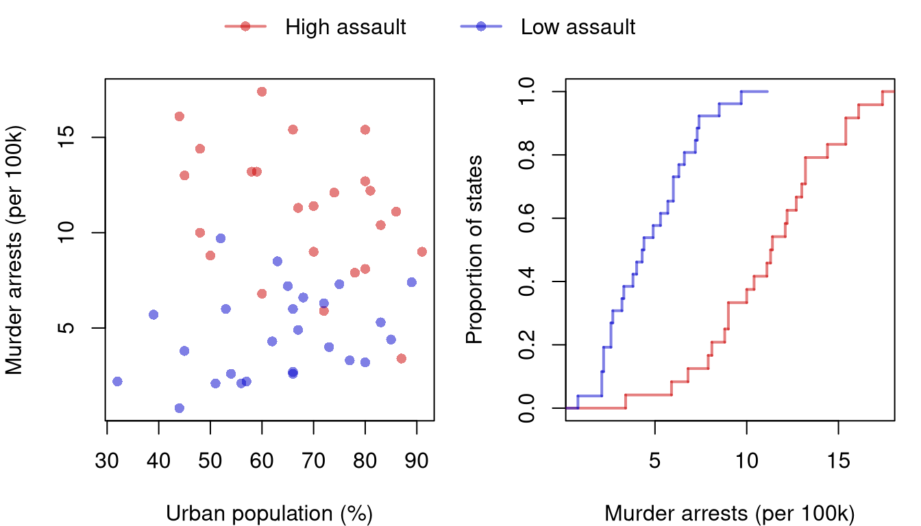
The figure below splits the states at the median assault rate and shows the two groups in two panels, with one legend for both.
Code
high <- USArrests[,'Assault'] > median(USArrests[,'Assault'])
cols <- c(rgb(.8, 0, 0, .5), rgb(0, 0, .8, .5))
par(mfrow=c(1,2), mar=c(4, 4, 1, 1), oma=c(0, 0, 2, 0))

# Scatterplot
plot(USArrests[,'Murder'] ~ USArrests[,'UrbanPop'],
    pch=16, col=ifelse(high, cols[1], cols[2]),
    xlab='Urban population (%)', ylab='Murder arrests (per 100k)')

# ECDFs
F_hi_hat <- ecdf(USArrests[high, 'Murder'])
F_lo_hat <- ecdf(USArrests[!high, 'Murder'])
plot(F_hi_hat, col=cols[1], lwd=2, verticals=TRUE, do.points=FALSE, col.01line=NA,
    xlim=range(USArrests[,'Murder']), main=NA,
    xlab='Murder arrests (per 100k)', ylab='Proportion of states')
plot(F_lo_hat, add=TRUE, col=cols[2], lwd=2, verticals=TRUE, do.points=FALSE, col.01line=NA)

# One legend for both panels, in the outer margin above them
par(fig=c(0, 1, 0, 1), oma=c(0, 0, 0, 0), mar=c(0, 0, 0, 0), new=TRUE)
plot.new()
legend('top', legend=c('High assault', 'Low assault'),
    pch=16, lwd=2, col=cols, horiz=TRUE, bty='n',
    text.width=.2) # room between entries, which horiz=TRUE packs tightly
Both panels share one cols vector, so a group has the same color everywhere and a single legend can serve both panels. oma=c(0, 0, 2, 0) leaves two lines of outer margin above the panels. The last par() call then lays an empty plot over the whole figure, so that legend('top', ...) lands in that margin rather than inside either panel. The legend sets both pch=16 and lwd=2, so its symbols match the points in one panel and the lines in the other.
Add titles with title(..., font.main=1) after the plot call, rather than with main= inside it. R’s default title is bold, and a bold title competes with the data for attention. Keep the text short, usually a statistic or a single phrase, and use title('label', outer=TRUE) for a label spanning a multi-panel figure. For text annotations with text(), match the color to the element being labeled, use expression() or bquote() for math, and set adj=0 to left-align or adj=0.5 to center.
The Grey and RGB System
Scatterpoints and histogram fills use grey(0, alpha), varying only the transparency, while anything you want the reader to look at uses rgb() with an explicit alpha channel.
rgb(1, 0, 0, .8) |
Red |
Means, fitted lines, key statistics |
rgb(0, 0, 1, .8) |
Blue |
SD bounds, secondary reference lines |
rgb(0, 0, 0, .8) |
Black |
Interval bounds, and horizontal and vertical reference lines |
Avoid numeric codes such as col=2, which depend on the current palette, and names such as 'red', since neither form lets you set transparency. To compare groups, store one color per group in cols.
| 2 |
cols <- c(rgb(.8, 0, 0, .5), rgb(0, 0, .8, .5)) |
| 3 |
cols <- c(rgb(.8, 0, 0, .5), rgb(0, .8, 0, .5), rgb(0, 0, .8, .5)) |
| 4 or more |
cols <- hcl.colors(k, alpha=.45), where k is the number of groups |
With four or more groups, hcl.colors() spaces the colors evenly in a perceptual space, so no one group looks louder than the others.
Reference Card
border=NA and freq=FALSE for every histogram.- A rug under histograms of data; more bins and no rug for histograms of resampled data.
- The observed statistic in red and interval bounds in black, both
lwd=2.
pch=16 and grey(0, alpha) for scatterplots, with alpha matched to \(n\).font.main=1 for every title.rgb() with alpha for emphasis colors, never col=2 or 'red'.par(mfrow=...) for multi-panel layouts, not layout().