Code
# Admission rate by Gender, pooled over departments
ucb_pooled <- prop.table(margin.table(UCBAdmissions, c(1, 2)), margin=2)
round(ucb_pooled['Admitted', ], 2)
##   Male Female
## 0.45 0.30Earlier chapters described how two variables move together, fitted predictive models, and measured uncertainty about those summaries. None of those tools alone identifies what would happen to \(Y\) if we intervened and changed \(X\). This chapter brings together three warnings: Simpson’s paradox shows that pooling groups can reverse a relationship, association can appear without causation or causation without linear correlation, and predictive models trade bias against variance without answering a causal question.
A relationship visible inside every subgroup can flip direction once those subgroups are pooled. The conditional distributions from Chapter 11 compare outcomes within values of another variable; adding a subgroup \(g\) lets us compare \(\hat{p}(y\mid x,g)\) within each group to the pooled \(\hat{p}(y\mid x)\).
Simpson’s paradox is useful as a warning whenever you are tempted to pool subgroups: the pooled relationship reflects both the within-group pattern and how the subgroups differ in size. The base-rate fallacy is a related composition effect: a category’s share of a pooled statistic can be driven by its size rather than its rate. The classic example involves graduate admissions at the University of California, Berkeley, in 1973. R ships the data as UCBAdmissions, a three-way table of applicants by admission status (Admit), sex (Gender), and department (Dept). Pooled over all six departments, men were admitted at a higher rate than women.
# Admission rate by Gender, pooled over departments
ucb_pooled <- prop.table(margin.table(UCBAdmissions, c(1, 2)), margin=2)
round(ucb_pooled['Admitted', ], 2)
## Male Female
## 0.45 0.30Within departments, the gap mostly disappears or reverses.
# Admission rate by Gender within each department
ucb_within <- prop.table(UCBAdmissions, margin=c(2, 3))
round(ucb_within['Admitted', , ], 2)
##         Dept
## Gender      A    B    C    D    E    F
##   Male   0.62 0.63 0.37 0.33 0.28 0.06
##   Female 0.82 0.68 0.34 0.35 0.24 0.07

# Share of each Gender's applicants going to each department
ucb_apply <- prop.table(margin.table(UCBAdmissions, c(2, 3)), margin=1)
round(ucb_apply, 2)
##         Dept
## Gender      A    B    C    D    E    F
##   Male   0.31 0.21 0.12 0.15 0.07 0.14
##   Female 0.06 0.01 0.32 0.20 0.21 0.19
Women had higher admission rates than men in four of the six departments (A, B, D, and F). Men applied mostly to departments A and B, which admitted over \(60\%\) of applicants. Over \(90\%\) of women applied to departments C to F, which admitted \(35\%\) of applicants or fewer. The pooled gap mostly reflects where men and women applied, not how each department treated them. The example is part of a real debate about discrimination (http://homepage.stat.uiowa.edu/~mbognar/1030/Bickel-Berkeley.pdf) and the same logic applies to the gender pay gap, cross-country growth comparisons, and many other social issues.1 Neither the pooled rates nor the within-department rates alone identify what would happen under an intervention.
The same issue shows up in continuous data. The figure below shows three simulated groups. Within each group the relationship between \(X_1\) and \(X_2\) is negative, but the group centers rise together from lower-left to upper-right.
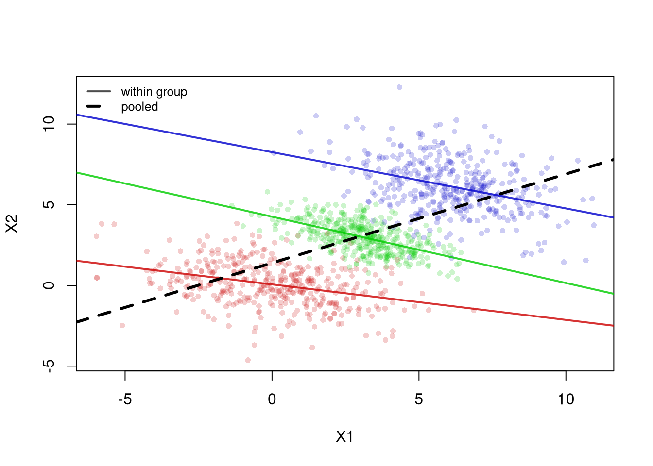
Each within-group regression line (solid) slopes downward, yet the pooled regression line (dashed) slopes upward. A researcher who ignored the groups would report a positive relationship that holds within no single group. The Simple Regression chapter explains how these lines are fit.
Sampling variability is one problem: relationships in the population may not appear in a sample, and apparent sample relationships may not exist in the population. Inference helps quantify that uncertainty, but statistical significance does not distinguish association from causation. Two other problems remain: real relationships can average out, and random data can acquire mechanically induced relationships. To make both problems concrete, we focus on the Pearson correlation from Statistics of Association and examine
Examples of the first problem include nonlinear effects and heterogeneous effects that average out. For example, wages tend to rise with age early in a career and then flatten or fall, and a minimum wage increase can raise pay for some workers while others lose their jobs.
set.seed(123)
n <- 10000

# X causes Y via Y = X^2 + noise
x_sim <- runif(n, min = -1, max = 1)
epsilon <- rnorm(n, mean = 0, sd = 0.1)
y_sim <- x_sim^2 + epsilon  # clear causal effect of X on Y
plot(x_sim, y_sim, pch=16, col=grey(0, .05),
    main=NA, xlab='X', ylab='Y')

# Correlation over the entire range
title( paste0('Cor: ', round( cor(x_sim, y_sim), 1) ) ,
    font.main=1)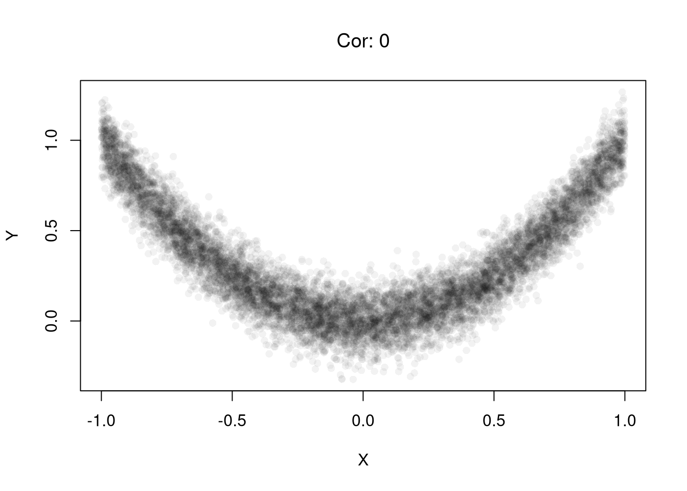
# Heterogeneous Effects
x_sim <- rnorm(n) # Randomized 'treatment'

# Heterogeneous effects based on group
group <- rbinom(n, size = 1, prob = 0.5)
epsilon <- rnorm(n, mean = 0, sd = 1)
y_sim <- ifelse(group == 1,
            x_sim + epsilon,   # positive effect
            -x_sim + epsilon)  # negative effect
plot(x_sim, y_sim, pch=16, col=grey(0, .05),
    main=NA, xlab='X', ylab='Y')

# Correlation in the pooled sample
title( paste0('Cor: ', round( cor(x_sim, y_sim), 1) ),
    font.main=1 )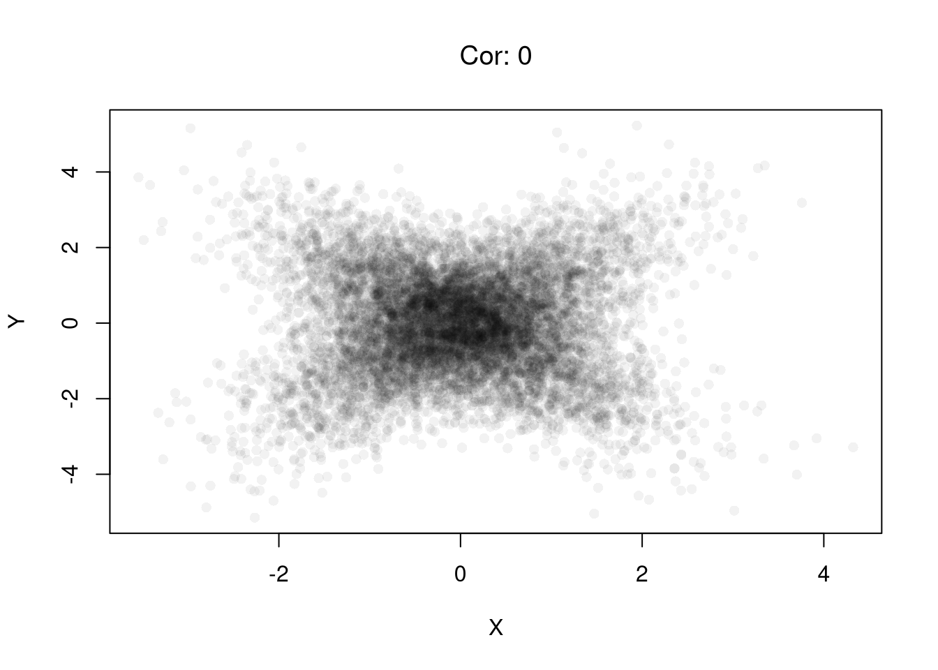
Examples of the second problem include shared denominators and selection bias that induce correlations.
Consider three completely random variables. We can induce a mechanical relationship between the first two variables by dividing them both by the third variable. Per-capita statistics are a common real case, such as crimes per resident and police officers per resident across cities, which share population as the denominator.
set.seed(123)
n <- 20000

# Independent components
A <- runif(n)
B <- runif(n)
C <- runif(n)
par(mfrow=c(1, 2))
plot(A, B, pch=16, col=grey(0, .05),
    main=NA, xlab='A', ylab='B')
title('Independent Variables', font.main=1)

# Ratios with a shared denominator
x_sim <- A / C
y_sim <- B / C
plot(x_sim, y_sim, pch=16, col=grey(0, .05),
    main=NA, xlab='X', ylab='Y')
title('With Common Divisor', font.main=1)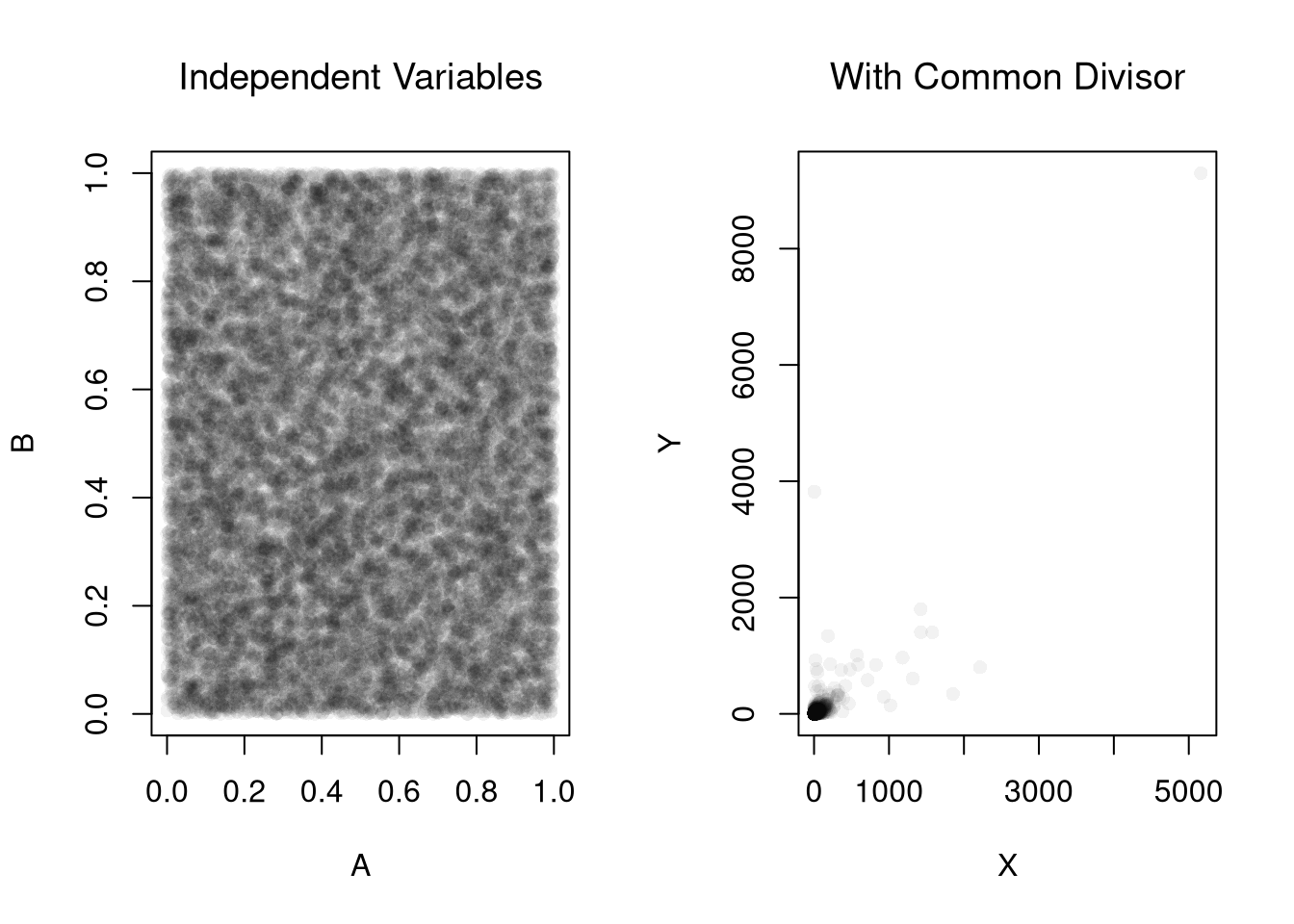
# Correlation
cor(x_sim, y_sim)
## [1] 0.8183118
Consider an admissions rule into university: applicants are accepted if they have either high test scores or strong extracurriculars. Even if there is no general relationship between test scores and extracurriculars, you will see one amongst university students. Real datasets are often selected in a similar way; for example, Wages1 only includes people with observed wages, so its relationships describe workers rather than everyone who could have worked.
# Independent traits in the population
test_score        <- rnorm(n, mean = 0, sd = 1)
extracurriculars  <- rnorm(n, mean = 0, sd = 1)

# Selection above thresholds
threshold <- 1.0
admitted <- (test_score > threshold) | (extracurriculars > threshold)
mean(admitted)  # admission rate
## [1] 0.29615

par(mfrow = c(1, 2))
# Full population
plot(test_score, extracurriculars,
     pch=16, col=grey(0, .05),
     main=NA, xlab='Test Score', ylab='Extracurriculars')
title('General Sample', font.main=1)
# Admitted only
plot(test_score[admitted], extracurriculars[admitted],
     pch=16, col=grey(0, .05),
     main=NA, xlab='Test Score', ylab='Extracurriculars')
title('University Sample', font.main=1)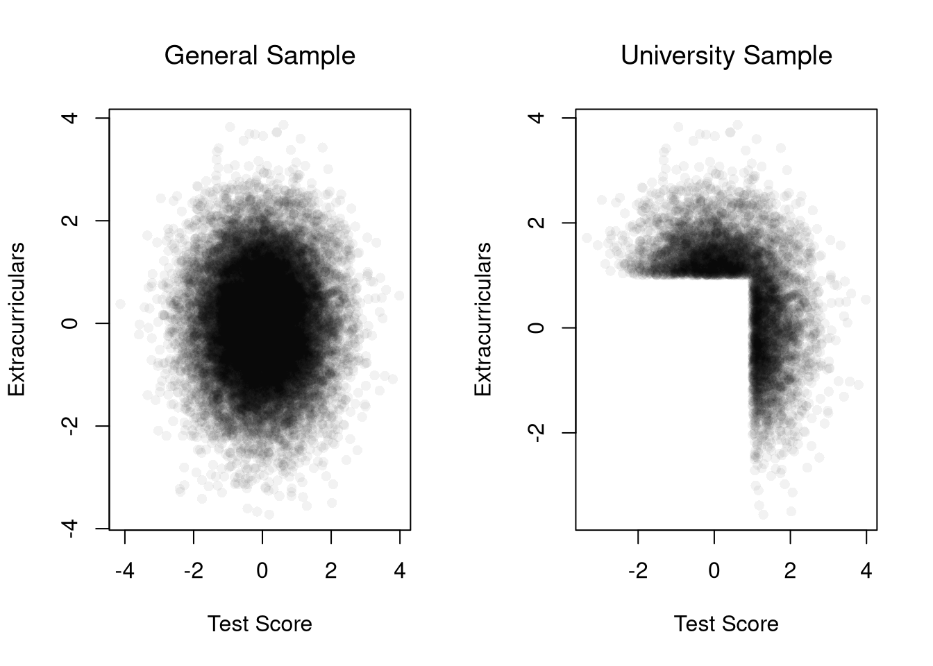
# Correlation among admitted applicants only
cor(test_score[admitted], extracurriculars[admitted])
## [1] -0.5597409
Real data often mix several of these issues. The USArrests data record arrests per \(100,000\) residents in each U.S. state in 1973. States with more assault arrests also tend to have more murder arrests.
plot(Murder ~ Assault, USArrests, pch=16, col=grey(0, .5),
    main=NA, xlab='Assault Arrests', ylab='Murder Arrests')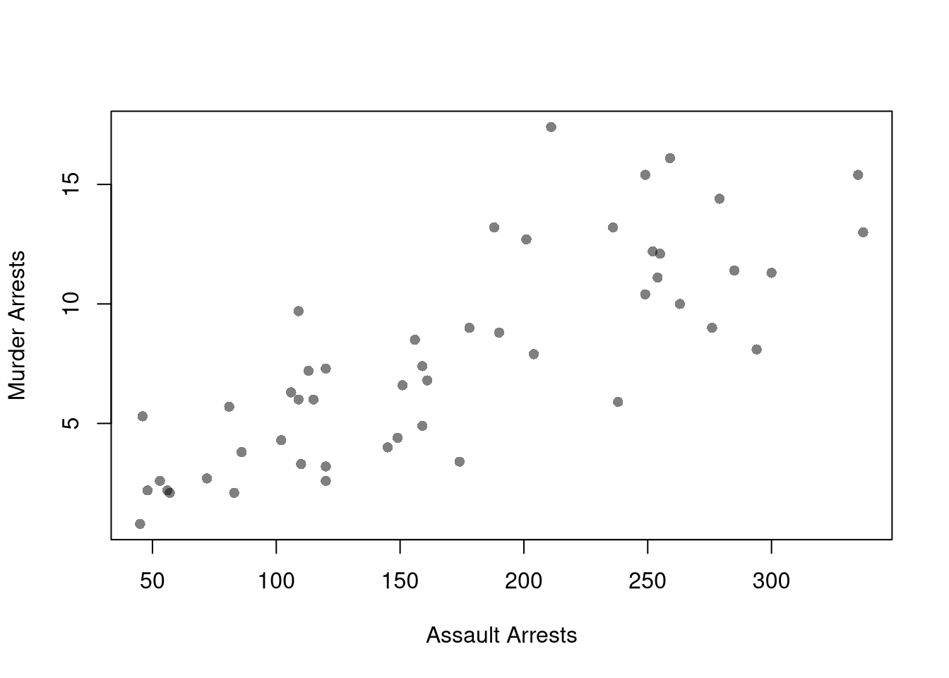
# Correlation across states
cor(USArrests$Murder, USArrests$Assault)
## [1] 0.8018733
The correlation is about \(0.8\), but this does not mean that assaults cause murders. Both variables are divided by the same state population. Both also likely respond to common factors, such as policing practices or local economic conditions.
Note that the examples above are not the only examples of “correlation does not mean causation”. Many real datasets have temporal and spatial interdependence that create additional issues. Many real datasets also have economic interdependence, which also creates additional issues.
The applied Bias-Variance Tradeoff section compared narrow and wide LOESS spans. We now use a population where the true conditional mean is known, so we can separate bias from variance and study how both change across samples. As in Sampling, pretend the \(3294\) workers in Wages1 are the whole population, so the true mean wage at each schooling level is known. We call these means the population curve, and we evaluate it at \(8\) to \(15\) years of schooling, where there are many workers. Schooling takes only a few distinct values, so we fit local linear LOESS (degree=1), which is more stable than the default local quadratic in small samples.
Bootstrap confidence bands are approximations: they estimate how much predicted values vary from sample to sample. The simulation below compares a bootstrap CI constructed from one sample of \(300\) workers to the true sampling variation observed across many independent samples from the population.
# Pretend these 3294 workers are the whole population
data(Wages1, package='Ecdat')
population_xy <- Wages1[, c('school', 'wage')]
colnames(population_xy) <- c('x', 'y') # x=years of schooling, y=hourly wage
population_slope <- coef(lm(y ~ x, data=population_xy))[2]

# Population curve: mean wage at each schooling level
population_curve <- tapply(population_xy[, 'y'], population_xy[, 'x'], mean)

# Evaluate at schooling levels with many workers (8 to 15 years)
# Rare levels are often missing from a sample, and loess does not extrapolate
x_levels <- 8:15
population_levels <- population_curve[as.character(x_levels)]

# Draw a simple random sample of n workers from the population
draw_xy <- function(n=300){
    s_id <- sample(nrow(population_xy), n, replace=FALSE)
    xy_sim <- population_xy[s_id, ]
    colnames(xy_sim) <- c('x_hat', 'y_hat')
    return(xy_sim)
}

# Span for all local linear fits in the main text
span_wage <- 0.6

## Data from one sample
xy_sim <- draw_xy(300)
plot(y_hat ~ x_hat, data=xy_sim, pch=16, col=grey(0, .1),
    ylim=c(0, 15), # zoom in on the fitted curves
    main=NA, ylab='Hourly Wage', xlab='Years of Schooling')
reg_lo <- loess(y_hat ~ x_hat, data=xy_sim, span=span_wage, degree=1)

## Plot Bootstrap CI for Single Sample
pred_design <- data.frame(x_hat=x_levels)
boot_lo <- matrix(NA, nrow=nrow(pred_design), ncol=399)
for (b in 1:399) {
    xy_boot <- xy_sim[sample(nrow(xy_sim), replace=TRUE), ]
    reg_i <- loess(y_hat ~ x_hat, data=xy_boot, span=span_wage, degree=1)
    boot_lo[, b] <- predict(reg_i, newdata=pred_design)
}
boot_cb <- apply(boot_lo, 1, quantile,
    probs=c(.025, .975), na.rm=TRUE)
polygon(
    c(pred_design[[1]], rev(pred_design[[1]])),
    c(boot_cb[1, ], rev(boot_cb[2, ])),
    col=hcl.colors(3, alpha=.25)[2],
    border=NA)

# Construct CI across Multiple Samples from the population
sample_lo <- matrix(NA, nrow=nrow(pred_design), ncol=399)
for (b in 1:399) {
    xy_sim_b <- draw_xy(300) # Entirely new sample
    reg_b <- loess(y_hat ~ x_hat, data=xy_sim_b, span=span_wage, degree=1)
    sample_lo[, b] <- predict(reg_b, newdata=pred_design)
}
ci_lo <- apply(sample_lo, 1, quantile,
    probs=c(.025, .975), na.rm=TRUE)
polygon(
    c(pred_design[[1]], rev(pred_design[[1]])),
    c(ci_lo[1, ], rev(ci_lo[2, ])),
    col=grey(0, alpha=.25),
    border=NA)

# Population curve
points(x_levels, population_levels, pch=16, col=rgb(1, 0, 0, .8))
legend('topleft', bty='n', cex=.8,
    legend=c('Bootstrap CI (one sample)', 'CI across samples', 'Population mean'),
    pch=c(15, 15, 16),
    col=c(hcl.colors(3, alpha=.5)[2], grey(0, .5), rgb(1, 0, 0, .8)))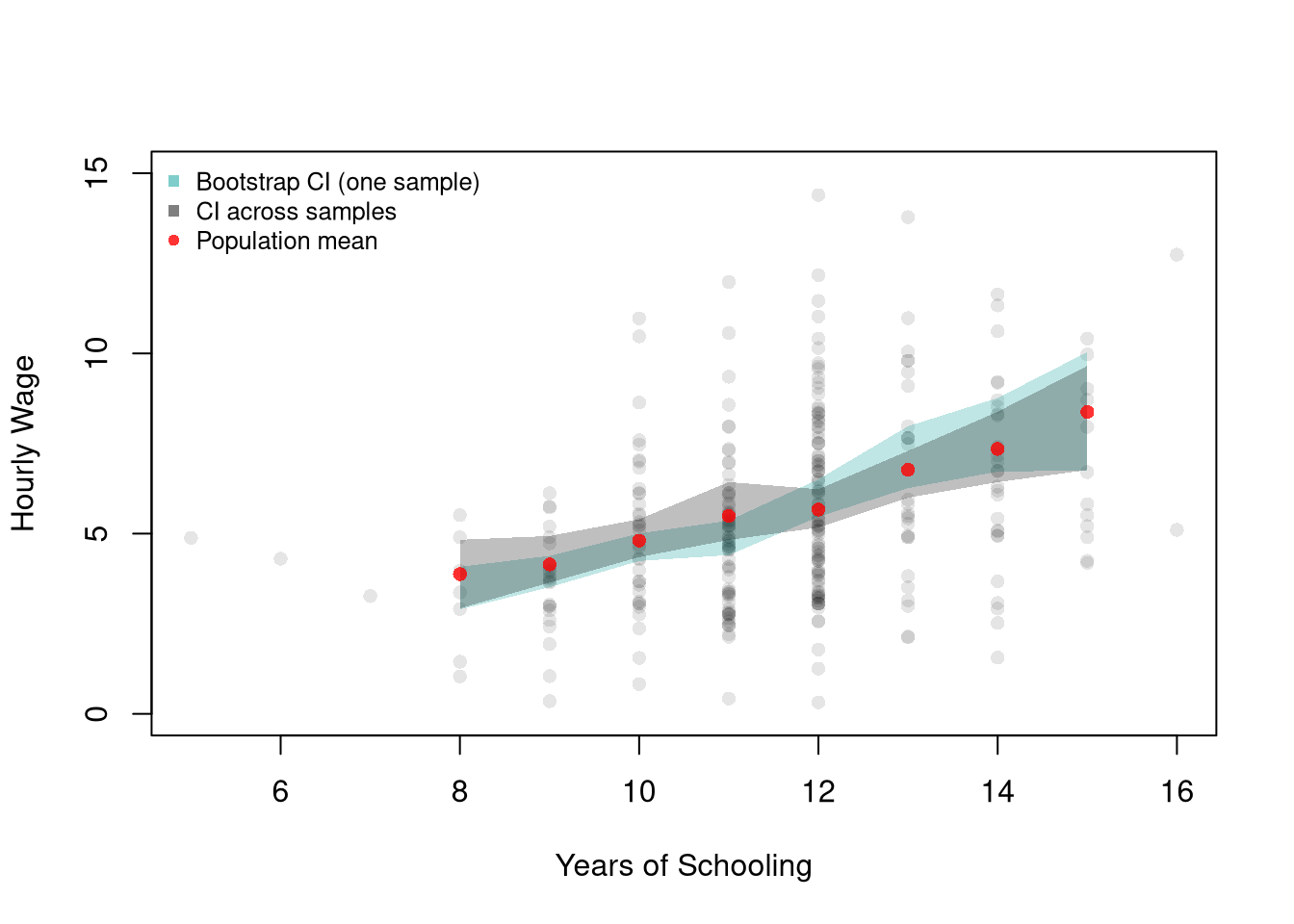
The two bands typically have a similar width, so the bootstrap from one sample gives a reasonable idea of the variation across samples. The bootstrap band is centered on the one sample we happen to have, however, so it can sit a little above or below the population curve.
The same comparison can be made with a simulated process, where the true mean is a smooth function of a continuous variable. Here yearly productivity depends on age.
## Ages
Xmx <- 70
Xmn <- 15

##Generate Sample Data
sim_xy <- function(n=1000){
    x_sim <- seq(Xmn, Xmx, length.out=n)
    ## Random Productivity
    e <- runif(n, 0, 1E6)
    beta <-  1E-10*exp(1.4*x_sim -.015*x_sim^2)
    y_sim    <-  (beta*x_sim + e)/10
    return(data.frame(y_sim, x_sim))
}
xy_sim <- sim_xy(1000)
xy_sim <- xy_sim[order(xy_sim[, 'x_sim']), ]

## Data from one sample
plot(y_sim ~ x_sim, data=xy_sim, pch=16, col=grey(0, .05),
    main=NA, ylab='Yearly Productivity ($)', xlab='Age' )
reg_lo <- loess(y_sim ~ x_sim, data=xy_sim, span=.8)

## Plot Bootstrap CI for Single Sample
pred_design <- data.frame(x_sim=seq(Xmn, Xmx))
y_fit <- predict(reg_lo, newdata=pred_design)
boot_lo <- matrix(NA, nrow=nrow(pred_design), ncol=399)
for (b in 1:399) {
    xy_boot <- xy_sim[sample(nrow(xy_sim), replace=TRUE), ]
    reg_i <- loess(y_sim ~ x_sim, data=xy_boot, span=.8)
    boot_lo[, b] <- predict(reg_i, newdata=pred_design)
}
boot_cb <- apply(boot_lo, 1, quantile,
    probs=c(.025, .975), na.rm=TRUE)
polygon(
    c(pred_design[[1]], rev(pred_design[[1]])),
    c(boot_cb[1, ], rev(boot_cb[2, ])),
    col=hcl.colors(3, alpha=.25)[2],
    border=NA)

# Construct CI across Multiple Samples
sample_lo <- matrix(NA, nrow=nrow(pred_design), ncol=399)
for (b in 1:399) {
    xy_sim_b <- sim_xy(1000) #Entirely new sample
    reg_b <- loess(y_sim ~ x_sim, data=xy_sim_b, span=.8)
    sample_lo[, b] <- predict(reg_b, newdata=pred_design)
}
ci_lo <- apply(sample_lo, 1, quantile,
    probs=c(.025, .975), na.rm=TRUE)
polygon(
    c(pred_design[[1]], rev(pred_design[[1]])),
    c(ci_lo[1, ], rev(ci_lo[2, ])),
    col=grey(0, alpha=.25),
    border=NA)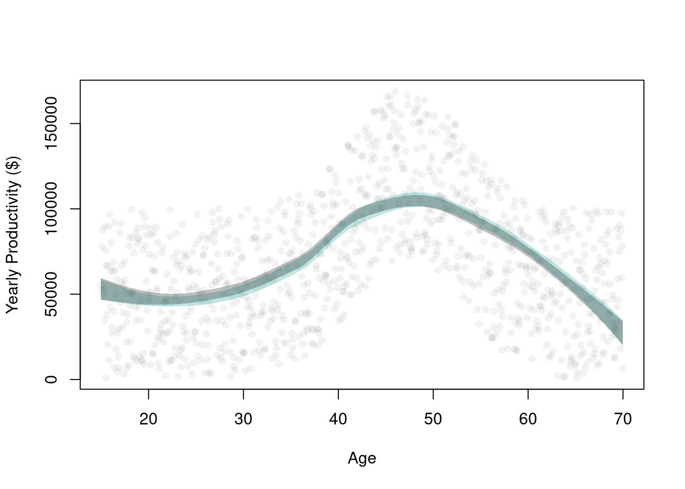
The plot below shows the average prediction across many samples of \(200\) workers against the population mean wage at each schooling level. Notice that LOESS tracks the population curve closely. Notice that a linear model does not: it is too high at \(12\) years of schooling and too low at \(13\) to \(15\) years.
## Shared settings used by Bias, Variance, and the Decomposition
n_rep <- 300
n_seq <- c(50, 100, 200, 400, 800)
n_bias <- 200
x_target <- 12 # high school graduates

## Predictions at x_target: one row per sample, one column per sample size
target_lm_sim <- matrix(NA, nrow=n_rep, ncol=length(n_seq))
target_lo_sim <- matrix(NA, nrow=n_rep, ncol=length(n_seq))

## Predictions at every schooling level when n == n_bias
curves_lm_sim <- matrix(NA, nrow=length(x_levels), ncol=n_rep)
curves_lo_sim <- matrix(NA, nrow=length(x_levels), ncol=n_rep)

## One sweep over sample sizes
for (ni in seq_along(n_seq)) {
    n <- n_seq[ni]
    for (r in 1:n_rep) {
        xy_sim <- draw_xy(n)
        fit_lm <- lm(y_hat ~ x_hat, data=xy_sim)
        fit_lo <- loess(y_hat ~ x_hat, data=xy_sim, span=span_wage, degree=1)
        pred_lm <- predict(fit_lm, newdata=data.frame(x_hat=x_levels))
        pred_lo <- predict(fit_lo, newdata=data.frame(x_hat=x_levels))
        target_lm_sim[r, ni] <- pred_lm[x_levels == x_target]
        target_lo_sim[r, ni] <- pred_lo[x_levels == x_target]
        if (n == n_bias) {
            curves_lm_sim[, r] <- pred_lm
            curves_lo_sim[, r] <- pred_lo
        }
    }
}m_lm_hat <- rowMeans(curves_lm_sim, na.rm=TRUE)
m_lo_hat <- rowMeans(curves_lo_sim, na.rm=TRUE)
y_rng <- range(c(population_levels, m_lm_hat, m_lo_hat), na.rm=TRUE)
plot(x_levels, population_levels, type='b', pch=16, lwd=2,
col=rgb(0, 0, 0, .8), ylim=y_rng,
xlab='Years of Schooling', ylab='Mean Hourly Wage', main=NA)
lines(x_levels, m_lm_hat, type='b', pch=16, lwd=2, col=rgb(1, 0, 0, .8))
lines(x_levels, m_lo_hat, type='b', pch=16, lwd=2, col=rgb(0, 0, 1, .8))
legend('topleft', lty=1, lwd=2, bty='n',
col=c(rgb(0, 0, 0, .8), rgb(1, 0, 0, .8), rgb(0, 0, 1, .8)),
legend=c('Population mean',
'Linear',
paste0('Loess(', span_wage, ')')
))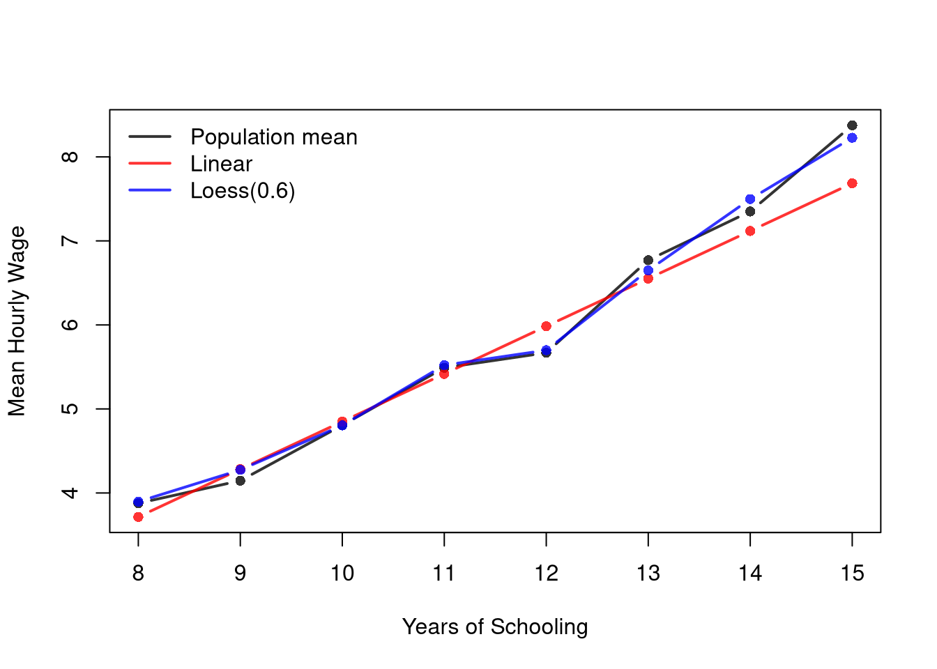
The linear bias does not go away with more data. Fit to the whole population, the line predicts a mean wage of \(5.96\) at \(12\) years of schooling, while the population mean is \(5.67\).
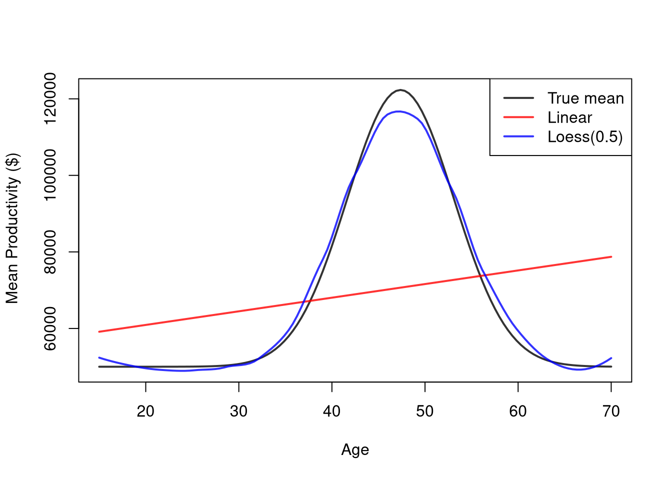
The simulated age-productivity process shows the same pattern. The true mean is a smooth curve, so the average LOESS fit tracks it and the average linear fit does not.
set.seed(123)

## Shared parameters used by Bias and Variance
n_rep        <- 300
n_bias   <- 200
Nseq     <- seq(50, 500, by=50)
span_lo  <- 0.5
true_m   <- function(x) (1E-10*exp(1.4*x - .015*x^2)*x + 5E5) / 10
x_grid   <- seq(Xmn, Xmx, length.out=120)
m0       <- true_m(x_grid)
pred_design <- data.frame(x_sim=x_grid)

## Storage for Bias predictions (filled when n == n_bias)
pred_lm_bias <- matrix(NA_real_, nrow=length(x_grid), ncol=n_rep)
pred_lo_bias <- matrix(NA_real_, nrow=length(x_grid), ncol=n_rep)

## One sweep: gradient SEs across all n, plus bias predictions at n_bias
SE <- matrix(NA, nrow=2, ncol=length(Nseq))
for (ni in seq_along(Nseq)) {
    n <- Nseq[ni]
    stats <- matrix(NA, nrow=2, ncol=n_rep)
    for (b in 1:n_rep) {
        xy_sim_b <- sim_xy(n)
        fit_lm <- lm(y_sim ~ x_sim, data=xy_sim_b)
        fit_lo <- loess(y_sim ~ x_sim, data=xy_sim_b, span=span_lo)
        grad_lo <- diff(predict(fit_lo))/diff(xy_sim_b[, 'x_sim'])
        if(n == n_bias){
            pred_lm_bias[, b] <- predict(fit_lm, newdata=pred_design)
            pred_lo_bias[, b] <- predict(fit_lo, newdata=pred_design)
        }
        stats[, b] <- c(coef(fit_lm)[2], mean(grad_lo, na.rm=TRUE))
    }
    SE[, ni] <- apply(stats, 1, sd)
}m_lm_hat <- rowMeans(pred_lm_bias, na.rm=TRUE)
m_lo_hat <- rowMeans(pred_lo_bias, na.rm=TRUE)
y_rng <- range(c(m0, m_lm_hat, m_lo_hat), na.rm=TRUE)
plot(x_grid, m0, type='l', lwd=2, col=rgb(0, 0, 0, .8), ylim=y_rng,
xlab='Age', ylab=' Mean Productivity ($)', main=NA)
lines(x_grid[is.finite(m_lm_hat)], m_lm_hat[is.finite(m_lm_hat)], lwd=2, col=rgb(1, 0, 0, .8))
lines(x_grid[is.finite(m_lo_hat)], m_lo_hat[is.finite(m_lo_hat)], lwd=2, col=rgb(0, 0, 1, .8))
legend('topright', lty=1, lwd=2, col=c(rgb(0, 0, 0, .8), rgb(1, 0, 0, .8), rgb(0, 0, 1, .8)),
legend=c('True mean',
'Linear',
paste0('Loess(', span_lo, ')')
))
The model estimates also vary from sample to sample. The plot below shows the standard error of each model’s predicted mean wage at \(12\) years of schooling, computed across the repeated samples. Notice that the linear prediction generally varies less than the LOESS prediction, even though it is biased.
Also notice that there are diminishing returns to larger sample sizes. Both predictions vary less from sample to sample as \(n\) grows, making confidence intervals narrower and hypothesis tests more accurate.
se_sim <- rbind(
    apply(target_lm_sim, 2, sd, na.rm=TRUE),
    apply(target_lo_sim, 2, sd, na.rm=TRUE))
cols <- c(rgb(1, 0, 0, .8), rgb(0, 0, 1, .8))
matplot(n_seq, t(se_sim), type='b', pch=16,
    lty=1, lwd=2, col=cols,
    ylab='standard error', xlab='sample size',
    main=NA)
legend('topright',
    lty=1, lwd=2, col=cols,
    legend=c('Linear', paste0('Loess(', span_wage, ')')))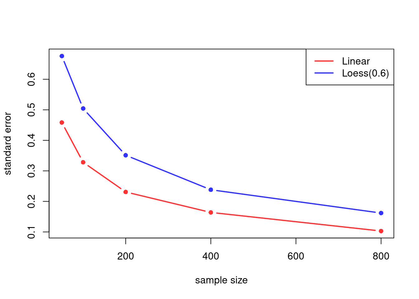
In the simulated age-productivity process, compare the OLS slope coefficient with the LOESS mean gradient. The OLS slope generally varies less, and both vary less as \(n\) grows.
cols <- c(rgb(1, 0, 0, .8), rgb(0, 0, 1, .8))
matplot(Nseq, t(SE), type='b', pch=16,
    lty=1, lwd=2, col=cols,
    ylab='standard error', xlab='sample size',
    main=NA)
legend('topright',
    lty=1, lwd=2, col=cols,
    legend=c('OLS slope', 'Loess mean gradient'))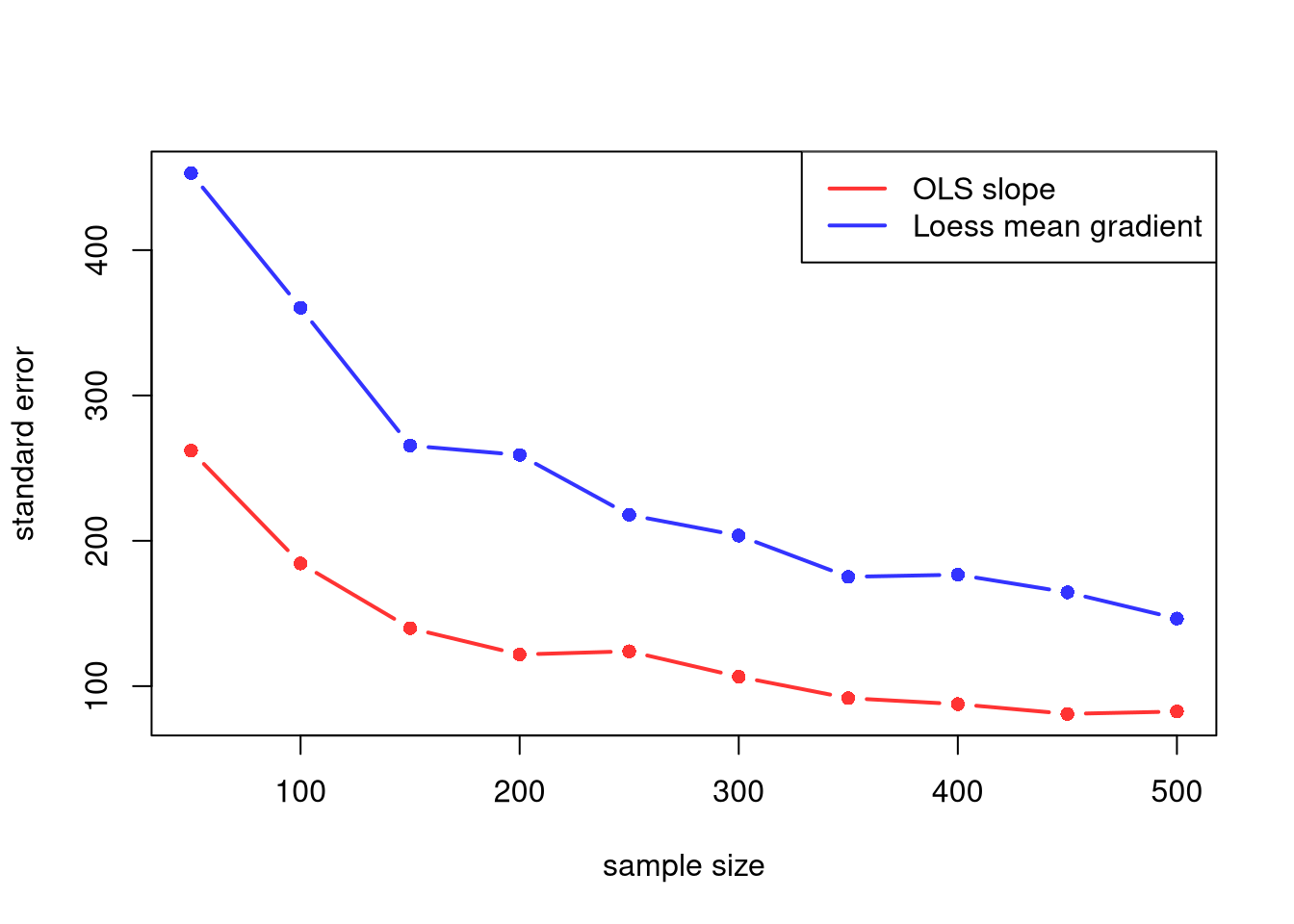
The applied section in Inference introduced the bias-variance tradeoff intuitively with the bandwidth knob; here we decompose it formally and check both pieces with simulations.
The bias-variance decomposition is useful as the formal expression of why we cannot simply minimize one source of error and ignore the other: cutting one usually raises the other, so there is a tradeoff to navigate. Concretely:
The mean squared error (MSE) adds the two pieces together. The code below computes the squared bias, the variance, and the MSE of each model’s prediction at \(12\) years of schooling, for each sample size.
# Squared bias, variance, and MSE for each column (sample size)
truth_target <- population_curve[as.character(x_target)]
mse_parts <- function(P, truth){
    bias2 <- (colMeans(P, na.rm=TRUE) - truth)^2
    variance <- apply(P, 2, var, na.rm=TRUE)
    mse <- colMeans((P - truth)^2, na.rm=TRUE)
    return(cbind(bias2, variance, mse))
}
parts_lm <- mse_parts(target_lm_sim, truth_target)
parts_lo <- mse_parts(target_lo_sim, truth_target)
rownames(parts_lm) <- rownames(parts_lo) <- paste0('n=', n_seq)
round(parts_lm, 3) # Linear
##       bias2 variance   mse
## n=50  0.060    0.210 0.270
## n=100 0.070    0.108 0.177
## n=200 0.100    0.053 0.153
## n=400 0.093    0.027 0.120
## n=800 0.088    0.011 0.099
round(parts_lo, 3) # Loess
##       bias2 variance   mse
## n=50  0.000    0.457 0.456
## n=100 0.000    0.254 0.254
## n=200 0.001    0.123 0.124
## n=400 0.000    0.057 0.057
## n=800 0.000    0.026 0.026

# MSE across sample sizes
cols <- c(rgb(1, 0, 0, .8), rgb(0, 0, 1, .8))
matplot(n_seq, cbind(parts_lm[, 'mse'], parts_lo[, 'mse']),
    type='b', pch=16, lty=1, lwd=2, col=cols,
    ylab='mean squared error', xlab='sample size',
    main=NA)
legend('topright',
    lty=1, lwd=2, col=cols,
    legend=c('Linear', paste0('Loess(', span_wage, ')')))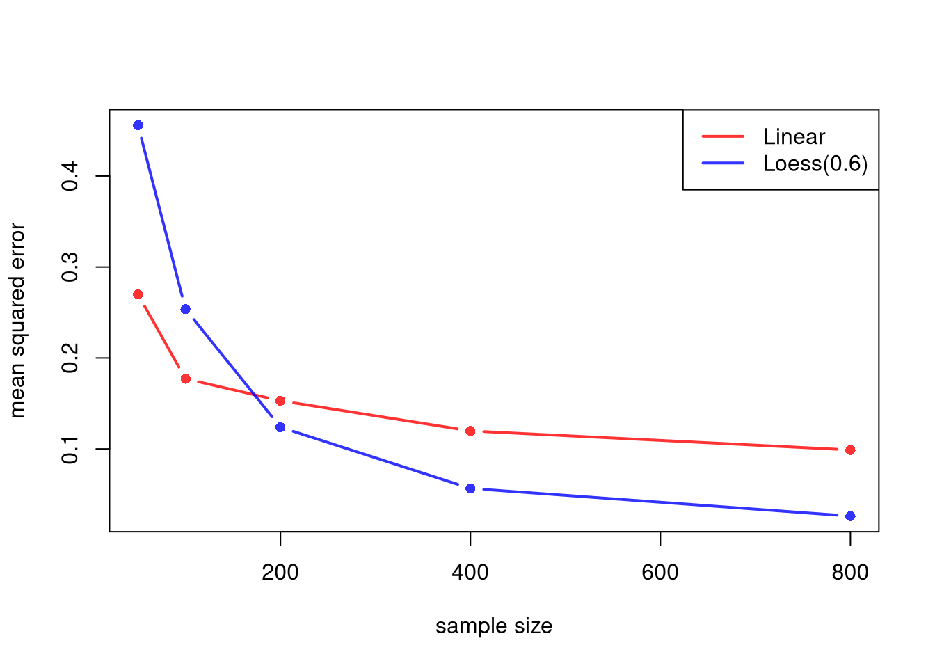
For the linear model, the squared bias stays roughly the same as \(n\) grows, while the variance shrinks. For LOESS, the squared bias is typically close to zero, and the MSE is mostly variance. With small samples, the stable linear model typically has the lower MSE. With large samples, the flexible LOESS model typically has the lower MSE.
The bias-variance tradeoff raises a question: can both be reduced simultaneously as \(n\) grows? For local regression, the answer is yes, provided we shrink the bandwidth as \(n\) grows. The neighborhood shrinks (reducing bias) while the local sample size still grows (reducing variance). This is often written as bandwidth conditions: \[ h_n \to 0 \quad\text{and}\quad n h_n \to \infty. \] In LOESS language, this corresponds to the span shrinking with \(n\), but not too fast.
The simulation below illustrates this at one target point, \(12\) years of schooling. The span is \(2n^{-1/5}\), which satisfies the same two conditions as \(n^{-1/5}\). The factor \(2\) keeps the span above \(0.5\) for these sample sizes, since about a third of workers have exactly \(12\) years of schooling and narrower spans can leave no other schooling levels in the neighborhood, where loess() breaks down. The mean absolute error in estimating the population mean wage tends to decrease with larger \(n\).
x_target <- 12 # high school graduates
n_grid <- c(50, 100, 200, 400, 800)
n_rep <- 200

avg_abs_err <- numeric(length(n_grid))
for (ni in seq_along(n_grid)) {
    n <- n_grid[ni]
    span_n <- min(0.9, 2*n^(-1/5)) # shrinks with n
    errs <- replicate(n_rep, {
        xy_sim <- draw_xy(n)
        fit <- loess(y_hat ~ x_hat, data=xy_sim, span=span_n, degree=1)
        y_fit <- predict(fit, newdata=data.frame(x_hat=x_target))
        abs(y_fit - population_curve[as.character(x_target)])
    })
    avg_abs_err[ni] <- mean(errs, na.rm=TRUE)
}

plot(n_grid, avg_abs_err, type='b', pch=16,
     xlab='Sample size (n)',
     ylab='Mean Absolute Error',
     main=NA)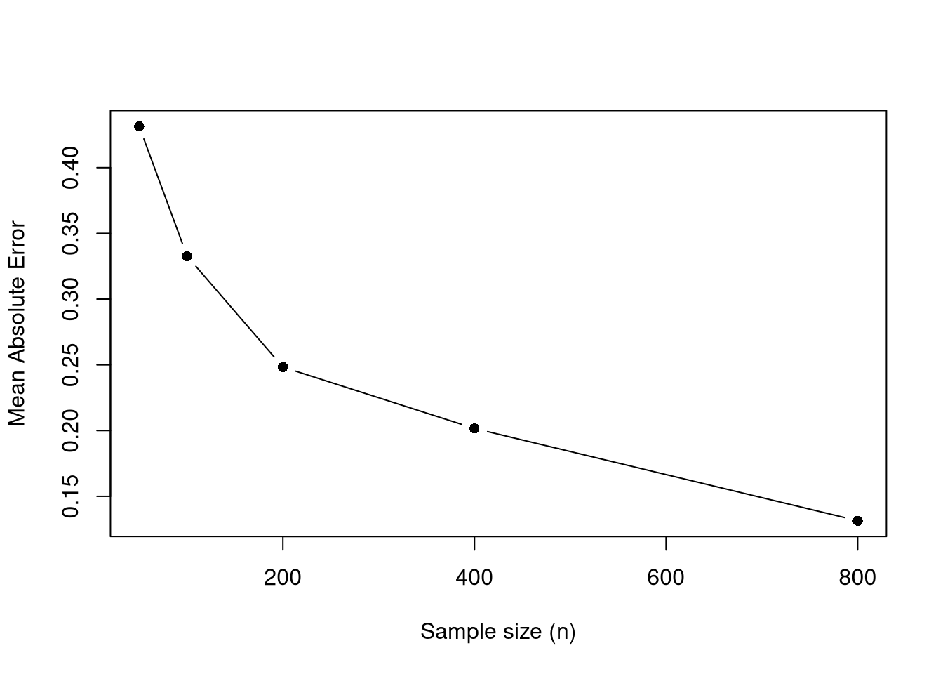
The same check can be made in the simulated age-productivity process, at age \(40\).
set.seed(42)

x_target <- 40  # mid-career age
n_grid <- c(60, 120, 240, 480)
n_rep <- 120

avg_abs_err <- numeric(length(n_grid))
for (ni in seq_along(n_grid)) {
  n <- n_grid[ni]
  span_n <- min(0.9, n^(-1/5)) # shrinks with n
  errs <- replicate(n_rep, {
    xy_sim_b <- sim_xy(n)
    fit <- loess(y_sim ~ x_sim, data=xy_sim_b, span=span_n, degree=1)
    y_fit <- predict(fit, newdata=data.frame(x_sim=x_target))
    abs(y_fit - true_m(x_target))
  })
  avg_abs_err[ni] <- mean(errs, na.rm=TRUE)
}

plot(n_grid, avg_abs_err, type='b', pch=16,
     xlab='Sample size (n)',
     ylab='Mean Absolute Error',
     main=NA)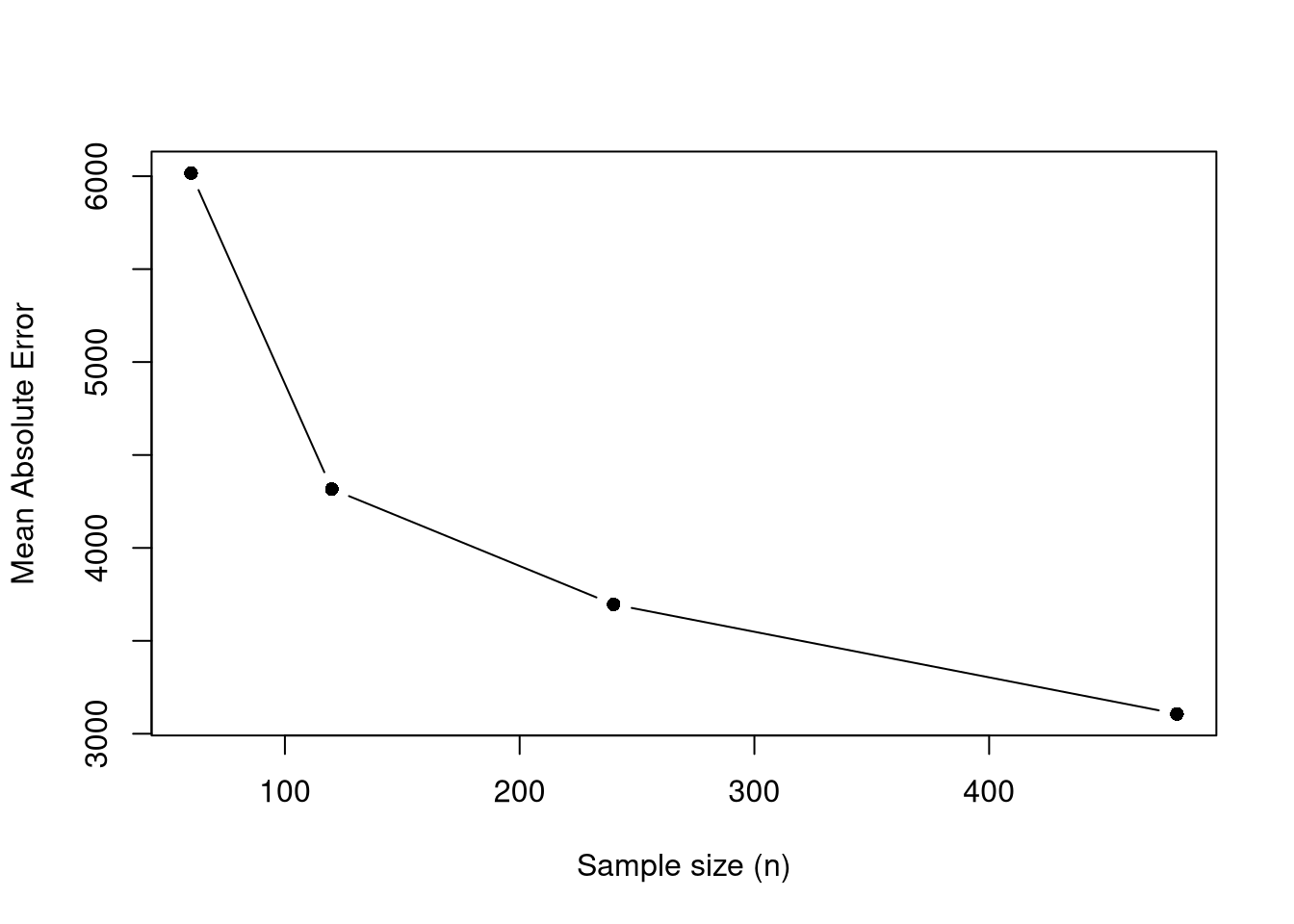
A similar result holds for OLS when the true relationship is linear. Even with unlimited data, however, a misspecified model cannot recover the true conditional mean, as the linear fit to the wage population shows. These results concern prediction across samples; they do not establish that changing \(X\) would cause \(Y\) to change.
Comment the script you wrote for this chapter, then restart R and check that it runs from a clean session, then check the script with AI as explained in Working with AI. Write three sentences from memory on the main statistical idea of this chapter, and ask the assistant what is wrong, vague, or missing. Finish with your own questions about whatever you found hardest.
Use UCBAdmissions to compute what the pooled admission rate for men and for women would be if both applied to the six departments in the same proportions as all applicants combined. To do this, weight each group’s within-department admission rates by the combined share of applicants in each department. Compare these adjusted rates with the pooled rates shown in this chapter, then explain why the adjustment does not by itself establish whether admissions were discriminatory.
Give an example of a dataset where Pearson’s correlation \(\hat{r}_{XY}\) is close to zero but there is a clear causal relationship between \(X\) and \(Y\). What feature of the relationship causes the correlation to miss it, and which alternative statistic from Statistics of Association might detect it?
Explain why a model can have low prediction error but still fail to estimate the causal effect of \(X\) on \(Y\). In your answer, distinguish the bias-variance tradeoff from confounding and selection bias.
Simpson’s paradox showed that a pooled relationship can reverse the within-group relationships: at Berkeley, men had the higher pooled admission rate even though women had the higher rate in four of six departments. The correlation examples showed both causation without linear correlation and correlation without causation. The bias-variance analysis showed how model flexibility affects prediction across samples, but predictive performance alone does not identify a causal effect.
A ratio can also change due to changes in either the numerator or the denominator.↩︎