22  Multivariate Distributions


Most datasets record more than two variables for each observation. A state has a murder rate, an assault rate, an urban share, and a region. A worker has a wage, years of schooling, years of experience, and a sex. This chapter describes such data with tables and figures before any model is fit: three-way tables for discrete data, scatterplot matrices for continuous data, and conditioning plots and grouped summaries for mixed data. The recurring lesson is that a comparison between two variables can look different once a third variable is held fixed. The only prerequisites are the data frames, proportions, ECDFs, and boxplots from Data & Visualization, and the scatterplot from Bivariate Distributions.

22.1 Discrete Data

Three-Way Tables

Joint Distributions tabulated two discrete variables at once. With three, the table gains a third dimension.

ImportantKey Definition

The joint distribution of three discrete variables \(\hat{x}_{i}\), \(\hat{y}_{i}\), and \(\hat{z}_{i}\) is the share of observations with each combination of values: \[\hat{p}(x,y,z) = \sum_{i=1}^{n}\mathbf{1}\left( \hat{x}_{i}=x, \hat{y}_{i}=y, \hat{z}_{i}=z \right)/n.\] Summing over the values of one variable collapses the table to the two-way joint distribution of the other two, for example \(\hat{p}(x,y) = \sum_{z} \hat{p}(x,y,z)\).

A three-way table is useful whenever a two-way comparison might depend on a third factor: it keeps every combination visible, and collapsing it recovers the two-way table you would have made had you ignored the third variable. The built-in UCBAdmissions data record graduate applications to six departments at Berkeley in 1973 by admission outcome and gender. R stores it directly as a three-way table of counts.

Code
# Three factors: Admit (2 levels), Gender (2 levels), Dept (6 levels)
dim(UCBAdmissions)
## [1] 2 2 6
dimnames(UCBAdmissions)
## $Admit
## [1] "Admitted" "Rejected"
## 
## $Gender
## [1] "Male"   "Female"
## 
## $Dept
## [1] "A" "B" "C" "D" "E" "F"

# ftable() flattens the table so it prints on one page
ftable(UCBAdmissions, row.vars=c('Dept', 'Gender'), col.vars='Admit')
##             Admit Admitted Rejected
## Dept Gender                        
## A    Male              512      313
##      Female             89       19
## B    Male              353      207
##      Female             17        8
## C    Male              120      205
##      Female            202      391
## D    Male              138      279
##      Female            131      244
## E    Male               53      138
##      Female             94      299
## F    Male               22      351
##      Female             24      317

Dividing by the total number of applicants gives the joint distribution, and margin.table() collapses it.

Code
# Joint distribution over all 24 cells
n <- sum(UCBAdmissions)
p_xyz <- UCBAdmissions / n

# Collapse over Dept to get the two-way distribution of Admit and Gender
p_xy <- margin.table(p_xyz, c(1, 2))
round(p_xy, 3)
##           Gender
## Admit       Male Female
##   Admitted 0.265  0.123
##   Rejected 0.330  0.282

# Collapse further to the marginal distribution of Gender
round(margin.table(p_xyz, 2), 3)
## Gender
##   Male Female 
##  0.595  0.405

Suppose \(n=20\) workers are recorded by sex (\(x\)), whether they were promoted (\(y\)), and whether they hold a degree (\(z\)).

No degree Degree
Men, promoted 2 4
Men, not promoted 6 2
Women, promoted 1 3
Women, not promoted 1 1

The joint proportion of promoted men without a degree is \(\hat{p}(\text{man}, \text{promoted}, \text{no degree}) = 2/20 = 0.10\). Collapsing over degree, the share of promoted men is \(\hat{p}(\text{man}, \text{promoted}) = (2+4)/20 = 0.30\). Collapsing again, the marginal share of men is \((2+6+4+2)/20 = 0.70\).

Code
# Build the same table from a small data frame, one row per worker
xy0_hat <- data.frame(
    sex=rep(c('man', 'woman'), c(14, 6)),
    degree=c(rep(c('no', 'yes'), c(8, 6)), rep(c('no', 'yes'), c(2, 4))),
    promoted=c(rep(c(1, 0), c(2, 6)), rep(c(1, 0), c(4, 2)),
        rep(c(1, 0), c(1, 1)), rep(c(1, 0), c(3, 1))))
tab <- table(xy0_hat)
ftable(tab, row.vars=c('sex', 'promoted'), col.vars='degree')
##                degree no yes
## sex   promoted              
## man   0                6   2
##       1                2   4
## woman 0                1   1
##       1                1   3

# Collapse over degree
round(margin.table(tab / sum(tab), c(1, 3)), 2)
##        promoted
## sex       0   1
##   man   0.4 0.3
##   woman 0.1 0.2

Conditional Proportions

Collapsing hides the third variable. Conditioning does the opposite: it fixes the third variable at one value and compares within that slice.

ImportantKey Definition

The conditional distribution of \(\hat{y}_{i}\) given \(\hat{x}_{i}=x\) and \(\hat{z}_{i}=z\) is the share of observations with \(\hat{y}_{i}=y\) inside the subgroup where both conditioning variables take the stated values: \[\hat{p}(y \mid x, z) = \frac{\hat{p}(x,y,z)}{\hat{p}(x,z)}.\]

Conditional proportions are useful for comparing groups on equal footing: the admission rate for women in department A is compared with the rate for men in department A, so differences in which departments people apply to cannot drive the comparison. In R, prop.table() with a margin= argument divides each cell by the total of its slice.

Code
# Admission rate by Gender, pooling all departments
p_pooled <- prop.table(margin.table(UCBAdmissions, c(1, 2)), margin=2)
round(p_pooled['Admitted', ], 2)
##   Male Female 
##   0.45   0.30

# Admission rate by Gender within each Dept
p_within <- prop.table(UCBAdmissions, margin=c(2, 3))
round(p_within['Admitted', , ], 2)
##         Dept
## Gender      A    B    C    D    E    F
##   Male   0.62 0.63 0.37 0.33 0.28 0.06
##   Female 0.82 0.68 0.34 0.35 0.24 0.07

Pooled over departments, men were admitted at a higher rate than women. Within departments, women were admitted at a similar or higher rate in four of the six. Both tables are correct summaries of the same data. They differ because the departments differ in how selective they are and in who applies to them, which the pooled table mixes together.

Code
# Where did each gender apply? Share of each gender's applications going to each Dept
p_apply <- prop.table(margin.table(UCBAdmissions, c(2, 3)), margin=1)
round(p_apply, 2)
##         Dept
## Gender      A    B    C    D    E    F
##   Male   0.31 0.21 0.12 0.15 0.07 0.14
##   Female 0.06 0.01 0.32 0.20 0.21 0.19

# How selective is each Dept? Admission rate by Dept, pooling genders
p_dept <- prop.table(margin.table(UCBAdmissions, c(1, 3)), margin=2)
round(p_dept['Admitted', ], 2)
##    A    B    C    D    E    F 
## 0.64 0.63 0.35 0.34 0.25 0.06

Most men applied to departments A and B, which admitted more than half of their applicants. Most women applied to departments C through F, which admitted a third or fewer. Not Causation names this reversal Simpson’s paradox and discusses what it does and does not say about discrimination. For now, the descriptive lesson is enough: report the within-group comparison alongside the pooled one, and say how the groups differ in composition.

Compute the number of applicants in each cell of the Gender by Dept table with margin.table(UCBAdmissions, c(2, 3)). Which two departments account for most of the male applicants, and what were their admission rates? Then verify that p_within can be rebuilt from the joint distribution as \(\hat{p}(x,y,z) / \hat{p}(x,z)\), using p_xyz and margin.table(p_xyz, c(2, 3)).

22.2 Continuous Data

Scatterplot Matrices

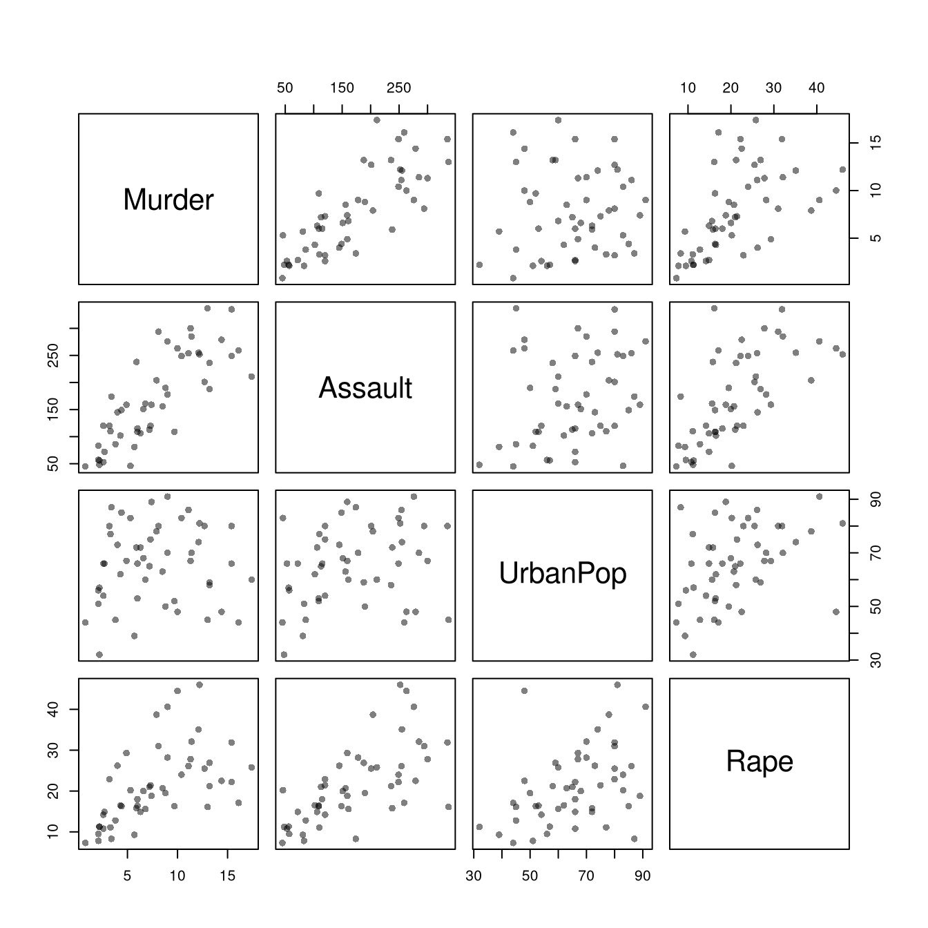
For two cardinal variables, the basic figure is the scatterplot: one point per observation, with \(\hat{x}_{i}\) on the horizontal axis and \(\hat{y}_{i}\) on the vertical axis. We return to USArrests, which records four cardinal variables for each state, so there are six pairs. A scatterplot matrix draws all of them in one grid, so you can scan every pairwise relationship at once.

Code
# Store the observed data, one row per state
xy_hat <- USArrests

# Every pair of variables, one panel each
pairs(xy_hat, pch=16, col=grey(0, .5), main=NA)

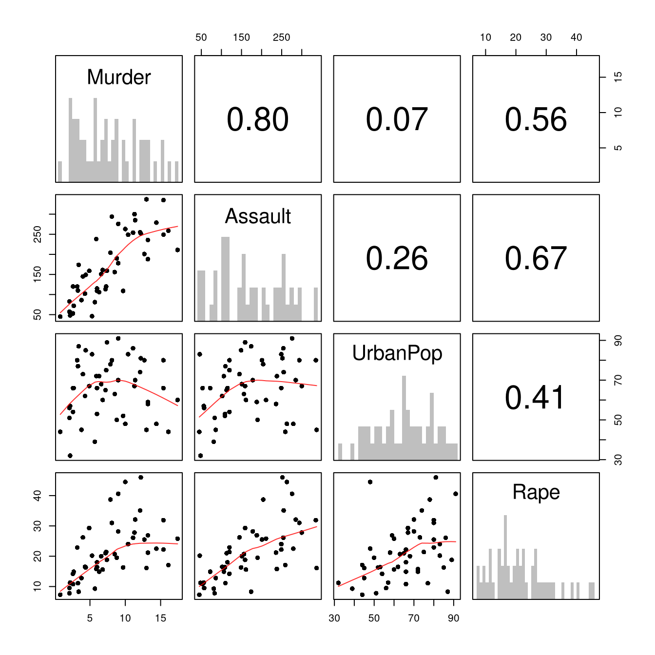
The panel in row Murder and column Assault plots murder rates on the vertical axis against assault rates on the horizontal axis. The panel below the diagonal repeats the panel above it with the axes swapped, so you only need to read one triangle. The psych package adds histograms on the diagonal and a summary of each pairwise relationship in the upper triangle.

Code
# pairs.panels lays out univariate histograms on the diagonal,
# scatterplots in the lower triangle, and correlations in the upper triangle.
psych::pairs.panels(xy_hat,
    hist.col=grey(0, .25), breaks=30, density=FALSE, hist.border=NA, # Diagonal
    ellipses=FALSE, rug=FALSE, smoother=FALSE, pch=16, col=rgb(1, 0, 0, .8) # Lower Triangle
    )

The diagonal shows univariate histograms. The lower triangle shows scatterplots between each pair of variables. The upper triangle shows correlation coefficients, a summary of linear association between \(-1\) and \(1\) that Associations defines. Scan the matrix for three things: (1) pairs where the cloud bends rather than running straight, (2) points far from the rest of the cloud, and (3) pairs so tightly related that they carry almost the same information. Which pair of variables in USArrests is most tightly related, and which variable is nearly unrelated to the others?

Encoding More Variables

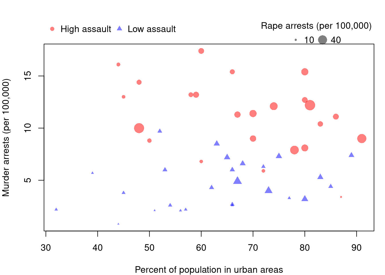
A scatterplot has two axes, but a point has more attributes than position: color, shape, and size can each carry another variable. The figure below colors and shapes each state by whether its assault rate is above the median, and sizes each point by its rape arrest rate.

Code
# Split states at the median assault rate
assault_high <- xy_hat$Assault > median(xy_hat$Assault)
col_high <- rgb(1, 0, 0, .5)
col_low <- rgb(0, 0, 1, .5)
cols <- ifelse(assault_high, col_high, col_low)
pchs <- ifelse(assault_high, 16, 17)

# Scale point size by a fourth variable
sizes <- xy_hat$Rape / max(xy_hat$Rape) * 2.5

# Legends go in the margin above the plot so they cover no points
par(mar=c(4, 4, 4, 1))
plot(Murder ~ UrbanPop, data=xy_hat, pch=pchs, col=cols, cex=sizes,
    xlab='Percent of population in urban areas',
    ylab='Murder arrests (per 100,000)', main=NA)
legend('topleft', inset=c(0, -.14), xpd=TRUE, horiz=TRUE, bty='n',
    legend=c('High assault', 'Low assault'),
    pch=c(16, 17), col=c(col_high, col_low))
legend('topright', inset=c(0, -.14), xpd=TRUE, horiz=TRUE, bty='n',
    title='Rape arrests (per 100,000)', legend=c('10', '40'),
    pch=16, col=grey(0, .5), pt.cex=c(10, 40) / max(xy_hat$Rape) * 2.5)

Two patterns appear that the plain Murder against UrbanPop panel of the matrix hid. High-assault states sit toward the top of the figure at every level of urbanization, so the murder rate tracks the assault rate rather than the urban share. Larger points also cluster toward the top, so states with many murder arrests tend to have many rape arrests too. Each added channel makes the figure harder to read, so two extra variables is a practical limit. Interactive versions, where hovering over a point reveals the state name and every variable at once, are covered in Data Analysis.

22.3 Mixed Data

Conditioning Plots

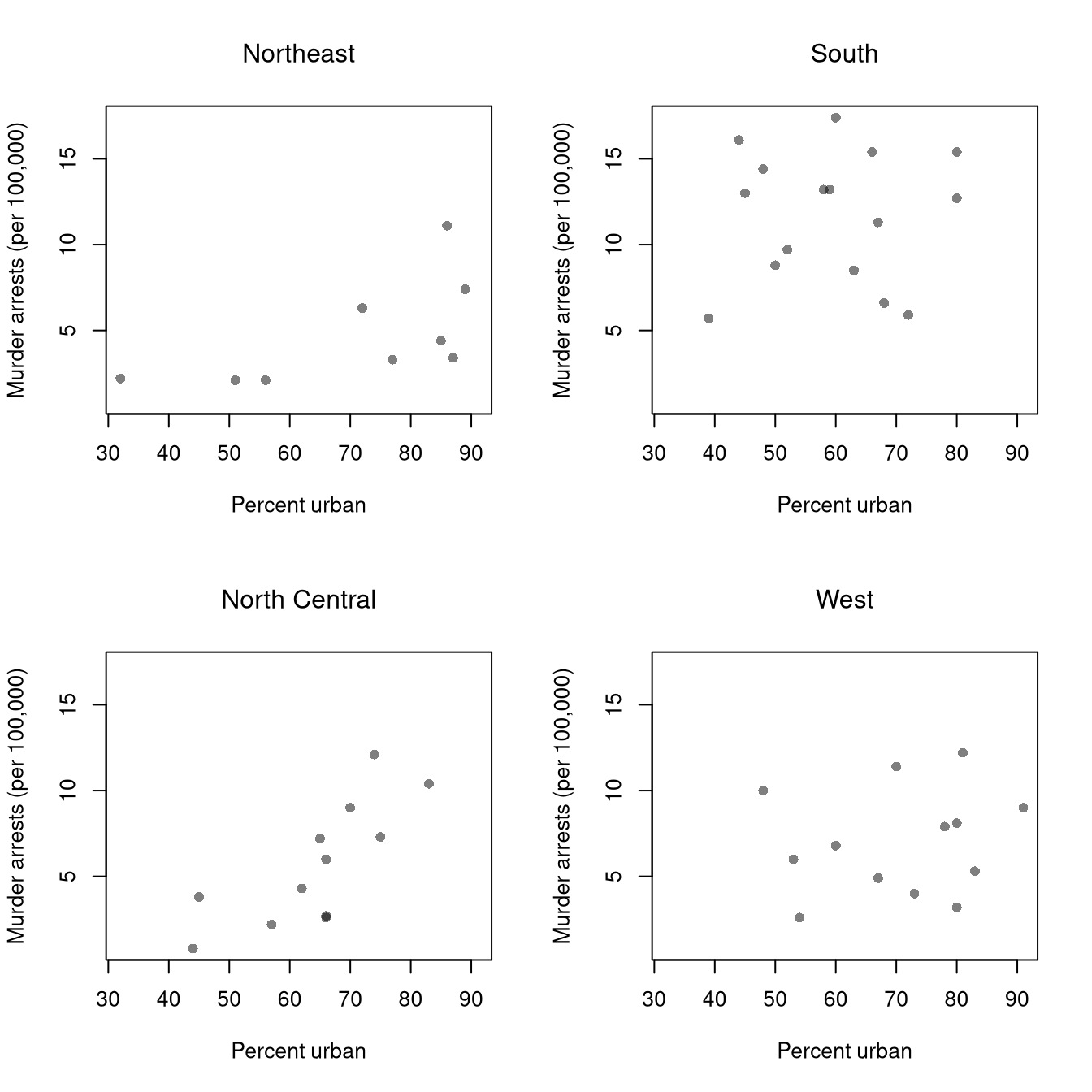
A scatterplot can also be split by a factor: draw it separately for each group. A conditioning plot holds the factor fixed within each panel, so any pattern that appears is a within-group pattern. Comparing More Than Two Groups develops the factor-variable idea and its boxplot and ECDF summaries for one factor at a time; here we go straight to conditioning, and then combine two factors at once below.

Code
# Attach the four-level region factor to the observed data
xy_hat$Region <- state.region
Code
# One scatterplot per region, on common axes so the panels are comparable
par(mfrow=c(2, 2))
for (r in levels(xy_hat$Region)) {
    xy_r_hat <- xy_hat[xy_hat$Region == r, ]
    plot(Murder ~ UrbanPop, data=xy_r_hat, pch=16, col=grey(0, .5),
        xlim=range(xy_hat$UrbanPop), ylim=range(xy_hat$Murder),
        xlab='Percent urban', ylab='Murder arrests (per 100,000)', main=NA)
    title(r, font.main=1)
}

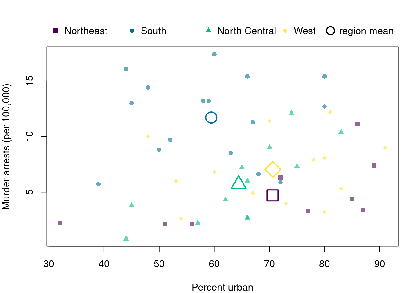
Pooled over regions, murder rates were nearly unrelated to urbanization. Within the Northeast and the North Central states, more urban states have clearly higher murder rates. Within the South and the West there is little pattern, but the South sits high at every level of urbanization. The pooled figure hides the first two patterns because the regions differ so much in their average murder rate.

The pooled and within-group views can be placed on one figure by marking each group with its own symbol and adding each group’s center as a large hollow symbol, so the marker does not cover the states beneath it.

Code
# Small filled points: states, by region; large hollow points: region means
reg_cols <- hcl.colors(4, alpha=.6)
reg_pch <- c(15, 16, 17, 18)
reg_pch_hollow <- c(0, 1, 2, 5)
par(mar=c(4, 4, 4, 1))
plot(Murder ~ UrbanPop, data=xy_hat, pch=reg_pch[xy_hat$Region], col=reg_cols[xy_hat$Region],
    xlab='Percent urban', ylab='Murder arrests (per 100,000)', main=NA)
means <- aggregate(cbind(UrbanPop, Murder) ~ Region, data=xy_hat, FUN=mean)
points(means$UrbanPop, means$Murder, pch=reg_pch_hollow, col=hcl.colors(4), cex=2.5, lwd=2)

# Legends in the margin above the plot
legend('topleft', inset=c(0, -.14), xpd=TRUE, horiz=TRUE, bty='n',
    legend=levels(xy_hat$Region), pch=reg_pch, col=hcl.colors(4))
legend('topright', inset=c(0, -.14), xpd=TRUE, bty='n',
    legend='region mean', pch=1, col='black', pt.cex=1.8, pt.lwd=2)

Conditional means can reverse when pooled, for the same compositional reason as conditional proportions. Suppose \(40\) men and \(40\) women work at a firm, split by whether they hold a degree, with the mean hourly wage in each cell shown below.

Men Women
No degree \(n=10\), mean \(10\) \(n=30\), mean \(11\)
Degree \(n=30\), mean \(20\) \(n=10\), mean \(21\)

Within each degree group, women earn \(1\) more per hour. Pooled, men earn \((10 \cdot 10 + 30 \cdot 20)/40 = 17.5\) and women earn \((30 \cdot 11 + 10 \cdot 21)/40 = 13.5\), so women earn \(4\) less. The pooled mean is a weighted average of the within-group means, \(\hat{m}_{Y}(x) = \sum_{z} \hat{m}_{Y}(x, z)\, \hat{p}(z \mid x)\), and the weights differ by sex: three quarters of the women and only one quarter of the men are in the no-degree group.

Code
# Rebuild the pooled means from the cell means and cell sizes
m_men_hat <- (10 * 10 + 30 * 20) / (10 + 30)
m_women_hat <- (30 * 11 + 10 * 21) / (30 + 10)
c(men=m_men_hat, women=m_women_hat)
##   men women 
##  17.5  13.5

Load Wages1 from the Ecdat package, store it as xy2_hat <- Wages1, and draw a conditioning plot of wage against exper with one panel per sex. Use col=grey(0, .1) since there are \(3294\) points. Then compute the mean wage by sex, pooled and within each value of school, with aggregate(wage ~ sex + school, data=xy2_hat, FUN=mean). Does the pooled gap match the within-schooling gaps?

Two Factors at Once

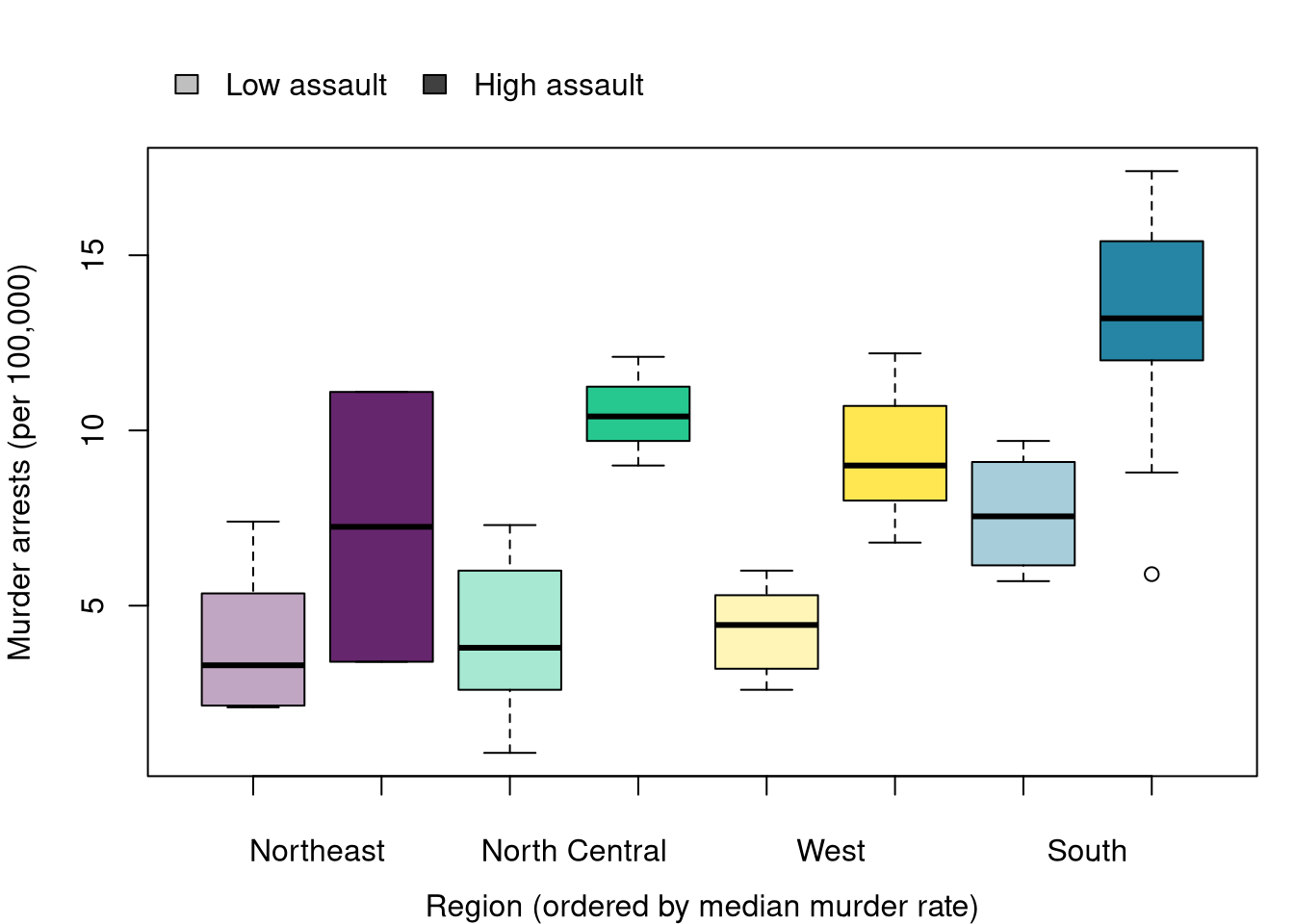
A group summary is not limited to one factor. Encoding More Variables split states into high- and low-assault groups at the median; crossing that split with Region gives eight groups, each small but still worth comparing.

Code
# A second factor: assault rate split at the median, same split as Encoding More Variables
xy_hat$AssaultLevel <- factor(ifelse(xy_hat$Assault > median(xy_hat$Assault), 'High assault', 'Low assault'),
    levels=c('Low assault', 'High assault'))
table(xy_hat$Region, xy_hat$AssaultLevel)
##                
##                 Low assault High assault
##   Northeast               7            2
##   South                   4           12
##   North Central           9            3
##   West                    6            7

A grouped boxplot places the two low/high assault boxes side by side within each region, so a within-region comparison and a between-region comparison are both visible at once. Color keeps the region hues used in Conditioning Plots above, and a lighter or darker shade of each region’s hue marks low or high assault, so hue and shade carry two different variables. Regions are ordered left to right by their median murder rate, from lowest to highest.

Code
# Region hue stays fixed to each region's identity; shade (light/dark) marks assault level.
# Regions are ordered along the x-axis by their median murder rate.
region_order <- names(sort(tapply(xy_hat$Murder, xy_hat$Region, median)))
xy_hat$RegionOrdered <- factor(xy_hat$Region, levels=region_order)
reg_hues <- setNames(hcl.colors(4), levels(xy_hat$Region))
col_low_shade  <- sapply(reg_hues[region_order], adjustcolor, alpha.f=.35)
col_high_shade <- sapply(reg_hues[region_order], adjustcolor, alpha.f=.85)
box_cols <- as.vector(rbind(col_low_shade, col_high_shade))

par(mar=c(4, 4, 4, 1))
boxplot(Murder ~ AssaultLevel + RegionOrdered, data=xy_hat,
    col=box_cols, xaxt='n',
    xlab='Region (ordered by median murder rate)', ylab='Murder arrests (per 100,000)', main=NA)
axis(1, at=seq(1.5, by=2, length.out=4), labels=region_order, tick=FALSE, line=0.5)
axis(1, at=seq_len(8), labels=FALSE)
legend('topleft', inset=c(0, -.16), xpd=TRUE, horiz=TRUE, bty='n',
    legend=c('Low assault', 'High assault'), fill=c(grey(.75), grey(.25)))

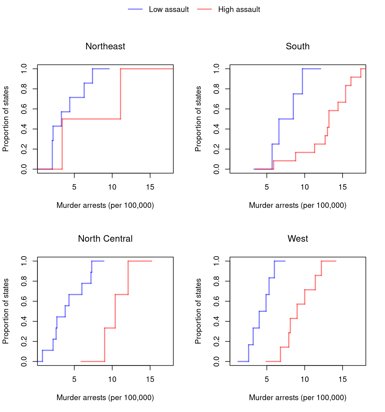
The same comparison as an ECDF, one panel per region, shows the full distribution rather than five numbers per box, with a single legend shared across all four panels.

Code
# One panel per region; within each panel, one ECDF for each assault level
col_high <- rgb(1, 0, 0, .5)
col_low  <- rgb(0, 0, 1, .5)
par(mfrow=c(2, 2), oma=c(0, 0, 3, 0))
for (r in levels(xy_hat$Region)) {
    xy_r_hat <- xy_hat[xy_hat$Region == r, ]
    plot(NULL, xlim=range(xy_hat$Murder), ylim=c(0, 1),
        xlab='Murder arrests (per 100,000)', ylab='Proportion of states', main=NA)
    F_lo_hat <- ecdf(xy_r_hat$Murder[xy_r_hat$AssaultLevel == 'Low assault'])
    F_hi_hat <- ecdf(xy_r_hat$Murder[xy_r_hat$AssaultLevel == 'High assault'])
    plot(F_lo_hat, add=TRUE, col=col_low, lwd=2, verticals=TRUE, do.points=FALSE, col.01line=NA)
    plot(F_hi_hat, add=TRUE, col=col_high, lwd=2, verticals=TRUE, do.points=FALSE, col.01line=NA)
    title(r, font.main=1)
}

# One legend for all four panels, drawn on an invisible full-figure overlay
par(fig=c(0, 1, 0, 1), oma=c(0, 0, 0, 0), mar=c(0, 0, 0, 0), new=TRUE)
plot(0, 0, type='n', bty='n', xaxt='n', yaxt='n')
legend('top', horiz=TRUE, bty='n',
    legend=c('Low assault', 'High assault'), col=c(col_low, col_high), lwd=2)
In every region the high-assault curve sits to the right of the low-assault curve, so the assault-murder link is not an artifact of region. The South’s high-assault states reach the highest murder rates of any group, while its own low-assault states resemble the low-assault states elsewhere. The Northeast panel is the thinnest, with only two high-assault states, so its curve should be read cautiously.

22.4 Exercises

  1. Comment the script you wrote for this chapter, then restart R and check that it runs from a clean session, then check the script with AI as explained in Working with AI. Write three sentences from memory on the main statistical idea of this chapter, and ask the assistant what is wrong, vague, or missing. Finish with your own questions about whatever you found hardest.

  2. Using UCBAdmissions, compute the number of applicants and the admission rate for each department, pooling genders. Then compute the share of all female applicants and the share of all male applicants who applied to each department. Write two sentences that explain the pooled gender gap in admission rates using only these two tables.

  3. The built-in LifeCycleSavings data record the savings rate sr, the share of the population under 15 (pop15) and over 75 (pop75), real disposable income dpi, and its growth rate ddpi for fifty countries, averaged over 1960 to 1970. Draw a scatterplot matrix. Which pair of variables is most tightly related, which panels show a bend rather than a straight cloud, and which country is an outlier in ddpi?

  4. Attach state.region to USArrests and make a conditioning plot of Rape against UrbanPop with one panel per region, on common axes. Then draw the pooled scatterplot. Describe one within-region pattern that the pooled figure hides, or explain why the pooled figure is a fair summary in this case.

Further Reading

Recall

This chapter described data with three or more variables without fitting a model. Three-way tables and prop.table() with a margin= argument showed that men were admitted to Berkeley at a higher rate than women when departments were pooled, yet women were admitted at a similar or higher rate within most departments, because women applied to the more selective departments. Scatterplot matrices and extra point channels did the same job for continuous data, and conditioning plots and grouped boxplots and ECDFs did it for mixed data: the region panels revealed within-region patterns in murder rates that the pooled scatterplot hid, and crossing region with assault level showed the same assault-murder link holding inside every region.