11  Bivariate Distributions


Earlier chapters summarized one variable at a time. We now study two variables together. This chapter builds the two basic ways to summarize them: the joint distribution, which records how often each combination of values occurs, and the conditional distribution, which records the distribution of one variable within fixed values of the other. We do each for discrete data and then for continuous data. Throughout, the data for each observation are grouped together as a vector \((\hat{x}_{i}, \hat{y}_{i})\).

Code
# USArrests has 50 rows (one per US state) and four crime columns;
# pick two of those columns to form a bivariate dataset.
xy_hat <- USArrests[, c('UrbanPop', 'Murder')]
colnames(xy_hat) <- c('x_hat', 'y_hat') # x_hat=urban population share, y_hat=murder arrests per 100K
xy_hat[1, ]                             # first state's two values
##         x_hat y_hat
## Alabama    58  13.2

11.1 Joint Distributions

Discrete Data

When two variables are recorded together for each observation, the first question is how often each combination of values appears.

ImportantKey Definition

The joint distribution of two discrete variables \(\hat{x}_{i}\) and \(\hat{y}_{i}\) is the table giving the share of observations with \(\hat{x}_{i}=x\) and \(\hat{y}_{i}=y\), for every combination of values \((x,y)\): \[\hat{p}(x,y) = \sum_{i=1}^{n}\mathbf{1}\left( \hat{x}_{i}=x, \hat{y}_{i}=y \right)/n,\] where \(\mathbf{1}(\cdot)\) is an indicator function that equals \(1\) if the expression inside is TRUE and \(0\) otherwise.

The joint distribution is also called a frequency table (or cross-tabulation) and is useful for summarizing how two categorical variables co-occur: it is the starting point for every other two-variable statistic in this chapter. Dividing the count by \(n\) puts the cells on a probability scale, so each cell reports a proportion of the sample and the whole table sums to one.

Sometimes we only need to summarize one of the two variables and ignore the other.

ImportantKey Definition

The marginal distribution of \(\hat{x}_{i}\) is the univariate distribution obtained by summing the joint distribution over all values of \(\hat{y}_{i}\). The marginal distribution of \(\hat{y}_{i}\) is obtained by summing the joint distribution over all values of \(\hat{x}_{i}\). \[\hat{p}(x) = \sum_{y} \hat{p}(x,y) \quad \quad \hat{p}(y) = \sum_{x} \hat{p}(x,y).\]

The marginal (so called because it lives in the row and column margins of the joint table) is useful for recovering the univariate picture once the joint table is built, and for supplying the base rates (\(\hat{p}(x)\), \(\hat{p}(y)\)) that conditional distributions divide by. The same numbers can also be computed directly from the univariate data without ever forming the joint table (see here).

For example, consider the Wages1 data on US workers. Let \(\hat{x}_{i}\) be years of schooling and \(\hat{y}_{i}\) be sex. We keep only workers with at least \(10\) years of schooling, which drops the few workers with less schooling and leaves \(n=3001\).

Code
library(Ecdat)

# Workers with at least 10 years of schooling: schooling and sex
xy2_hat <- Wages1[, c('school', 'sex')]
xy2_hat <- xy2_hat[xy2_hat[, 'school'] >= 10, ]

# Frequency table and joint distribution
tab <- table(xy2_hat)    # raw counts: rows=school, cols=sex
tab
##       sex
## school female male
##     10    166  233
##     11    307  354
##     12    594  594
##     13    189  150
##     14    140  124
##     15     68   66
##     16     11    5
prop <- tab / sum(tab)   # joint sample distribution (sums to 1)
round(prop, 3)
##       sex
## school female  male
##     10  0.055 0.078
##     11  0.102 0.118
##     12  0.198 0.198
##     13  0.063 0.050
##     14  0.047 0.041
##     15  0.023 0.022
##     16  0.004 0.002

# addmargins() appends row and column totals (i.e., the marginals)
prop_m <- addmargins(prop)
round(prop_m, 3)
##       sex
## school female  male   Sum
##    10   0.055 0.078 0.133
##    11   0.102 0.118 0.220
##    12   0.198 0.198 0.396
##    13   0.063 0.050 0.113
##    14   0.047 0.041 0.088
##    15   0.023 0.022 0.045
##    16   0.004 0.002 0.005
##    Sum  0.492 0.508 1.000

Each cell of the joint table is the share of all workers with that schooling and sex. For example, \(\hat{p}(x=12, y=\text{female}) \approx 0.198\), so about \(20\%\) of workers are women with \(12\) years of schooling. The row totals are the marginal distribution of schooling: \(\hat{p}(x=12) \approx 0.396\). The column totals are the marginal distribution of sex: \(\hat{p}(y=\text{female}) \approx 0.49\).

Note that you can compute various univariate statistics using the marginal distributions. E.g., the mean of \(\hat{x}_{i}\) is \(\hat{m}_{X}=\sum_{x} x \hat{p}(x)\). In the above example, that equals about \(12.0\) years of schooling. Try computing the standard deviation \(\hat{s}_{X}\) yourself.

Code
# marginals and univariate statistics
p_x <- margin.table(prop, 1)
sum(p_x * as.numeric(names(p_x)))
## [1] 11.95801
mean(xy2_hat[, 'school'])
## [1] 11.95801

# p_y <- margin.table(prop, 2)

It helps to work through a small table by hand. Suppose we observe a sample of \(n=13\) students with two discrete variables:

  • \(\hat{x}_{i}\) depicts years of education, taking values in \(\{12, 14\}\)
  • \(\hat{y}_{i}\) depicts sex, where \(y=1\) means female and \(y=0\) means male

Assume the count data are summarized by the following table:

\[\begin{array}{c|cc} & y=0\ (\text{male}) & y=1\ (\text{female})\\ \hline x=12 & 4 & 3 \\ x=14 & 1 & 5 \\ \hline \end{array}\] The joint distribution divides each cell count by the total number of observations to obtain \[\begin{array}{c|cc} & y=0 & y=1\\ \hline x=12 & 4/13 & 3/13 \\ x=14 & 1/13 & 5/13 \end{array}\]

The marginal distribution of \(\hat{x}_{i}\) is \[\begin{aligned} \hat{p}(x=12) &= \hat{p}(x=12,y=0) + \hat{p}(x=12,y=1) = \frac{4}{13} + \frac{3}{13} = \frac{7}{13}, \\ \hat{p}(x=14) &= \hat{p}(x=14,y=0) + \hat{p}(x=14,y=1) = \frac{1}{13} + \frac{5}{13} = \frac{6}{13}. \end{aligned}\] The marginal distribution of \(\hat{y}_{i}\) is \[\begin{aligned} \hat{p}(y=0) &= \hat{p}(x=12,y=0) + \hat{p}(x=14,y=0) = \frac{4}{13} + \frac{1}{13} = \frac{5}{13}, \\ \hat{p}(y=1) &= \hat{p}(x=12,y=1) + \hat{p}(x=14,y=1) = \frac{3}{13} + \frac{5}{13} = \frac{8}{13} . \end{aligned}\]

Together, this yields a frequency table with marginals: \[ \begin{array}{c|cc|c} & y=0\ (\text{male}) & y=1\ (\text{female}) & \text{Row total}\\ \hline x=12 & 4/13 & 3/13 & 7/13\\ x=14 & 1/13 & 5/13 & 6/13\\ \hline \text{Column total} & 5/13 & 8/13 & 1 \end{array} \tag{11.1}\]

The mean of \(\hat{x}_{i}\) is \(12 \frac{7}{13} + 14\frac{6}{13} \approx 12.9\).

Code
# Simple hand-built dataset: 13 students, two variables each
xy0_hat <- rbind(
    c(12, 0), c(12, 0), c(12, 0), c(12, 0), # 4 male with 12 years
    c(14, 0),                                # 1 male with 14 years
    c(12, 1), c(12, 1), c(12, 1),            # 3 female with 12 years
    c(14, 1), c(14, 1), c(14, 1), c(14, 1), c(14, 1)) # 5 female with 14 years
colnames(xy0_hat) <- c('educ', 'female')
xy0_hat <- as.data.frame(xy0_hat)

# Frequency table and joint distribution
tab0  <- table(xy0_hat)      # raw counts: rows=educ, cols=female
prop0 <- tab0 / sum(tab0)    # joint sample distribution (sums to 1)

# addmargins() appends row and column totals (i.e., the marginals)
prop0_m <- addmargins(prop0)
round(prop0_m, 2)
##      female
## educ     0    1  Sum
##   12  0.31 0.23 0.54
##   14  0.08 0.38 0.46
##   Sum 0.38 0.62 1.00

# marginals and univariate statistics
p0_x <- margin.table(prop0, 1)
sum(p0_x * as.numeric(names(p0_x)))
## [1] 12.92308
mean(xy0_hat[, 'educ'])
## [1] 12.92308

Continuous Data

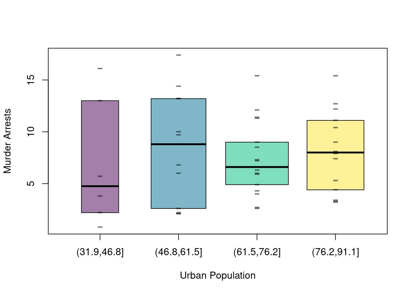
Scatterplots are used frequently to summarize the joint distribution of continuous data. They can be enhanced in several ways. As a default, use semi-transparent points so as not to hide any points (and perhaps see if your observations are concentrated anywhere). You can also add other features that help summarize the relationship.

Code
plot(y_hat ~ x_hat, xy_hat, pch=16, col=grey(0, .5),
    main=NA, xlab='Urban Population', ylab='Murder Arrests')

You can also show the marginal distributions of each variable along each axis (see this margin and layout cheatsheet for how layout(), mar, and oma work together).

Code
# Setup Plot
layout( matrix(c(2, 0, 1, 3), ncol=2, byrow=TRUE),
    widths=c(9/10, 1/10), heights=c(1/10, 9/10))

# Scatterplot
par(mar=c(4, 4, 1, 1))
plot(y_hat ~ x_hat, xy_hat, pch=16, col=grey(0, .5),
    main=NA, xlab='Urban Population', ylab='Murder Arrests')

# Add Marginals
par(mar=c(0, 4, 1, 1))
f_x_hat <- hist(xy_hat[, 'x_hat'], plot=FALSE)
barplot(f_x_hat[['counts']], axes=FALSE, space=0, border=NA)

par(mar=c(4, 0, 1, 1))
f_y_hat <- hist(xy_hat[, 'y_hat'], plot=FALSE)
barplot(f_y_hat[['counts']], axes=FALSE, space=0, horiz=TRUE, border=NA)

11.2 Conditional Distributions

Discrete Data

Often we want to know how the distribution of one variable changes when we restrict attention to a subgroup defined by another.

ImportantKey Definition

The conditional distribution of \(\hat{y}_{i}\) given \(\hat{x}_{i}=x\) is the joint share renormalized so the row at \(\hat{x}_{i}=x\) sums to one: \[\hat{p}(y \mid x) = \frac{\hat{p}(x,y)}{\hat{p}(x)}, \quad \quad \hat{p}(x|y) = \frac{\hat{p}(x,y)}{\hat{p}(y)},\] where \(\hat{p}(x)\) is the marginal of \(\hat{x}_{i}\) and where \(\hat{p}(y)\) is the marginal of \(\hat{y}_{i}\)..

Conditional distributions are useful when one variable splits the data into meaningful subgroups (sex, education level, treatment status) and we want to compare the outcome distribution across those subgroups. The renormalization is what changes the unit of analysis: row sums equal to one means each row is itself a probability distribution over \(y\) for the given \(x\), rather than a share of the whole sample.

For example, return to the Wages1 workers and their joint distribution table. To compute the conditional distribution of \(\hat{y}_{i}\) given \(\hat{x}_{i}=x\), we rescale the numbers in each row so that each row sums to 1.

Code
# Conditional distribution of sex given schooling: each row sums to 1
round(prop.table(tab, 1), 3)
##       sex
## school female  male
##     10  0.416 0.584
##     11  0.464 0.536
##     12  0.500 0.500
##     13  0.558 0.442
##     14  0.530 0.470
##     15  0.507 0.493
##     16  0.688 0.312

In this example, we say that

  • conditional on workers having \(10\) years of schooling, about \(58\%\) are male and \(42\%\) are female.
  • conditional on workers having \(13\) years of schooling, about \(44\%\) are male and \(56\%\) are female.

We can also compute the conditional distribution of \(\hat{x}_{i}\) given \(\hat{y}_{i}=y\), \(\hat{p}(x \mid y) = \hat{p}(x,y) / \hat{p}(y)\), just as we did above. In this case, we rescale the numbers in each column of the joint distribution table so that each column sums to 1.

Code
# Conditional distribution of schooling given sex: each column sums to 1
round(prop.table(tab, 2), 3)
##       sex
## school female  male
##     10  0.113 0.153
##     11  0.208 0.232
##     12  0.403 0.389
##     13  0.128 0.098
##     14  0.095 0.081
##     15  0.046 0.043
##     16  0.007 0.003

For example, among female workers, about \(40\%\) have \(12\) years of schooling.

Return to the sample of \(n=13\) students and its joint distribution table, Equation 11.1. To compute the conditional distribution of \(\hat{y}_{i}\) given \(\hat{x}_{i}=x\) by hand, we rescale the numbers in each row so that each row sums to 1. Specifically, for \(x=12\), we compute \[\begin{aligned} \hat{p}(y=0 \mid x=12) &= \frac{\hat{p}(x=12, y=0)}{\hat{p}(x=12)} = \frac{4/13}{7/13} = \frac{4}{7} \\ \hat{p}(y=1\mid x=12) &= \frac{\hat p(x=12, y=1)}{\hat{p}(x=12)} = \frac{3/13}{7/13} = \frac{3}{7} \end{aligned}\] Similarly, for \(x=14\), we compute \[\begin{aligned} \hat{p}(y=0 \mid x=14) &= \frac{\hat{p}(x=14, y=0)}{\hat{p}(x=14)} = \frac{1/13}{6/13} = \frac{1}{6}. \\ \hat{p}(y=1\mid x=14) &= \frac{\hat p(x=14, y=1)}{\hat{p}(x=14)} = \frac{5/13}{6/13} = \frac{5}{6}. \end{aligned}\] Together, we find \[\begin{array}{c|cc|c} & y=0\ (\text{male}) & y=1\ (\text{female}) & \text{Row total}\\ \hline x=12 & 4/7 & 3/7 & 7/7\\ x=14 & 1/6 & 5/6 & 6/6\\ \hline \end{array}\]

In this example, we say that

  • conditional on students having \(12\) years of education, \(4/7\) are male and \(3/7\) are female.
  • conditional on students having \(14\) years of education, \(1/6\) are male and \(5/6\) are female.

Continuing the \(13\)-student example above, show that

  • among male students, \(\approx 80\%\) have 12 years of education.
  • among female students, \(\approx 38\%\) have 12 years of education.

Try programming the results, especially if you are stuck or uncertain

Code
xy0_hat <- rbind(
    c(12, 0), c(12, 0), c(12, 0), c(12, 0), #Male
    c(14, 0), 
    c(12, 1), c(12, 1), c(12, 1),
    c(14, 1), c(14, 1), c(14, 1), c(14, 1), c(14, 1))
colnames(xy0_hat) <- c('educ', 'female')
xy0_hat <- as.data.frame(xy0_hat)

tab0 <- table(xy0_hat)
tab0
##     female
## educ 0 1
##   12 4 3
##   14 1 5

# Joint distribution
round(prop.table(tab0), 3)
##     female
## educ     0     1
##   12 0.308 0.231
##   14 0.077 0.385

# Conditional distribution of Y given X
round(prop.table(tab0, 1), 3)
##     female
## educ     0     1
##   12 0.571 0.429
##   14 0.167 0.833

# Conditional distribution of X given Y
round(prop.table(tab0, 2), 3)
##     female
## educ     0     1
##   12 0.800 0.375
##   14 0.200 0.625

Different conditional distributions change the unit of analysis. Swapping which variable is in the denominator like this generally answers a different question.

  • \(\hat{p}(y=\text{female})\) answers “what fraction of workers are female?”
  • \(\hat{p}(y=\text{female} \mid x=13)\) answers “what fraction of workers are female within the subgroup with 13 years of schooling?”
  • \(\hat{p}(x=13 \mid y=\text{female})\) answers “what fraction of workers have 13 years of schooling within the subgroup that is female?”

Confusing the different distributions is so common that they have names.

ImportantKey Definition

The confusion of the inverse is the mistake of confusing \(\hat{p}(y\mid x)\) with \(\hat{p}(x\mid y)\). The base-rate fallacy is the mistake of confusing \(\hat{p}(y\mid x)\) with \(\hat{p}(y)\).

Women and education. Suppose you read that women are more educated than men. Check the claim against the \(13\) students in Equation 11.1. Three statements sound alike but are not.

  • “Women are more likely than men to have \(14\) years of education.” This compares the education share within each sex: \(\hat{p}(x=14 \mid y=1) = 5/8 \approx 0.63\) for women versus \(\hat{p}(x=14 \mid y=0) = 1/5 = 0.20\) for men. Women are higher by a factor of three.
  • “Students with \(14\) years of education are mostly women.” This is the sex share within the educated group: \(\hat{p}(y=1 \mid x=14) = 5/6 \approx 0.83\). Women are higher by a factor of five.
  • “Most students are women.” This is the base rate: \(\hat{p}(y=1) = 8/13 \approx 0.62\). Women are higher by a factor of less than \(2\).

The confusion of the inverse is to read the first statement as the second. Both use the same numerator, the \(5\) women with \(14\) years of education, but divide by different groups: the \(8\) women or the \(6\) educated students. Here, the statements disagree on magnitude: are women \(3\) or \(5\) times more educated?

The base-rate fallacy is to forget that the second statement depends on the third: how many educated students are women depends on how many students are women. In this sample, most educated students are women (\(5/6\)) partly because most students are women (\(8/13\)). Now imagine the sample had \(50\) men instead of \(5\), with the same \(20\%\) rate. Then \(10\) men and \(5\) women would have \(14\) years of education: women would still be three times as likely to be educated, yet \(\hat{p}(y=1 \mid x=14) = 5/15 \approx 0.33\), so most educated students would be men. Rearranging the definition shows where the base rate enters: \[\begin{aligned} \hat{p}(y=1 \mid x=14) &= \frac{\hat{p}(x=14, y=1)}{\hat{p}(x=14)} = \frac{\hat{p}(x=14 \mid y=1)\,\hat{p}(y=1)}{\hat{p}(x=14 \mid y=0)\,\hat{p}(y=0) + \hat{p}(x=14 \mid y=1)\,\hat{p}(y=1)}. \end{aligned}\] The rates within each sex, \(0.63\) and \(0.20\), are the same in both samples. Only the base rate \(\hat{p}(y=1)\) changed, from \(8/13\) to \(8/58\), and that alone moved the conditional from \(0.83\) to \(0.33\). The Test Yourself examples below repeat this pattern.

Code
# Count table for the 13 students: rows = education, columns = sex
counts <- rbind(
    '12' = c(male=4, female=3),
    '14' = c(male=1, female=5))

# Education share within each sex: p(educ | sex)
round(prop.table(counts, 2), 3)
##    male female
## 12  0.8  0.375
## 14  0.2  0.625

# Sex share within each education level: p(sex | educ)
round(prop.table(counts, 1), 3)
##     male female
## 12 0.571  0.429
## 14 0.167  0.833

# Base rate: p(sex)
round(colSums(counts) / sum(counts), 3)
##   male female 
##  0.385  0.615

# Same rates within each sex, but 50 men instead of 5
counts_50 <- rbind(
    '12' = c(male=40, female=3),
    '14' = c(male=10, female=5))
round(prop.table(counts_50, 2), 3)     # p(educ | sex) unchanged
##    male female
## 12  0.8  0.375
## 14  0.2  0.625
round(prop.table(counts_50, 1), 3)     # p(sex | educ) reverses
##     male female
## 12 0.930  0.070
## 14 0.667  0.333
round(colSums(counts_50) / sum(counts_50), 3)   # base rate p(sex)
##   male female 
##  0.862  0.138

The base-rate fallacy often shows up as reading a large count as a high rate. A common category can have the most cases even when its rate per case is the lowest.

The most-stolen car. Suppose you read that the Honda Civic is the most-stolen car in a city. Does that mean a Civic is more likely to be stolen than other cars? Not necessarily.

Imagine a city with \(100{,}000\) cars: \(70{,}000\) Civics and \(30{,}000\) of other models. Let \(\hat{x}_{i}\) be the model and \(\hat{y}_{i}\) whether car \(i\) was stolen. The counts are

\[\begin{array}{c|cc|c} & \text{not stolen} & \text{stolen} & \text{Row total}\\ \hline \text{Civic} & 69300 & 700 & 70000\\ \text{other} & 29460 & 540 & 30000\\ \hline \text{Column total} & 98760 & 1240 & 100000 \end{array}\]

More Civics are stolen than other cars (\(700 > 540\)), so the Civic is the “most-stolen” model. But the conditional distributions tell two different stories:

  • \(\hat{p}(\text{stolen}\mid\text{Civic}) = \frac{700}{70000} = 0.010\) is the theft rate for a Civic.
  • \(\hat{p}(\text{stolen}\mid\text{other}) = \frac{540}{30000} = 0.018\) is the theft rate for other cars.
  • \(\hat{p}(\text{Civic}\mid\text{stolen}) = \frac{700}{1240} \approx 0.565\) is the share of stolen cars that are Civics.

A Civic is less likely to be stolen (\(1.0\%\) vs \(1.8\%\)), yet most stolen cars are Civics. The reason is the base rate: \(\hat{p}(\text{Civic}) = 0.70\) of all cars are Civics. “Most-stolen” is a statement about \(\hat{p}(x\mid y)\) (the model given theft), while car-theft risk is a statement about \(\hat{p}(y\mid x)\) (theft given the model).

Code
# Count table: rows = model, columns = stolen
counts <- rbind(
    Civic = c(not=69300, stolen=700),
    other = c(not=29460, stolen=540))

# Theft rate by model: p(stolen | model)
counts[, 'stolen'] / rowSums(counts)
## Civic other 
## 0.010 0.018

# Share of stolen cars by model: p(model | stolen)
counts[, 'stolen'] / sum(counts[, 'stolen'])
##     Civic     other 
## 0.5645161 0.4354839

How far a signal moves \(\hat{p}(y\mid x)\) away from \(\hat{p}(y)\) depends on the base rate \(\hat{p}(y)\) itself. The fraud-detection example below applies one screen to a rare outcome and then to a common one.

Fraud detection. A bank’s model flags \(99\%\) of fraudulent transactions and \(1\%\) of legitimate ones. What is the chance that a flagged transaction is fraud? The answer depends on the base rate \(\hat{p}(y)\): the share of all transactions that are fraud.

Let \(\hat{x}_{i}\) be whether the model flags transaction \(i\) and \(\hat{y}_{i}\) be whether the transaction is fraud. Suppose fraud is rare, \(100\) of \(100{,}000\) transactions, so \(\hat{p}(\text{fraud}) = 0.001\). The counts are

\[\begin{array}{c|cc|c} & \text{legitimate} & \text{fraud} & \text{Row total}\\ \hline \text{not flagged} & 98901 & 1 & 98902\\ \text{flagged} & 999 & 99 & 1098\\ \hline \text{Column total} & 99900 & 100 & 100000 \end{array}\]

Before seeing the model’s output, the chance that a transaction is fraud is the base rate, \(\hat{p}(\text{fraud}) = 100/100000 = 0.001\). After seeing a flag, it is the conditional, \(\hat{p}(\text{fraud}\mid\text{flagged}) = 99/1098 \approx 0.09\). The flag matters: it raises the chance of fraud \(90\)-fold. But \(91\%\) of flags are still false alarms, because the \(1\%\) false alarm rate applies to \(99{,}900\) legitimate transactions, which swamps the \(99\) true detections.

Now suppose fraud is common, \(10{,}000\) of \(100{,}000\) transactions, so \(\hat{p}(\text{fraud}) = 0.10\). The model is unchanged, but the counts become

\[\begin{array}{c|cc|c} & \text{legitimate} & \text{fraud} & \text{Row total}\\ \hline \text{not flagged} & 89100 & 100 & 89200\\ \text{flagged} & 900 & 9900 & 10800\\ \hline \text{Column total} & 90000 & 10000 & 100000 \end{array}\]

and \(\hat{p}(\text{fraud}\mid\text{flagged}) = 9900/10800 \approx 0.92\). The same flag from the same model means fraud is unlikely in one setting and likely in the other. The only thing that changed is the base rate.

The base-rate fallacy is to judge the flag by the model’s accuracy alone, as if \(\hat{p}(y\mid x)\) did not depend on \(\hat{p}(y)\). Whenever the outcome is rare, even an accurate screen produces mostly false positives: medical tests for rare diseases, polygraph screening of employees, and airport security checks all share this arithmetic.

Code
# Rare fraud: rows = model output, columns = transaction type
counts_rare <- rbind(
    not_flagged = c(legitimate=98901, fraud=1),
    flagged = c(legitimate=999, fraud=99))
colSums(counts_rare) / sum(counts_rare)      # base rate p(y)
## legitimate      fraud 
##      0.999      0.001
round(prop.table(counts_rare, 1), 3)         # conditional p(y | x)
##             legitimate fraud
## not_flagged       1.00  0.00
## flagged           0.91  0.09

# Common fraud: same model, base rate 100 times higher
counts_common <- rbind(
    not_flagged = c(legitimate=89100, fraud=100),
    flagged = c(legitimate=900, fraud=9900))
colSums(counts_common) / sum(counts_common)
## legitimate      fraud 
##        0.9        0.1
round(prop.table(counts_common, 1), 3)
##             legitimate fraud
## not_flagged      0.999 0.001
## flagged          0.083 0.917
Continuous Data

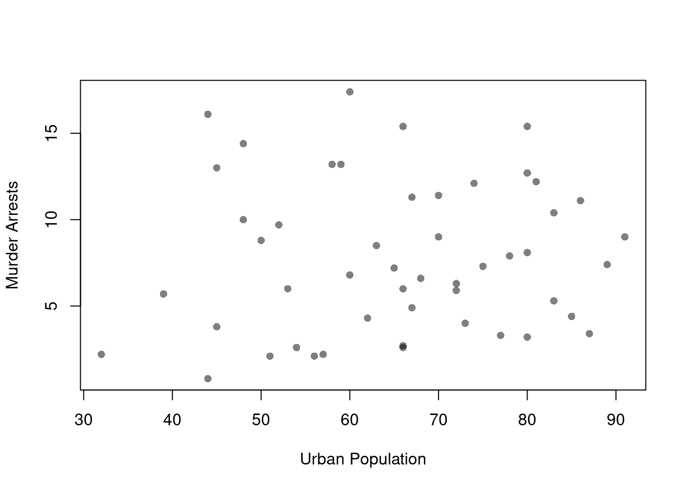
These describe the relationship between \(\hat{y}_{i}\) and \(\hat{x}_{i}\). We show how \(Y\) changes according to \(X\) using a histogram or bar plot. When \(X\) is continuous, as it often is, we split it into distinct bins and convert it to a factor variable. E.g.,

Code
# Split Data by Urban Population above/below mean
m_x_hat <- mean(xy_hat[, 'x_hat'])
low_urban <- xy_hat[, 'x_hat'] <= m_x_hat
y1_hat <- xy_hat[low_urban, 'y_hat']  # murder arrests, low urban population
y2_hat <- xy_hat[!low_urban, 'y_hat'] # murder arrests, high urban population
cols <- c(low=rgb(0, 0, 1, .75), high=rgb(1, 0, 0, .75))

# Common Histogram 
ylim <- c(0, .25)
xbks <-  seq(min(xy_hat[, 'y_hat'])-1, max(xy_hat[, 'y_hat'])+1, by=1)

par(mfrow=c(1, 2))
hist(y1_hat,
    breaks=xbks, col=cols[1],
    main=NA,
    xlab='Murder Arrests', freq=FALSE,
    border=NA, ylim=ylim)
title('Urban Pop <= Mean', font.main=1)

hist(y2_hat,
    breaks=xbks, col=cols[2],
    main=NA,
    xlab='Murder Arrests', freq=FALSE,
    border=NA, ylim=ylim)
title('Urban Pop > Mean', font.main=1)

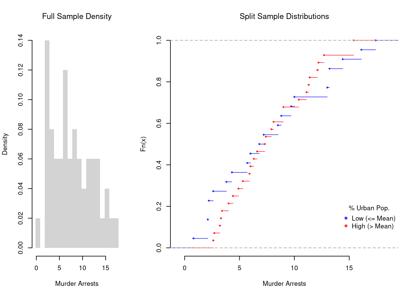
It is sometimes preferable to show the ECDF instead. And you can glue various combinations together to convey more information all at once

Code
layout( t(c(1, 2, 2)))
# Full Sample Density
hist(xy_hat[, 'y_hat'],
    main=NA,
    xlab='Murder Arrests',
    breaks=xbks, freq=FALSE, border=NA)
title('Full Sample Density', font.main=1)

# Split Sample Distribution Comparison
F_lowpop_hat <- ecdf(y1_hat)
plot(F_lowpop_hat, col=cols[1],
    pch=16, xlab='Murder Arrests',
    main=NA, bty='n')
title('Split Sample Distributions', font.main=1)
F_highpop_hat <- ecdf(y2_hat)
plot(F_highpop_hat, add=TRUE, col=cols[2], pch=16)

legend('bottomright', col=cols,
    pch=16, bty='n', inset=c(0, .1),
    title='% Urban Pop.',
    legend=c('Low (<= Mean)', 'High (> Mean)'))

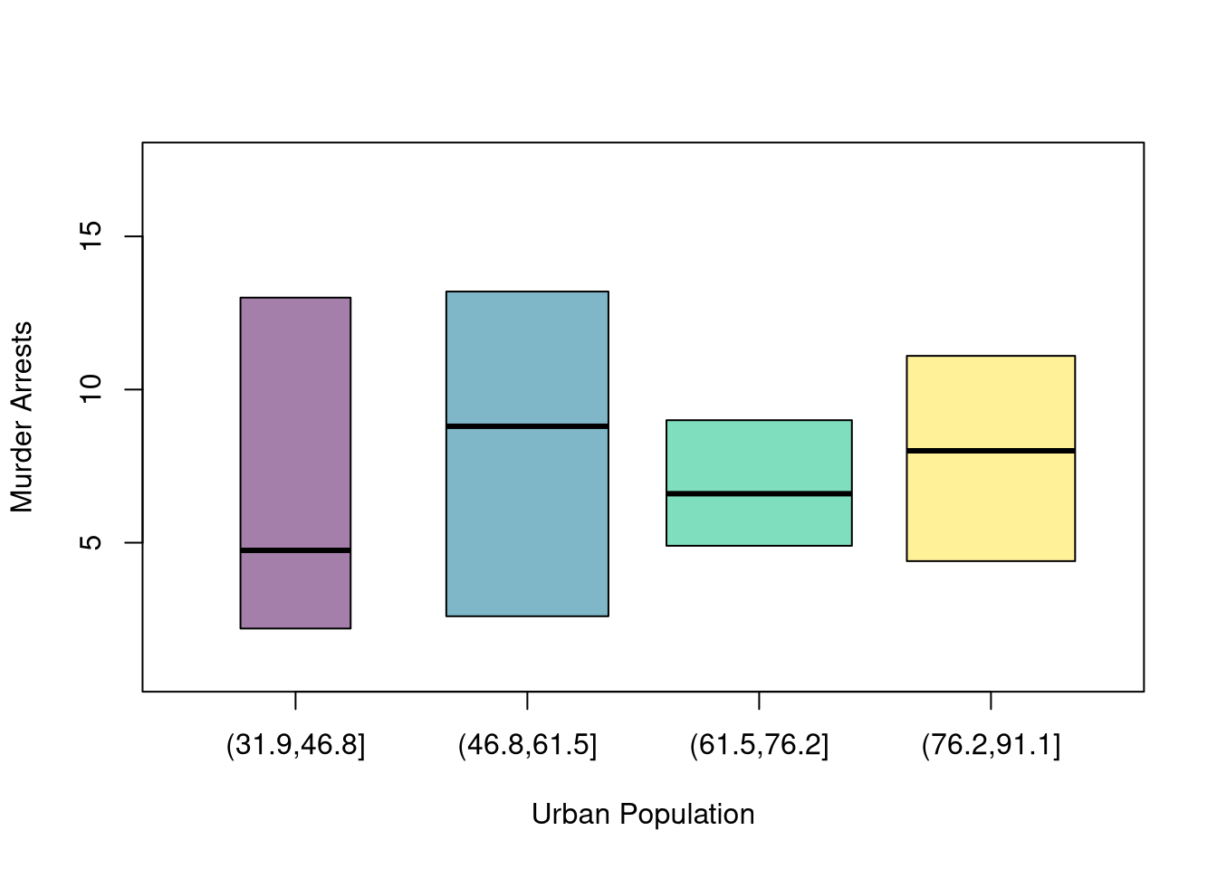
You can also split data into more than two groups. For more than three groups, boxplots are often more effective than histograms or ECDF’s.

Code
# K Groups with even spacing (not even counts)
K <- 4
x_cut_hat <- cut(xy_hat[, 'x_hat'], K)
table(x_cut_hat)
## x_cut_hat
## (31.9,46.8] (46.8,61.5] (61.5,76.2] (76.2,91.1] 
##           6          13          17          14

# Boxplots for each group
Kcols <- hcl.colors(K, alpha=.5)
boxplot(xy_hat[, 'y_hat'] ~ x_cut_hat,
    main=NA, col=Kcols,
    whisklty=0, staplelty=0, outline=FALSE,
    varwidth=TRUE, #show number of obs. per group
    xlab='Urban Population', ylab='Murder Arrests')

Code

# 4 Groups with equal numbers of observations
#Qcuts <- c(
#    '0%'=min(xy_hat[, 'x_hat'])-10*.Machine[['double.eps']],
#    quantile(xy_hat[, 'x_hat'], probs=c(.25, .5, .75, 1)))
#x_qcut_hat <- cut(xy_hat[, 'x_hat'], Qcuts)
#boxplot(xy_hat[, 'y_hat'] ~ x_qcut_hat, col=hcl.colors(4, alpha=.5))

11.3 Exercises

  1. Comment the script you wrote for this chapter, then restart R and check that it runs from a clean session, then check the script with AI as explained in Working with AI. Write three sentences from memory on the main statistical idea of this chapter, and ask the assistant what is wrong, vague, or missing. Finish with your own questions about whatever you found hardest.

  2. Explain the difference between a joint distribution, a marginal distribution, and a conditional distribution. Using the schooling-and-sex example from this chapter, describe in words what \(\hat{p}(y=\text{female} \mid x=13)\) tells you and how it differs from \(\hat{p}(x=13 \mid y=\text{female})\).

  3. Suppose you observe a sample of \(n=20\) people with two discrete variables: \(\hat{x}_{i}\) takes values in \(\{A, B\}\) and \(\hat{y}_{i}\) takes values in \(\{1, 2\}\). The counts are: \((A,1)=6\), \((A,2)=4\), \((B,1)=3\), \((B,2)=7\). Compute the joint distribution \(\hat{p}(x,y)\), both marginal distributions, and the conditional distribution \(\hat{p}(y \mid x)\).

  4. Using the USArrests dataset, split the variable Assault into two groups based on whether UrbanPop is above or below its median. Plot overlapping histograms of Assault for both groups with semi-transparent colors. Then plot the ECDF for each group on the same axes with a legend.

Further Reading

Recall

This chapter built up two-variable summaries from joint to marginal to conditional distributions, illustrated with the Wages1 schooling-and-sex table where \(\hat{p}(y=\text{female}\mid x=13)\approx 0.56\) is the share of female workers within the 13-years-of-school subgroup. We then saw how confusing the direction of conditioning produces the base-rate fallacy (the “most-stolen car” calculation, where Civics are the most-stolen model but the least likely to be stolen per car).