A fitted regression should be audited before its coefficients are reported. This chapter walks through that audit in three stages: first a visual exploration of the data, then the four standard diagnostic plots for outliers, collinearity, and residual structure, and finally data transformations that can sometimes rescue a misspecified model.
Data Exploration
First, you can summarize a dataset with multiple variables using the previous tools. This is often the first indication as to whether you should analyze the data using a linear model. Such figures are almost always a good idea to make first, as they can suggest issues that you were not even thinking about.
Code
# Inspect dataset on police arrests in the USA, 1973
head(USArrests)
##            Murder Assault UrbanPop Rape
## Alabama      13.2     236       58 21.2
## Alaska       10.0     263       48 44.5
## Arizona       8.1     294       80 31.0
## Arkansas      8.8     190       50 19.5
## California    9.0     276       91 40.6
## Colorado      7.9     204       78 38.7

# pairs.panels lays out univariate histograms on the diagonal,
# scatterplots in the lower triangle, and correlations in the upper triangle.
library(psych)
pairs.panels( USArrests[, c('Murder', 'Assault', 'UrbanPop')],
    hist.col=grey(0, .25), breaks=30, density=FALSE, hist.border=NA, # Diagonal
    ellipses=FALSE, rug=FALSE, smoother=FALSE, pch=16, col=rgb(1, 0, 0, .8) # Lower Triangle
    )
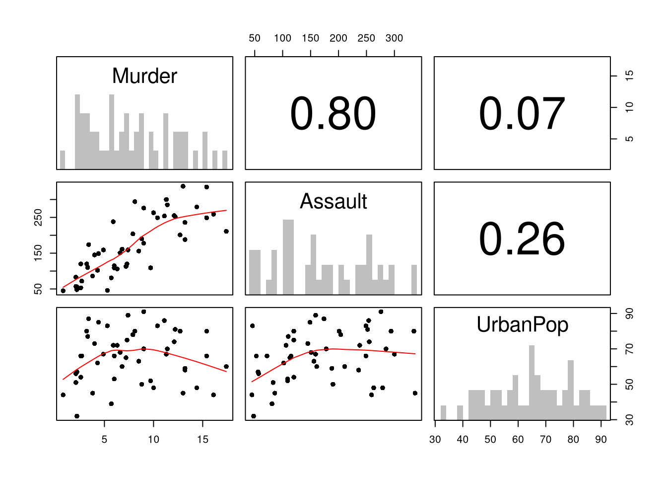
The diagonal shows univariate histograms. The lower triangle shows scatterplots between each pair of variables. The upper triangle shows correlation coefficients. Before running a regression, look for: (1) nonlinear patterns in the scatterplots, (2) outliers, and (3) high correlations between explanatory variables (which may indicate collinearity).
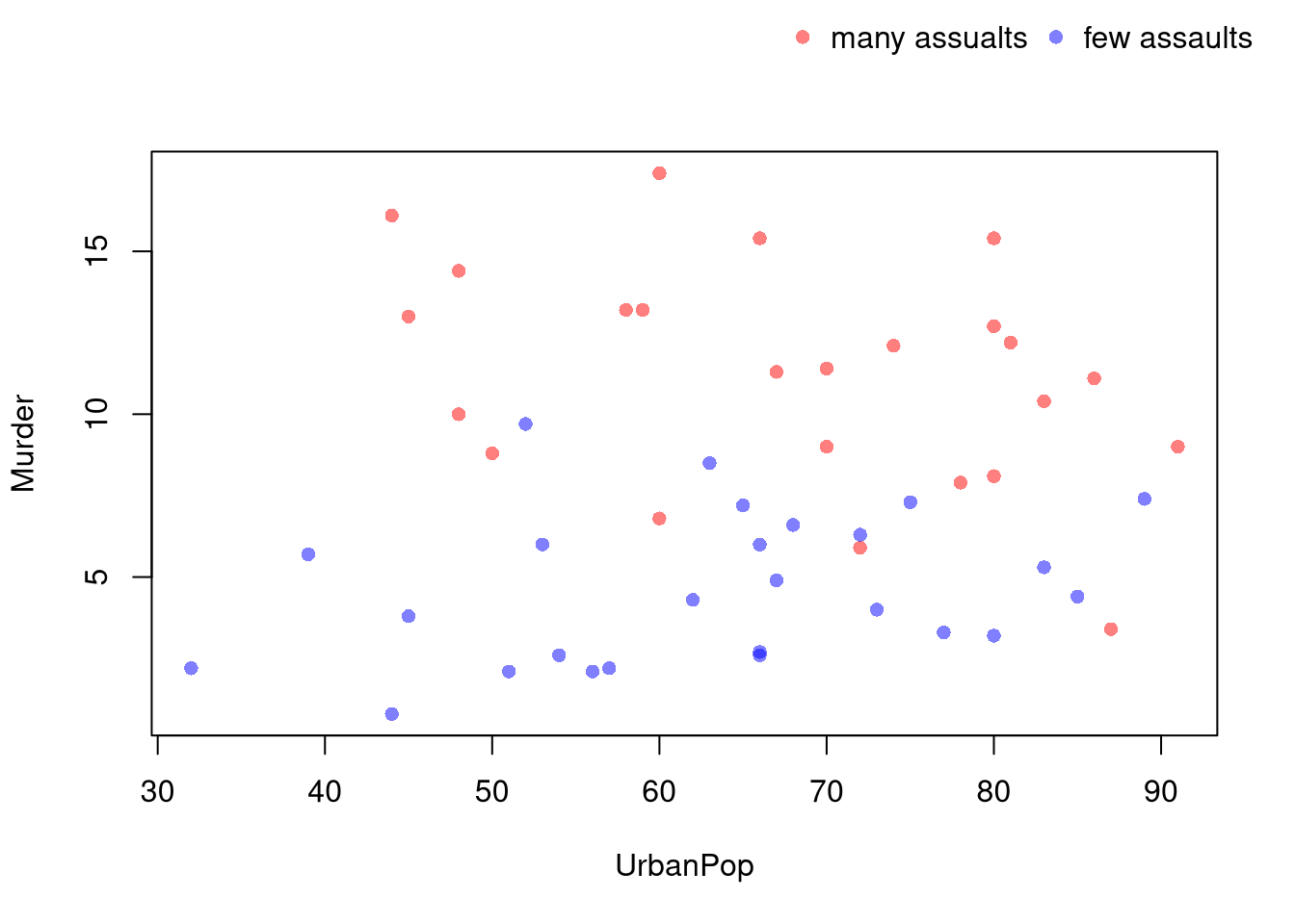
You can also use size, color, and shape to distinguish conditional relationships.
Code
# High Assault Areas
assault_high <- USArrests$Assault > median(USArrests$Assault)
col_high <- rgb(1, 0, 0, .5)
col_low <- rgb(0, 0, 1, .5)
cols <- ifelse(assault_high, col_high, col_low)

# Scatterplot
# Show High Assault Areas via 'cex=' or 'pch='
# Could further add regression lines for each data split
plot(Murder ~ UrbanPop, USArrests, pch=16, col=cols, main=NA)

outer_legend <- function(...) {
  opar <- par(fig=c(0, 1, 0, 1), oma=c(0, 0, 0, 0),
    mar=c(0, 0, 0, 0), new=TRUE)
  on.exit(par(opar))
  plot(0, 0, type='n', bty='n', xaxt='n', yaxt='n')
  legend(...)
}
outer_legend('topright',
    legend=c('many assaults', 'few assaults'),
    pch=16, col=c(col_high, col_low),
    horiz=TRUE, cex=1, bty='n')
See also https://plotly.com/r/bubble-charts/
Code
library(plotly)
# Scatter Plot
USArrests$ID <- rownames(USArrests)
fig <- plot_ly(
    USArrests, x = ~ UrbanPop, y = ~ Assault,
    mode='markers',
    type='scatter',
    hoverinfo='text',
    text = ~ paste('<b>', ID, '</b>',
        '<br>Urban  :', UrbanPop,
        '<br>Assault:', Assault,
        '<br>Murder :', Murder),
    color= ~ Murder,
    marker=list(
        size= ~ Murder,
        opacity=0.5,
        showscale=TRUE,
        colorbar = list(title='Murder Arrests (per 100, 000)')))
fig <- layout(fig,
    showlegend=FALSE,
    title='Crime and Urbanization in America 1975',
    xaxis = list(title = 'Percent of People in an Urban Area'),
    yaxis = list(title = 'Assault Arrests per 100, 000 People'))
fig
Model Diagnostics
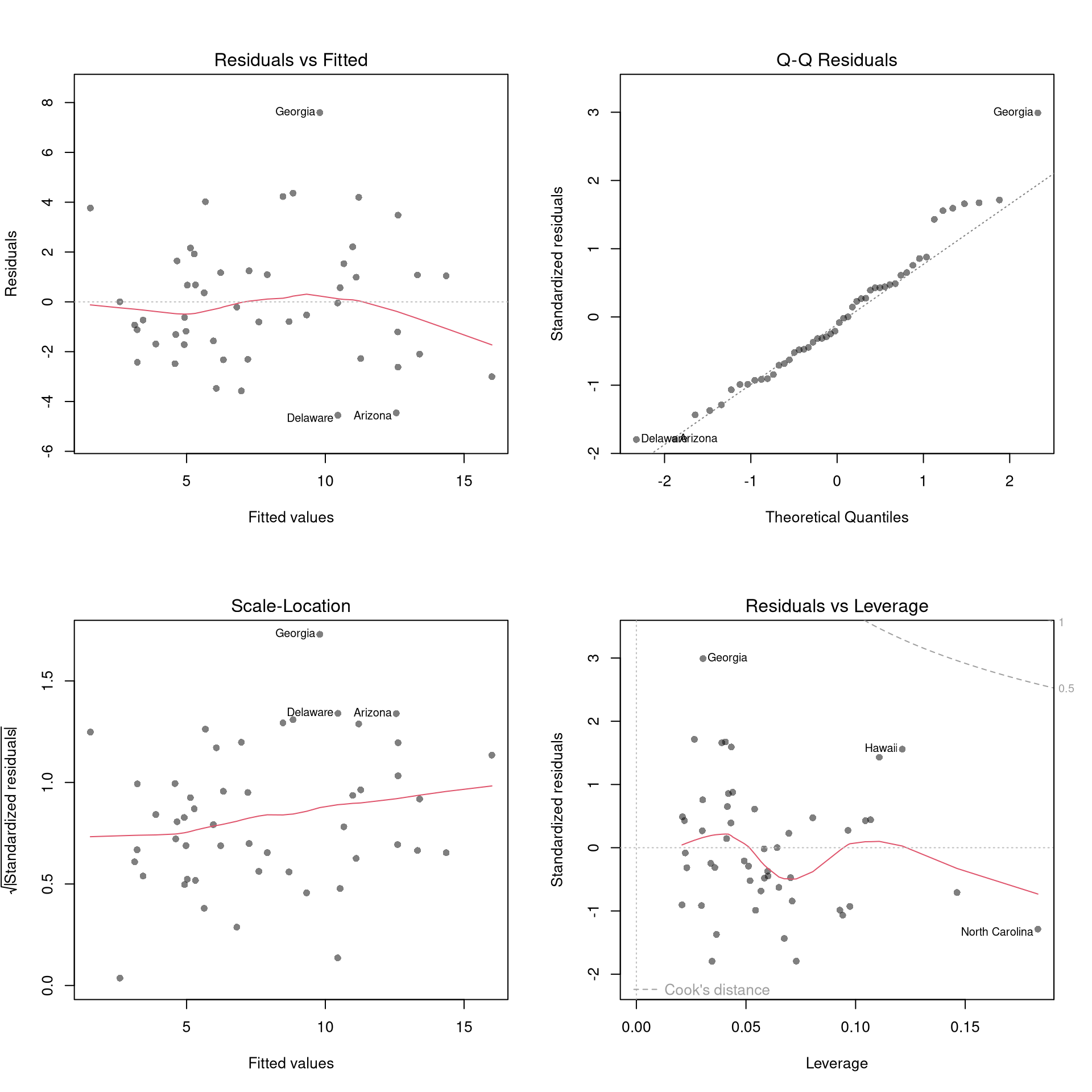
There’s little sense in getting great standard errors for a terrible model. Plotting your regression object is a simple and easy step to help diagnose whether your model is in some way bad. Calling plot() on an lm object returns four standard plots: (1) residuals vs fitted, (2) Q-Q normal of residuals, (3) scale-location, and (4) residuals vs leverage with Cook’s distance contours. We next go through what each shows.
Code
# Fit a multiple regression and produce the four standard diagnostic plots.
reg <- lm(Murder ~ Assault+UrbanPop, data=USArrests)
par(mfrow=c(2, 2))
plot(reg, pch=16, col=grey(0, .5))
Outliers.
Some observations sit far from the rest of the data. Eyeballing the plot will not tell us which ones actually move the fit, so we need quantitative tools.
For a regression with \(n\) observations and \(K\) parameters:
The leverage \(h_i \in [0, 1]\) of observation \(i\) measures how unusual its predictor values \(\hat{X}_i\) are relative to the rest of the sample: small \(h_i\) when \(\hat{X}_i\) sits near the centre of the predictor cloud, large \(h_i\) when it sits at the edges. Equivalently, \(h_i\) is the share of the fitted value \(\hat{y}_i\) that is determined by \(\hat{Y}_i\) itself rather than by the other observations, and the \(h_i\) across the sample sum to the number of coefficients \(K\).
The standardized residual \(r_i = \hat{e}_i / (s_{[i]}\sqrt{1-h_i})\) rescales the raw residual by an estimate of its standard deviation, where \(s_{[i]}\) is the root mean squared error of a regression with observation \(i\) removed.
Cook’s Distance sums all prediction changes when observation \(i\) is removed, scaled by the mean square error: \[D_{i} = \frac{\sum_{j} \left( \hat{y}_j - \hat{y}_{j[i]} \right)^2 }{ K \hat{S}^2 } = \frac{\hat{e}_{i}^2}{K \hat{S}^2 } \frac{h_i}{(1-h_i)^2}, \quad \hat{S}^2 = \frac{\sum_{i} \hat{e}_{i}^2}{n-K}.\]
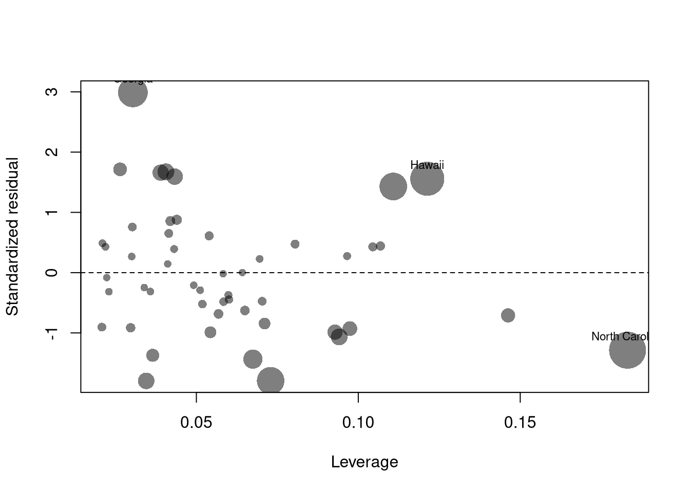
These three statistics are useful for triage: leverage flags points whose \(\hat{X}_i\) is unusual, the standardized residual flags points whose \(\hat{Y}_i\) is far from prediction, and Cook’s Distance combines both into one number that says how much the overall fit depends on each observation. The first diagnostic plot (residuals vs fitted) is the picture for outliers in the outcome, and the fourth (residuals vs leverage with Cook’s contours) is the picture for outliers in \(X\)-space; both can but do not have to be problematic.
Code
N <- 40
x <- c(25, runif(N-1, 3, 8))
e <- rnorm(N, 0, 0.4)
y <- 3 + 0.6*sqrt(x) + e
plot(y ~ x, pch=16, col=grey(0, .5), main=NA)
points(x[1], y[1], pch=16, col=rgb(1, 0, 0, .5))

abline(lm(y ~ x), col=rgb(1, 0, 0, .8), lty=2)
abline(lm(y[-1] ~ x[-1]))
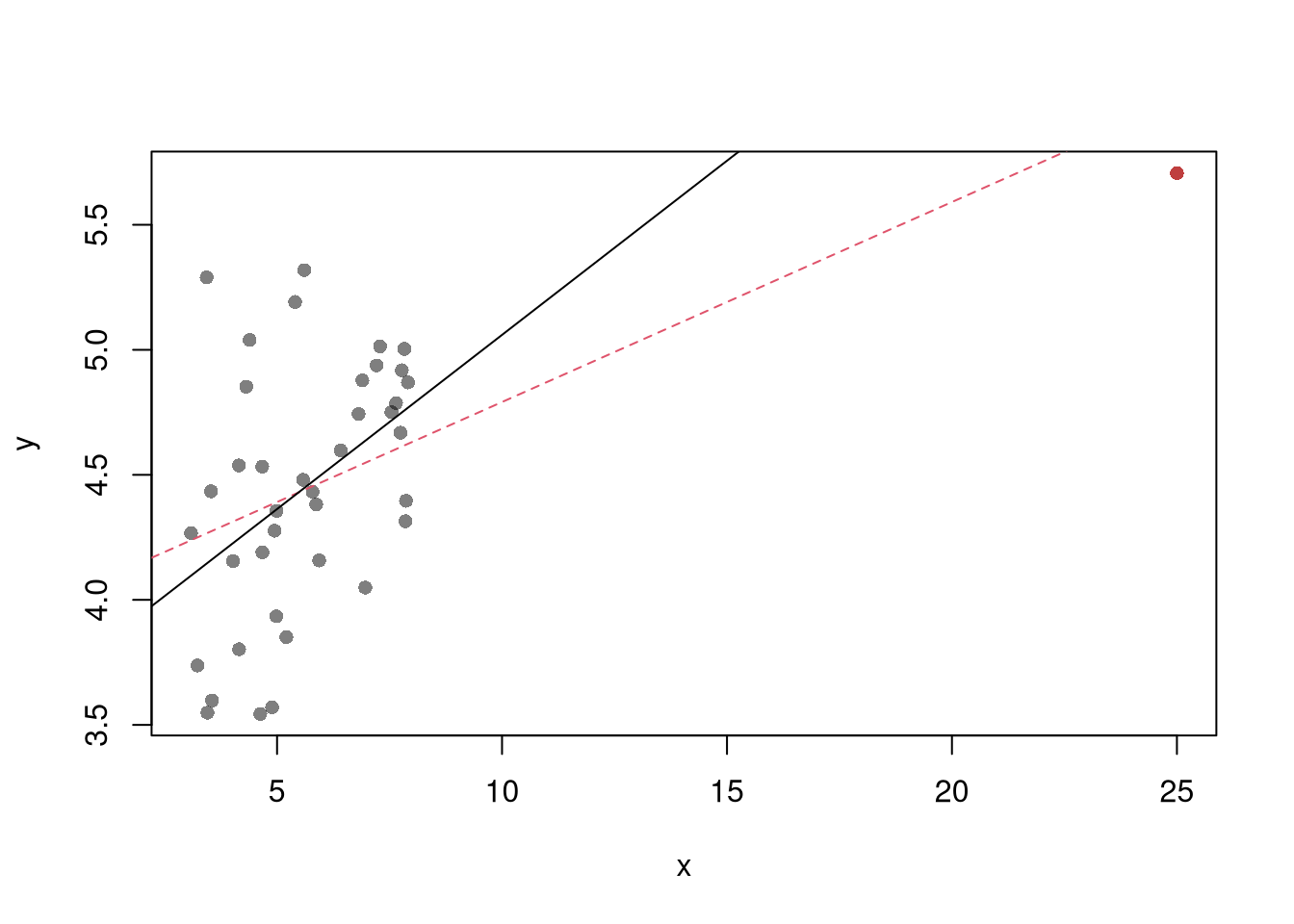
In the plot above, the red point is a high-leverage observation. How does removing it change the regression line? In your own data analysis, what steps would you take before deciding to remove an outlier?
Code
# State with the highest leverage
which.max(hatvalues(reg))
## North Carolina
##             33
# State with the largest standardized residual
which.max(rstandard(reg))
## Georgia
##      10
Code
# State with the largest Cook's Distance
which.max(cooks.distance(reg))
## North Carolina
##             33

# Influence plot: leverage vs. standardized residual,
# with point area proportional to Cook's Distance
h_i <- hatvalues(reg)
r_i <- rstandard(reg)
d_i <- cooks.distance(reg)

plot(h_i, r_i, pch=16, col=grey(0, .5),
    cex=1 + 4*d_i/max(d_i), main=NA,
    xlab='Leverage', ylab='Standardized residual')
abline(h=0, lty=2)

# Label the most influential observations
inf_id <- order(d_i, decreasing=TRUE)[1:3]
text(h_i[inf_id], r_i[inf_id],
    labels=rownames(USArrests)[inf_id], pos=3, cex=.7)
See https://www.r-bloggers.com/2016/06/leverage-and-influence-in-a-nutshell/ for a good interactive explanation, and https://online.stat.psu.edu/stat462/node/87/ for detail. See AEJ-leverage and NBER-leverage for examples of leverage in economics.
Collinearity.
When two regressors carry nearly the same information, OLS cannot tell their separate effects apart.
Collinearity is when one explanatory variable can be closely predicted by a linear combination of the others. The Variance Inflation Factor for variable \(k\), \[\hat{VIF}_{k}=\frac{1}{1-\hat{R}^2_{k}},\] quantifies how much collinearity inflates the variance of \(\hat{\beta}_{k}\) compared to the no-collinearity case, where \(\hat{R}^2_{k}\) comes from regressing \(\hat{X}_{k}\) on the other covariates \(\hat{X}_{-k}\) (a regression that does not involve the response variable \(\hat{Y}\)).
The Variance Inflation Factor is useful as a quick diagnostic for overlapping information between regressors: a \(\hat{VIF}_{k}\) near \(1\) means \(\hat{X}_{k}\) is uncorrelated with the others, and a common rule of thumb flags \(\sqrt{\hat{VIF}_{k}} > 2\). Collinearity does not bias the coefficients, it only widens their standard errors so that coefficient estimates may change erratically in response to small changes in the model or the data; in the extreme case with more variables than observations (\(K>n\)), the linear model has infinitely many solutions.
Code
# Variance Inflation Factor from its definition: VIF_k = 1/(1 - R^2_k),
# where R^2_k comes from regressing covariate k on the other covariates.
R2_assault  <- summary(lm(Assault ~ UrbanPop, data=USArrests))$r.squared
R2_urbanpop <- summary(lm(UrbanPop ~ Assault, data=USArrests))$r.squared

vif <- c(Assault=1/(1-R2_assault), UrbanPop=1/(1-R2_urbanpop))
vif
##  Assault UrbanPop
## 1.071828 1.071828

# A common rule of thumb flags sqrt(VIF) > 2
sqrt(vif) > 2
##  Assault UrbanPop
##    FALSE    FALSE
A \(\hat{VIF}_k\) of \(1\) means covariate \(k\) is uncorrelated with the others. A \(\hat{VIF}_k\) of \(4\) means the variance of \(\hat{b}_k\) is \(4\) times larger than it would be with no collinearity, so its standard error is \(\sqrt{4}=2\) times larger. With only two covariates, \(\hat{R}^2_1 = \hat{R}^2_2\) (it is just their squared correlation), so the two VIFs are equal. Collinearity does not bias the coefficients; it only makes them less precise.
Normality.
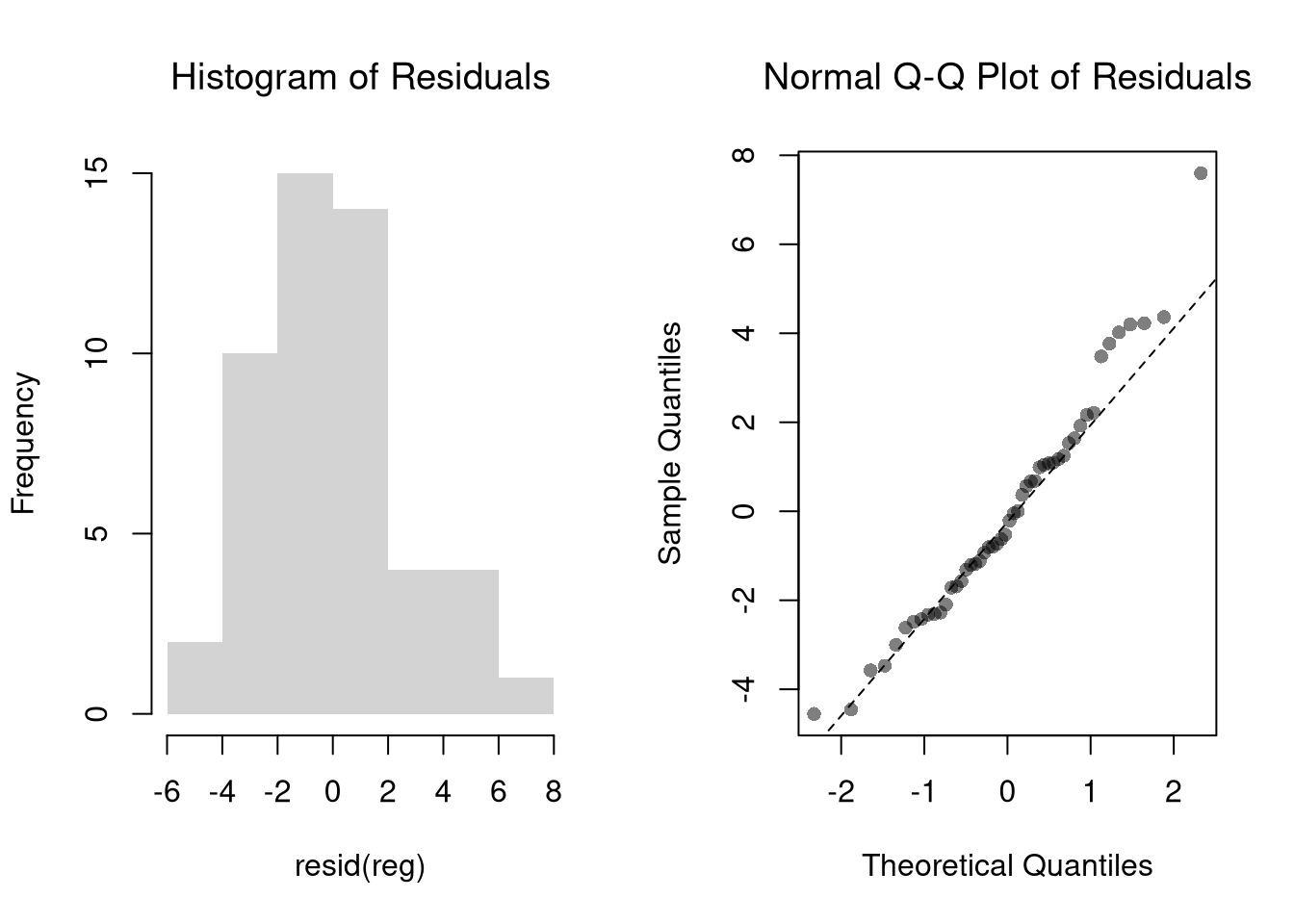
The second diagnostic plot (Q-Q normal of residuals) examines whether the residuals are normally distributed. Your OLS coefficient estimates do not depend on the normality of the residuals. (Good thing, because there’s no reason the residuals of economic phenomena should be so well behaved.) Many hypothesis tests are, however, affected by the distribution of the residuals. For these reasons, you may be interested in assessing normality.
Code
par(mfrow=c(1, 2))
hist(resid(reg),
    main='Histogram of Residuals',
    font.main=1, border=NA)

qqnorm(resid(reg),
    main='Normal Q-Q Plot of Residuals',
    font.main=1, col=grey(0, .5), pch=16)
qqline(resid(reg), col=1, lty=2)
Code
#shapiro.test(resid(reg))
Heteroskedasticity.
OLS treats the error variance as constant across observations, and when that assumption fails the coefficients are still fine but the standard errors are not.
Heteroskedasticity is when the variance of the residuals depends on the regressors.
Detecting heteroskedasticity is useful because the standard errors that R reports by default rely on a homoskedasticity assumption. If that assumption fails, every \(p\)-value and confidence interval based on those standard errors is wrong too, and typically too narrow. The third diagnostic plot (scale-location) is the visual check; the Breusch-Pagan test below is a numerical alternative.
Code
# Breusch-Pagan test for heteroskedasticity, by hand.
# Regress the squared residuals on the original regressors:
# a good fit (high R^2) signals non-constant variance.
e2 <- resid(reg)^2
aux <- lm(e2 ~ Assault + UrbanPop, data=USArrests)
R2_aux <- summary(aux)$r.squared

# Test statistic n*R^2 ~ chi-squared with K degrees of freedom
n <- nrow(USArrests)
K <- 2
BP <- n*R2_aux
c(statistic=BP, p.value=1-pchisq(BP, df=K))
## statistic   p.value
## 1.9072736 0.3853371
The Breusch-Pagan test asks whether the residual variance depends on the regressors. A small \(p\)-value is evidence of heteroskedasticity: the spread of the residuals changes with \(X\). Why does heteroskedasticity leave the OLS coefficients unbiased, but make the usual standard errors unreliable?
Exercises
Comment the script you wrote for this chapter, then restart R and check that it runs from a clean session, then check the script with AI as explained in Working with AI. Write three sentences from memory on the main statistical idea of this chapter, and ask the assistant what is wrong, vague, or missing. Finish with your own questions about whatever you found hardest.
A regression has high \(\hat{R}^2\) but one observation has a very large Cook’s Distance. Should you automatically drop that observation? Explain what Cook’s Distance measures and describe a situation where keeping the outlier is the right choice.
Using the USArrests dataset, fit lm(Murder ~ Assault + UrbanPop). Produce the four standard diagnostic plots with plot(). Identify the state with the highest leverage (using hatvalues()) and the state with the largest standardized residual (using rstandard()). Are they the same state?
Fit the model lm(Murder ~ Assault + UrbanPop, data = USArrests) and then fit a log-linear version lm(log(Murder + 1) ~ Assault + UrbanPop, data = USArrests). Compare the two models by computing the mean squared prediction error in the original (untransformed) scale for each. Which specification fits better?
Recall
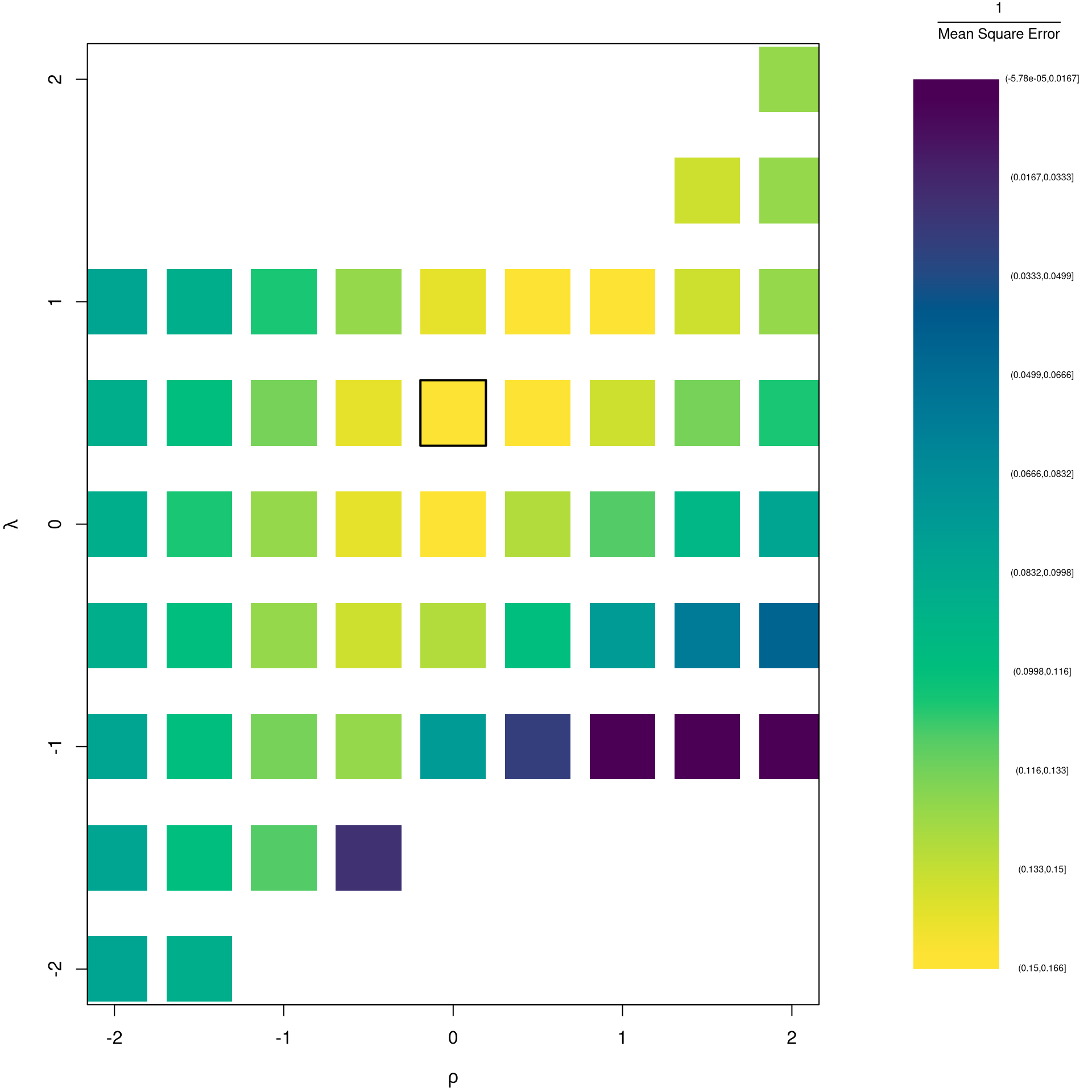
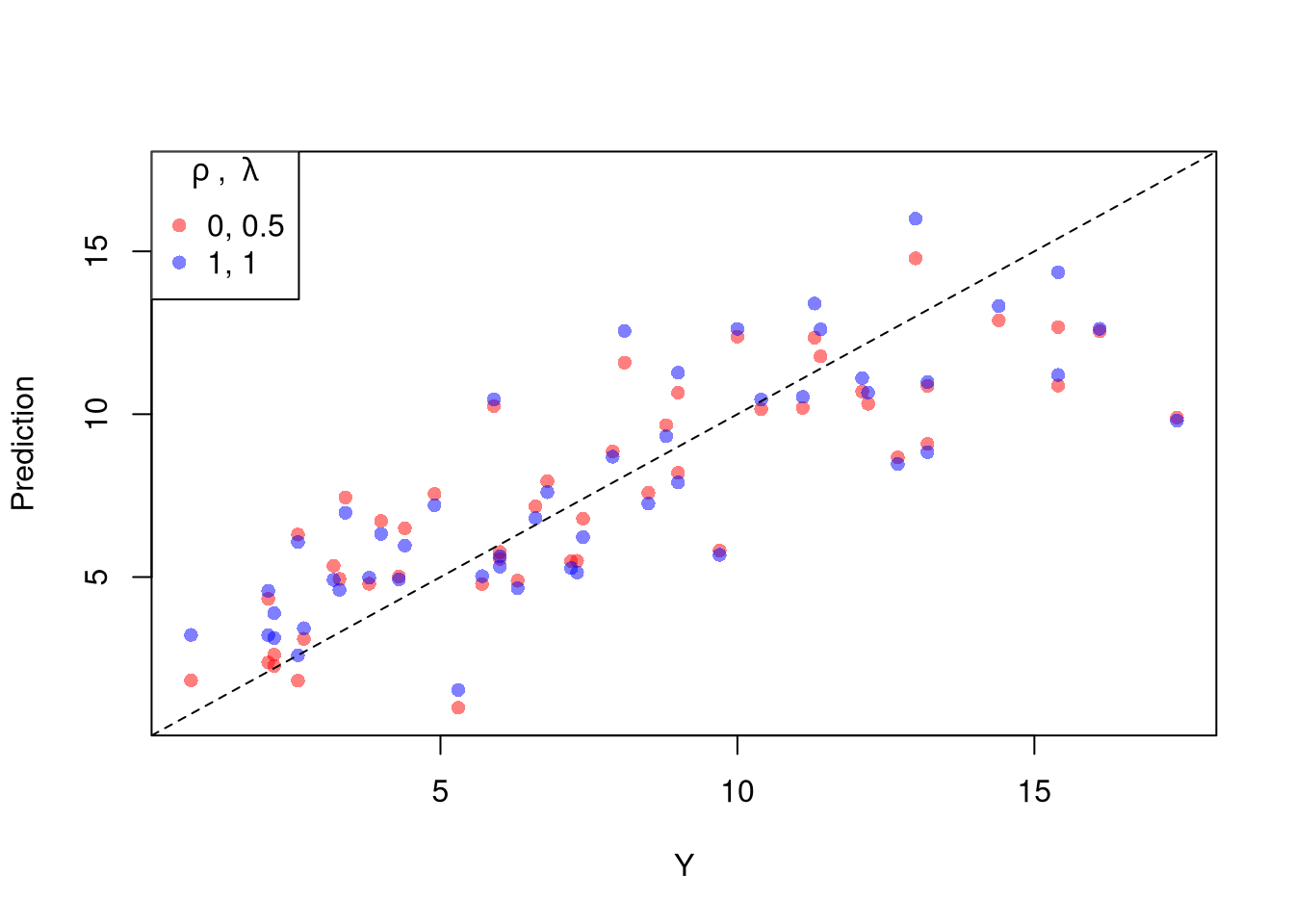
This chapter audited a fitted regression with four diagnostic plots (outliers, leverage, normality, scale) and three numerical companions: the Variance Inflation Factor for collinearity, the Breusch-Pagan test for heteroskedasticity, and Box-Cox transformations as a way to rescue a misspecified linear model. The Box-Cox grid-search on Murder ~ Assault + UrbanPop made the trade-off concrete: searching over \((\rho, \lambda)\) on \(\{-2, -1.5, \ldots, 2\}^2\) found a fit with lower MSE on the original Murder scale than the untransformed baseline. In the next chapter we keep the multivariate setup but drop the linear assumption: local regressions and regressograms estimate the conditional mean without committing to a single line.
Fox, John. 2020.
Regression Diagnostics: An Introduction. 2nd ed. Quantitative Applications in the Social Sciences 79. SAGE Publications.
https://doi.org/10.4135/9781071878651.