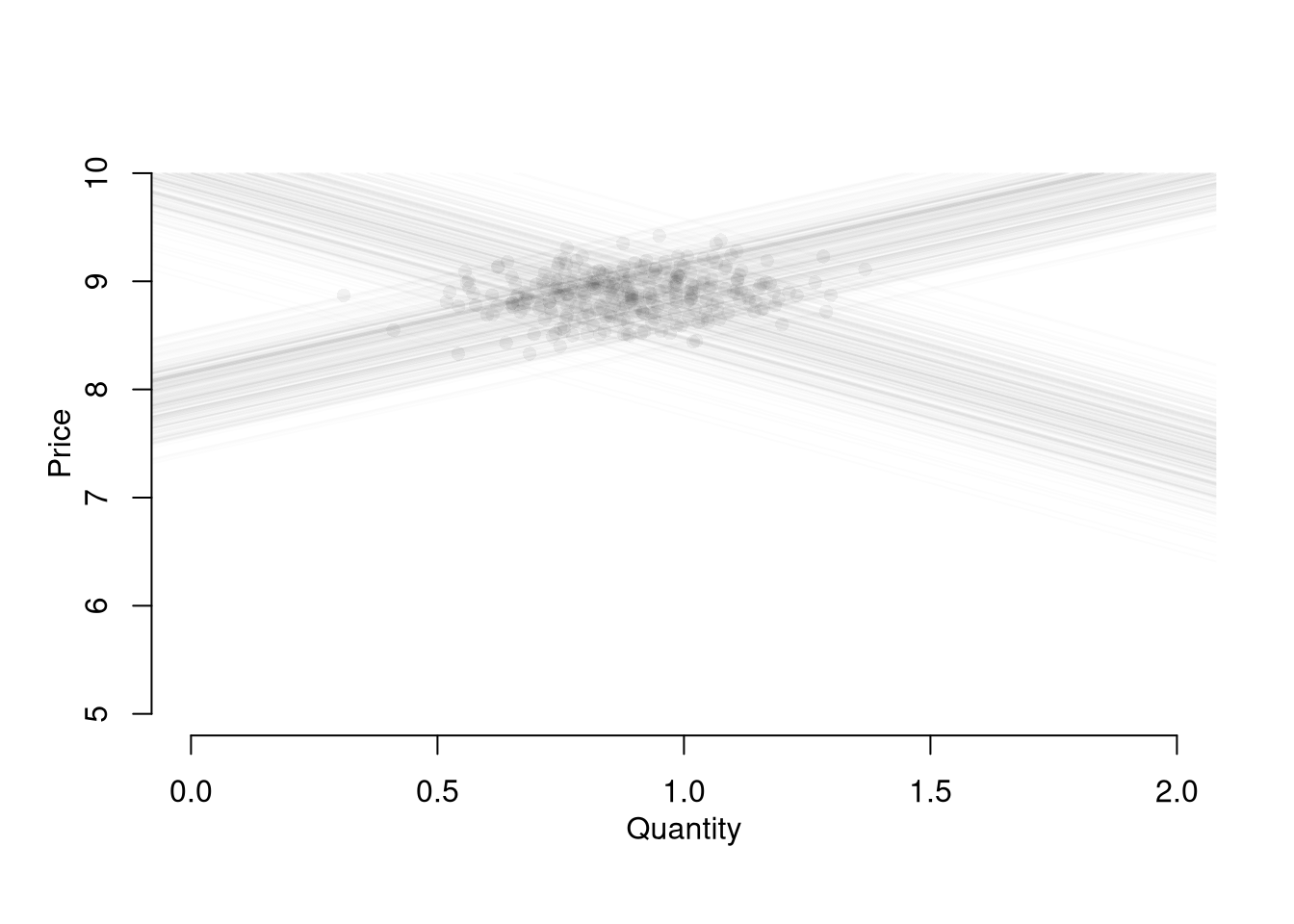
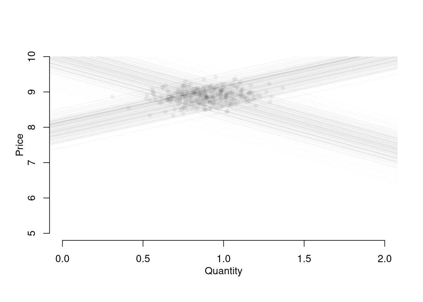
Most economic data are not generated by an experiment. They arrive with dependence across time, across space, and across the variables themselves, through market equilibrium, optimization, and selection. This chapter walks through those three forms of dependence in turn, each of which violates the independence assumption of standard regression and complicates causal interpretation.
Temporal Interdependence
Many observational datasets have temporal dependence, meaning that values at one point in time are related to past values. This violates the standard assumption of independence used in many statistical methods.
Stock prices are classic examples of temporally dependent processes. If Apple’s stock was high yesterday, it is more likely (but not guaranteed) to be high today.
Code
# Load a CSV of daily Apple stock prices and plot the daily high as a line.
library(plotly)
stock <- read.csv('https://raw.githubusercontent.com/plotly/datasets/master/finance-charts-apple.csv')
fig <- plot_ly(stock, type = 'scatter', mode = 'lines')%>%
  add_trace(x = ~ Date, y = ~ AAPL.High) %>%
  layout(showlegend = FALSE)
fig
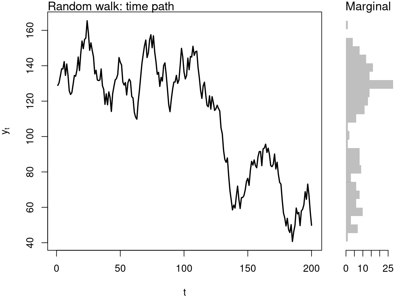
A random walk is the simplest mathematical model of temporal dependence. Each new value is just the previous value plus a random shock (white noise).
Code
# Generate Random Walk
tN <- 200
y <- numeric(tN)
y[1] <- stock$AAPL.High[1]
for (ti in 2:tN) {
    y[ti] <- y[ti-1] + runif(1, -10, 10)
}
#x <- runif(tN, -1, 1) White Noise

y_dat <- data.frame(Date=1:tN, RandomWalk=y)
fig <- plot_ly(y_dat, type = 'scatter', mode = 'lines') %>%
  add_trace(x= ~ Date, y= ~ RandomWalk) %>%
  layout(showlegend = FALSE)
fig
Modify the random walk above by changing runif(1, -10, 10) to rnorm(1, 0, 5). How does the choice of shock distribution affect the path? Does it change whether the series is stationary or nonstationary?
Hint. Both choices produce zero-mean, finite-variance shocks, so each simulated path is still a random walk: the variance of \(Y_t\) grows linearly in \(t\), so the series is nonstationary regardless of whether the shocks are uniform or normal. The shape of individual paths looks slightly different but the long-run behavior is the same.
In both plots, we see that today’s value is not independent of past values. In contrast to cross-sectional data (e.g. individual incomes), time series often require special methods to account for memory and nonstationarity.
It often helps to see the marginal distribution alongside the time path. A nonstationary series can disguise itself in a histogram because the histogram pools across \(t\).
Code
# Time path beside the marginal distribution
layout(matrix(c(1, 2), nrow = 1), widths = c(4, 1))

par(mar=c(4, 4, 1, 1))
plot(1:tN, y, type='l', lwd=2,
    xlab='t', ylab=expression(y[t]))
title('Random walk: time path', font.main=1, adj=0)

par(mar=c(4, 1, 1, 2))
y_hist <- hist(y, breaks=20, plot=FALSE)
barplot(y_hist$counts, horiz=TRUE, space=0, border=NA,
    col=grey(.5, .5), axes=FALSE)
axis(1)
title('Marginal', font.main=1, adj=0)
Stationary.
The simplest time-series methods implicitly assume the data have a stable distribution over time; this assumption fails often enough that we need a name for it.
A time series is stationary if both its mean and variance do not depend on \(t\):
- Stationary means: \(\mathbb{E}[Y_{t}]=\mathbb{E}[Y_{t'}]\) for all time periods \(t, t'\).
- Stationary variances: \(\mathbb{V}[Y_{t}]=\mathbb{V}[Y_{t'}]\) for all time periods \(t, t'\).
Stationarity is useful as a precondition for most classical time-series tools, and violations come in distinct flavors: a series with a deterministic trend is mean-nonstationary, while a random walk is variance-nonstationary because \(\mathbb{V}[Y_t]\) grows linearly in \(t\).
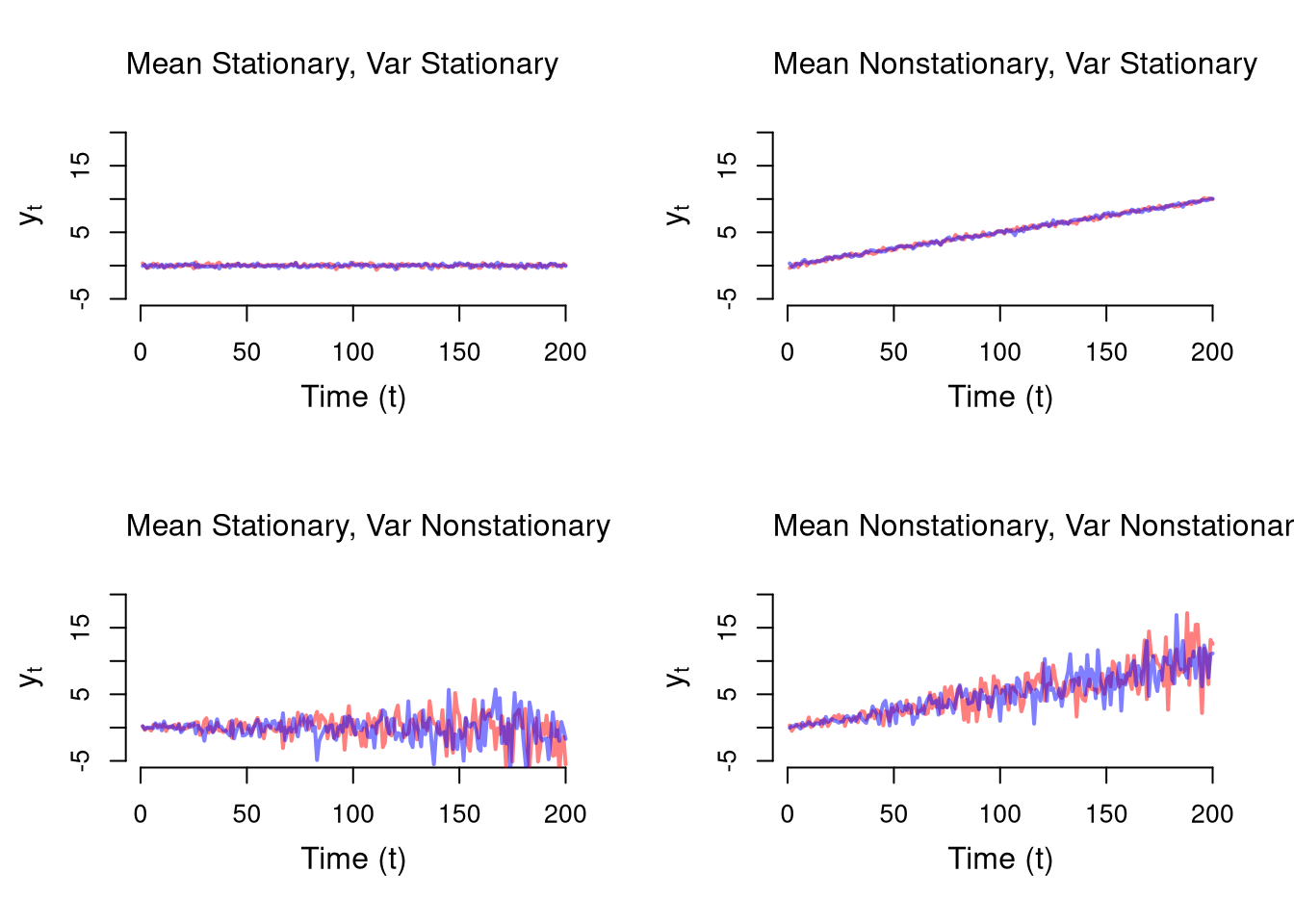
For example, consider the data generating process \(Y_t = \beta t + \epsilon_t\), with \(\epsilon_t \sim \text{N}(0, \sigma + \alpha t)\), with parameters \(\beta\) affecting mean stationarity and \(\alpha\) affecting variance stationarity.
Code
tN <- 200
simulate_series <- function(beta, alpha, sigma=.2){
    y <- numeric(tN)
    for (ti in 1:tN) {
        mean_ti <- beta*ti
        sd_ti <- (.2 + alpha*ti)
        y[ti] <- mean_ti + rnorm(1, sd=sd_ti)
    }
    return(y)
}

# Plotting Functions
plot_setup <- function(alpha, beta){
    plot.new()
    plot.window(xlim=c(1, tN), ylim=c(-5, 20))
    axis(1)
    axis(2)
    mtext(expression(y[t]), 2, line=2.5)
    mtext('Time (t)', 1, line=2.5)
}
plot_title <- function(alpha, beta){
    beta_name <- ifelse(beta==0, 'Mean Stationary', 'Mean Nonstationary')
    alpha_name <- ifelse(alpha==0, 'Var Stationary', 'Var Nonstationary')
    title(paste0(beta_name, ', ', alpha_name), font.main=1, adj=0)
}

par(mfrow = c(2, 2))
for(alpha in c(0, .015)){
for(beta in c(0, .05)){
    plot_setup(alpha=alpha, beta=beta)
    sim_cols <- c(rgb(.8, 0, 0, .5), rgb(0, 0, .8, .5))
    for( sim in 1:2){
        y_sim <- simulate_series(beta=beta, alpha=alpha)
        lines(y_sim, col=sim_cols[sim], lwd=2)
    }
    plot_title(alpha=alpha, beta=beta)
}}
In the top-left panel (\(\beta=0, \alpha=0\)), both the mean and variance are constant over time – this is stationary. In the top-right panel (\(\beta>0, \alpha=0\)), the mean drifts upward but the variance stays constant – mean nonstationary. In the bottom-left (\(\beta=0, \alpha>0\)), the mean is constant but the spread grows – variance nonstationary. The bottom-right has both problems.
Measures of temporal association.
When values at one time depend on values at other times, we need correlation-based diagnostics across lags to characterize the dependence.
The autocorrelation function of \(Y\) at lag \(k\) is the correlation of \(Y_t\) with its own lagged value \(Y_{t-k}\), \[ACF_{Y}(k) = \frac{\mathbb{C}(Y_{t},Y_{t-k})}{ \sqrt{\mathbb{V}(Y_{t})\mathbb{V}(Y_{t-k})}}.\] The cross-correlation function between \(Y\) and \(X\) at lag \(k\) is the corresponding correlation of \(Y_t\) with \(X_{t-k}\), \[CCF_{YX}(k) = \frac{\mathbb{C}(Y_{t},X_{t-k})}{ \sqrt{\mathbb{V}(Y_t)\mathbb{V}(X_{t-k})}}.\]
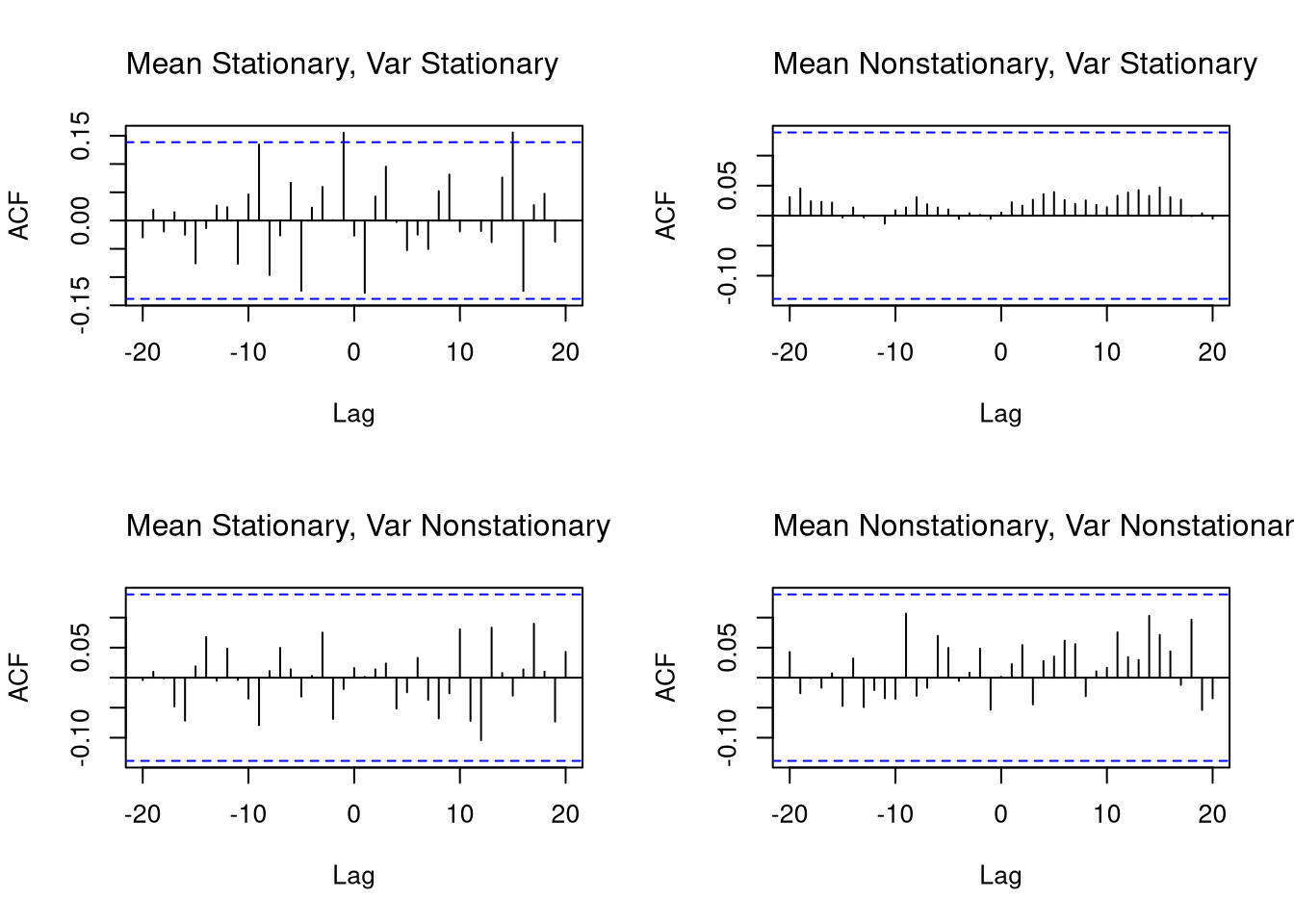
The ACF is useful for detecting temporal persistence (memory) within one series: for stationary processes it typically decays quickly, while nonstationary processes show ACFs that decay slowly or persist. The CCF is useful for detecting lagged relationships between two series, such as leading indicators or external drivers; if \(X\) is white noise, any visible structure in the CCF likely reflects nonstationarity in \(Y\).
Worked example: \(y=(2,4,6,8,10)\), with \(n=5\) and mean \(\bar{y}=6\). R’s acf() uses the biased estimator \[
\widehat{ACF}(1) = \frac{\frac{1}{n}\sum_{t=2}^{n}(y_t - \bar{y})(y_{t-1}-\bar{y})}{\frac{1}{n}\sum_{t=1}^{n}(y_t - \bar{y})^2}.
\] Deviations are \((-4,-2,0,2,4)\); lag-1 cross-products are \((-4)(-2)=8\), \((-2)(0)=0\), \((0)(2)=0\), \((2)(4)=8\), summing to \(16\). Sum of squared deviations is \(16+4+0+4+16=40\). So \(\widehat{ACF}(1) = 16/40 = 0.4\).
Code
y_acf <- c(2,4,6,8,10)
acf(y_acf, plot=FALSE)$acf[2]
## [1] 0.4
Code
par(mfrow = c(2, 2))
for(alpha in c(0, .015)){
for(beta in c(0, .05)){
    y_sim <- simulate_series(beta=beta, alpha=alpha)
    acf(y_sim, main=NA)
    plot_title(alpha=alpha, beta=beta)
}}
A cross-correlation plot diagnoses lagged dependence between two series at once:
Worked CCF example. Let \(y=(1,2,3,4,5)\) and \(x=(2,3,4,5,6)\), with \(\bar{y}=3, \bar{x}=4\). The lag-1 cross-correlation pairs \(y_t\) with \(x_{t-1}\), giving three cross-products \((2-3)(2-4) = 2\), \((3-3)(3-4) = 0\), \((4-3)(4-4) = 0\), \((5-3)(5-4) = 2\). With \(n=5\), the (biased) denominator is \(\sqrt{\sum_t(y_t-\bar y)^2 \sum_t(x_t-\bar x)^2}/n = \sqrt{10 \cdot 10}/5 = 2\), so \(\widehat{CCF}(1) = (2+0+0+2)/5 / 2 = 0.4\).
Code
y_ccf <- c(1,2,3,4,5)
x_ccf <- c(2,3,4,5,6)
ccf(y_ccf, x_ccf, lag.max=1, plot=FALSE)$acf
## , , 1
##
##      [,1]
## [1,]  0.4
## [2,]  1.0
## [3,]  0.4
Code
x_sim <- runif(tN, -1, 1) # White Noise
par(mfrow = c(2, 2))
for(alpha in c(0, .015)){
for(beta in c(0, .05)){
    y_sim <- simulate_series(beta=beta, alpha=alpha)
    ccf(y_sim, x_sim, main=NA)
    plot_title(alpha=alpha, beta=beta)
}}
Spatial Interdependence
Many observational datasets exhibit spatial dependence, meaning that values at one location tend to be related to values at nearby locations. This violates the standard assumption of independent observations used in many classical statistical methods.
For example, elevation is spatially dependent: if one location is at high elevation, nearby locations are also likely (though not guaranteed) to be high. Similarly, socioeconomic outcomes like disease rates or income often cluster geographically due to shared environmental or social factors.
Just as stock prices today depend on yesterday, spatial variables often depend on neighboring regions, creating a need for specialized statistical methods that account for spatial autocorrelation.
Raster vs. Vector Data.
Spatial data typically comes in two formats, each suited to different types of information:
- Vector data uses geometric shapes (points, lines, polygons) to store data. E.g., a census tract map that stores data on population demographics.
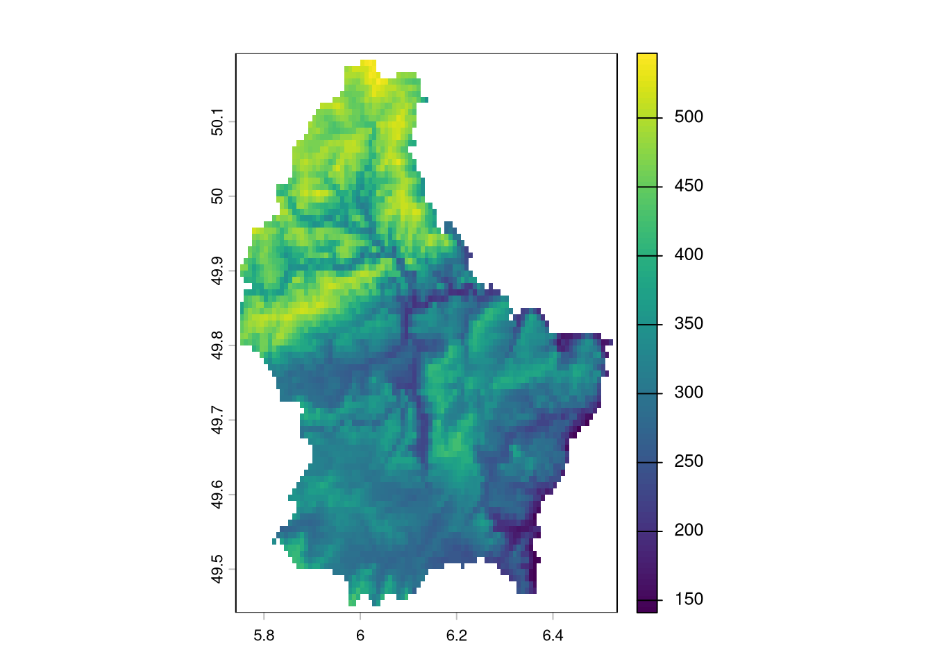
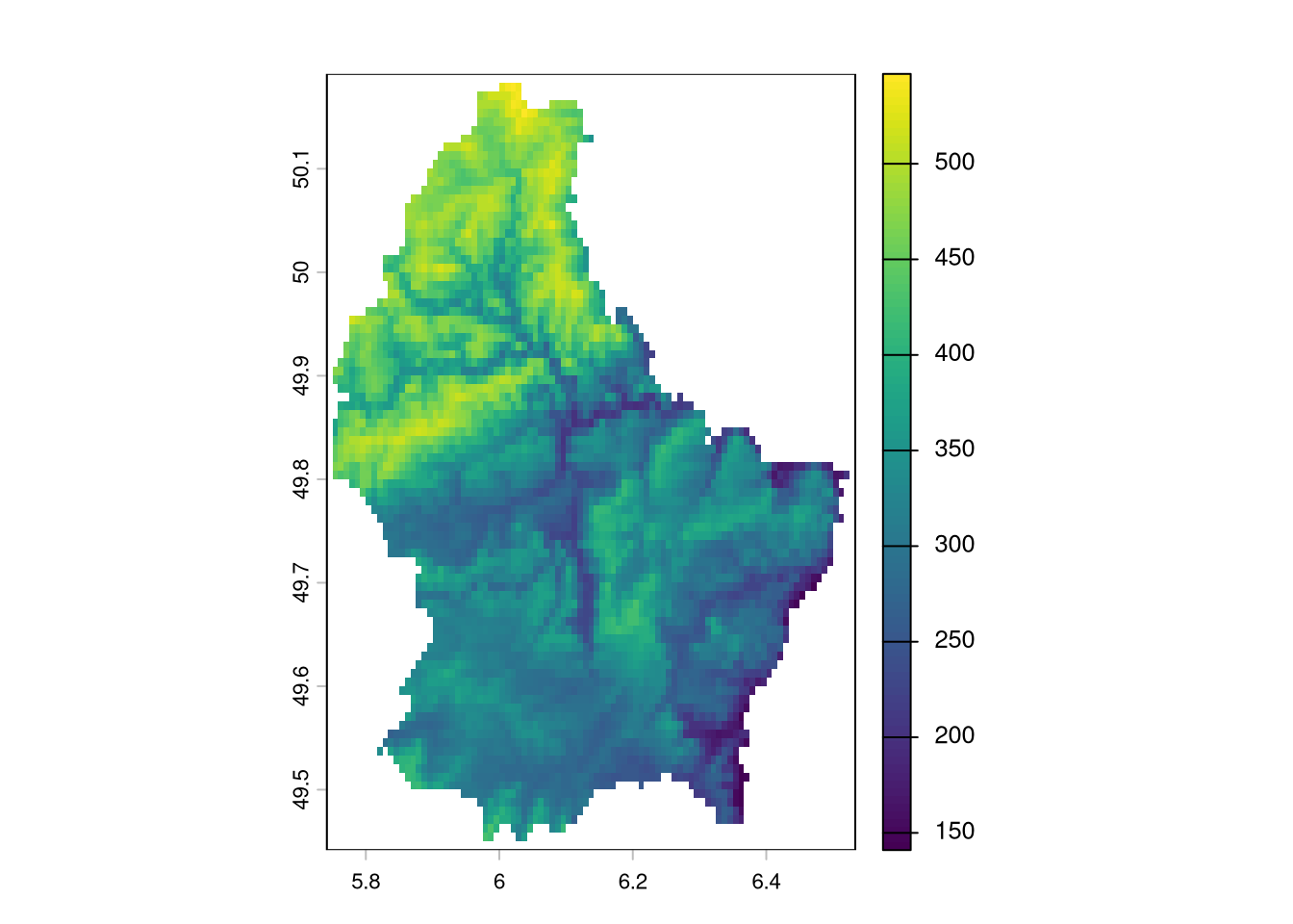
- Raster data uses grid cells (typically squares, but sometimes hexagons) to store data. E.g., an image that stores data on elevation above seawater.
Code
# Vector Data
library(sf)
northcarolina_vector <- st_read(system.file('shape/nc.shp', package='sf'))
## Reading layer `nc' from data source `/home/jadamson/R-Libs/sf/shape/nc.shp' using driver `ESRI Shapefile'
## Simple feature collection with 100 features and 14 fields
## Geometry type: MULTIPOLYGON
## Dimension:     XY
## Bounding box:  xmin: -84.32385 ymin: 33.88199 xmax: -75.45698 ymax: 36.58965
## Geodetic CRS:  NAD27
plot(northcarolina_vector['BIR74'], main=NA)
title('Number of Live Births in 1974', font.main=1)
Code
# https://r-spatial.github.io/spdep/articles/sids.html
Code
# Raster Data
library(terra)
luxembourg_elevation_raster <- rast(system.file('ex/elev.tif', package='terra'))
plot(luxembourg_elevation_raster)
Stationary.
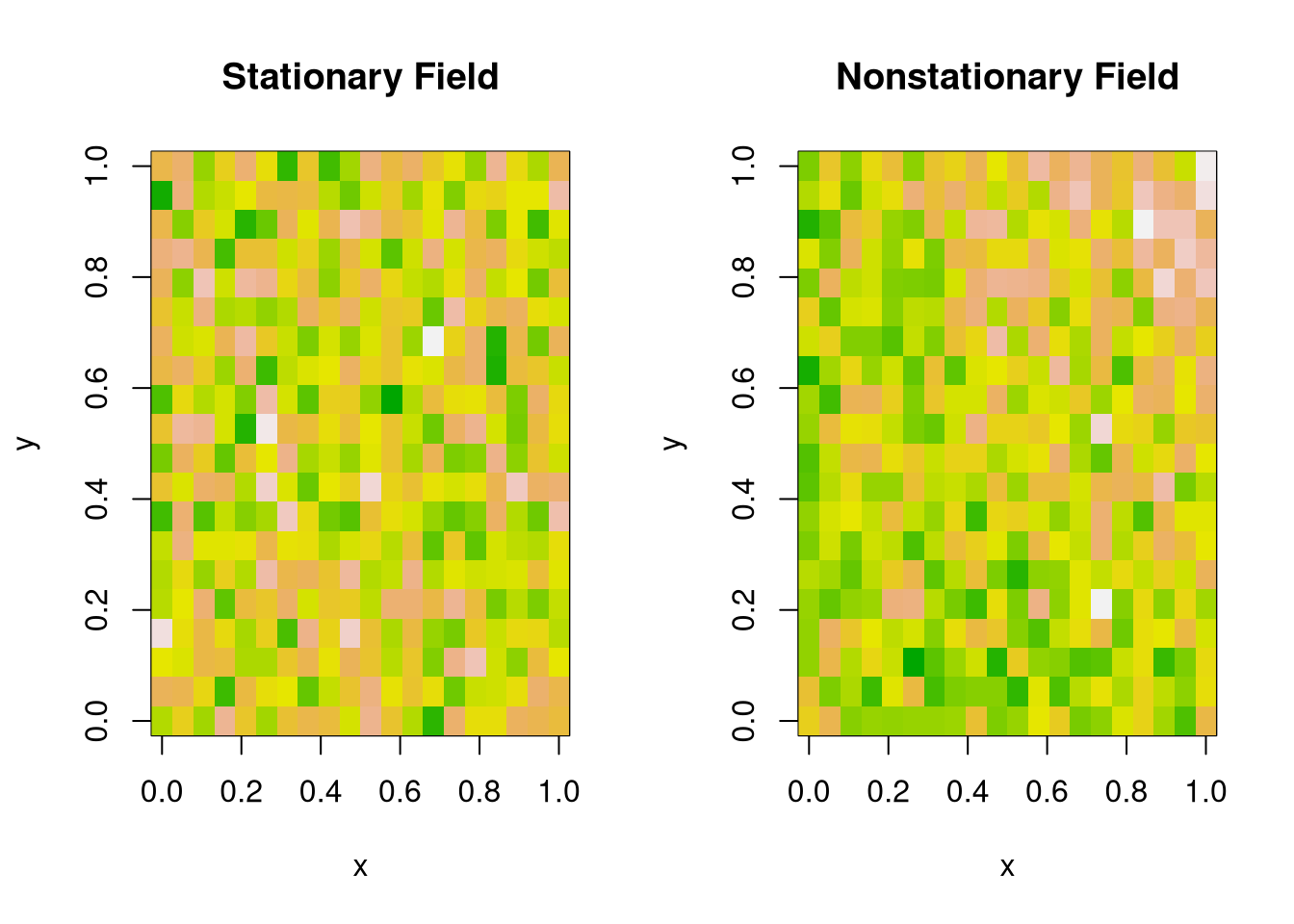
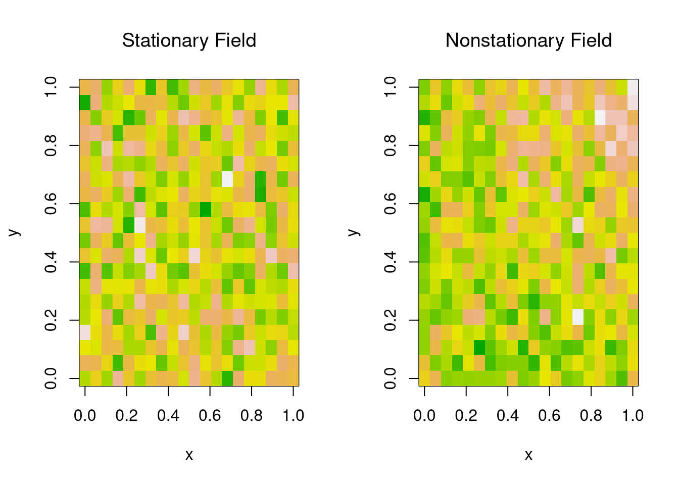
Just as with temporal data, stationarity in spatial data means that the statistical properties (like mean, variance, or spatial correlation) are roughly the same across space.
- Stationary Means: \(\mathbb{E}[Y(s)]=\mathbb{E}[Y(s')]\) for all spatial locations \(s,s'\)
- Stationary Vars: \(\mathbb{V}[Y(s)]=\mathbb{V}[Y(s')]\) for all spatial locations \(s,s'\)
Code
# Simulated 2D spatial fields
set.seed(1)
n <- 20
x <- y <- seq(0, 1, length.out = n)
grid <- expand.grid(x = x, y = y)

# 1. Stationary: Gaussian with constant mean and var
z_stationary <- matrix(rnorm(n^2, 0, 1), n, n)

# 2. Nonstationary: Mean increases with x and y
z_nonstationary <- outer(x, y, function(x, y) 3*x*y) + rnorm(n^2, 0, 1)

par(mfrow = c(1, 2))
# Stationary field
image(x, y, z_stationary,
      main = NA,
      col = terrain.colors(100),
      xlab = 'x', ylab = 'y')
title('Stationary Field', font.main = 1)
# Nonstationary field
image(x, y, z_nonstationary,
      main = NA,
      col = terrain.colors(100),
      xlab = 'x', ylab = 'y')
title('Nonstationary Field', font.main = 1)
Measures of spatial association.
Just as temporal data can exhibit autocorrelation, so can spatial data. Nearby locations tend to be more (or less) similar than spatial independence would predict.
Moran’s I is an index of spatial autocorrelation ranging from \(-1\) to \(1\). Values near \(1\) indicate that nearby locations have similar values, \(-1\) that they have dissimilar values, and \(0\) that they are spatially independent.
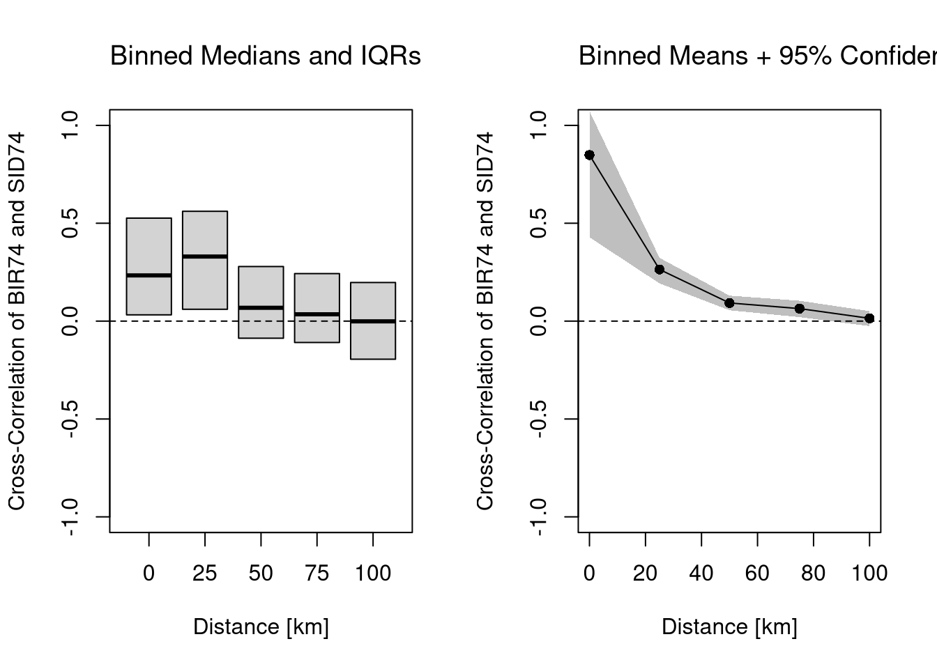
Moran’s I is useful as the spatial analog of the ACF: it summarizes overall spatial dependence in one number, and large positive values signal that observations near each other share information we cannot treat as independent. A two-variable analog measures spatial cross-correlation, computed like the CCF but with spatial rather than temporal lags.
Code
# Raster Data Example
autocor(luxembourg_elevation_raster, method='moran', global=TRUE)
## elevation
## 0.8917057
Moran’s I ranges from \(-1\) to \(1\). A value near \(1\) indicates strong positive spatial autocorrelation (nearby locations have similar values), near \(-1\) indicates negative spatial autocorrelation (nearby locations have dissimilar values), and near \(0\) indicates spatial independence. For elevation data, we expect strong positive autocorrelation because terrain changes gradually.
Cross-Correlation. We can also assesses the relationship between two variables at varying distances.
Code
# Vector Data Example
dat <- as.data.frame(northcarolina_vector)[, c('BIR74', 'SID74')]
mu <- colMeans(dat)

# Format Distances
dmat <- st_distance( st_centroid(northcarolina_vector) )
dmat <- units::set_units(dmat, 'km')

# At Which Distances to Compute CCF
# summary(dmat[, 1])
rdists <- c(-1, seq(0, 100, by=25)) # includes 0
rdists <- units::set_units(rdists , 'km')

# Compute Cross-Covariances
varXY <- prod( apply(dat, 2, sd) )
CCF <- lapply( seq(2, length(rdists)), function(ri){
    # Which Observations are within (rmin, rmax] distance
    dmat_r <- dmat
    d_id <- (dmat_r > rdists[ri-1] & dmat_r <= rdists[ri])
    dmat_r[!d_id]  <- NA
    # Compute All Covariances (Stationary)
    covs_r <- lapply(1:nrow(dmat_r), function(i){
        pairsi <- which(!is.na(dmat_r[i, ]))
        covXiYj <- sapply(pairsi, function(j) {
            dXi <- dat[i, 1] - mu[1]
            dYj <- dat[j, 2] - mu[2]
            return(dXi*dYj)
        })
        return(covXiYj)
    })
    corXY <- unlist(covs_r)/varXY
    return(corXY)
} )
Code
# Plot Cross-Covariance Function
x <- as.numeric(rdists[-1])

par(mfrow=c(1, 2))

# Distributional Summary
boxplot(CCF,
    outline=FALSE, whisklty=0, staplelty=0,
    ylim=c(-1, 1), #quantile(unlist(CCF), probs=c(.05, .95)),
    names=x,
    main=NA,
    xlab='Distance [km]',
    ylab='Cross-Correlation of BIR74 and SID74')
title('Binned Medians and IQRs', font.main=1, adj=0)
abline(h=0, lty=2)

# Inferential Summary
CCF_means <- sapply(CCF, mean)
plot(x, CCF_means,
    ylim=c(-1, 1),
    type='o', pch=16,
    main=NA,
    xlab='Distance [km]',
    ylab='Cross-Correlation of BIR74 and SID74')
title('Binned Means + 95% Confidence Band', font.main=1, adj=0)
abline(h=0, lty=2)
# Quick and Dirty Subsampling CI
CCF_meanCI <- sapply(CCF, function(corXY){
    ss_size <- floor(length(corXY)*3/4)
    corXY_boot <- sapply(1:200, function(b){
        corXY_b <- sample(corXY, ss_size, replace=FALSE)
        mean(corXY_b, na.rm=TRUE)
    })
    quantile(corXY_boot,  probs=c(.025, .975), na.rm=TRUE)
})
polygon( c(x, rev(x)),
    c(CCF_meanCI[1, ], rev(CCF_meanCI[2, ])),
    col=grey(0, .25), border=NA)
Economic Interdependence
In addition to spatial and temporal dependence, many observational datasets exhibit interdependence between variables for economic reasons.
Endogeneity.
Economic outcomes are not free variables we can move at will. Many are jointly determined, affected by selection, or driven by variables we have not measured.
A regressor is endogenous if it is correlated with the error term in a regression. The three classic sources are
- reverse causality: \(Y \to X\).
- simultaneity: \(Y \to X\) and \(X \to Y\).
- omitted variables: \(Z\to Y\) and either \(Z\to X\) or \(X \to Z\).
Endogeneity is the central reason observational data resist clean causal interpretation: in the linear model \(Y=X\beta + \epsilon\), endogeneity means \(\mathbb{E}[X'\epsilon] \neq 0\), so OLS is biased away from the structural causal parameter. The next chapter introduces experimental and quasi-experimental designs that supply exogenous variation in \(X\) and recover what OLS alone cannot.
Consider the relationship between education and wages. Identify a potential source of (a) omitted variable bias, (b) reverse causality, and (c) measurement error. For each, explain the direction in which you expect the OLS estimate to be biased.
Code
# Simulate data with an endogeneity issue
n <- 300
z <- rbinom(n, 1, .5)
xy <- sapply(z, function(zi){
    y <- rnorm(1, zi, 1)
    x <- rnorm(1, zi*2, 1)
    c(x, y)
})
xy <- data.frame(x=xy[1, ], y=xy[2, ])
plot(y ~ x, data=xy, pch=16, col=grey(0, .25), main=NA)
abline(lm(y ~ x, data=xy), col=rgb(1, 0, 0, .8))
I will focus on the seminal economic example to provide some intuition.
Competitive Market Equilibrium.
This model has three structural relationships: (1) market supply is the sum of quantities supplied by individual firms at a given price, (2) market demand is the sum of quantities demanded by individual people at a given price, and (3) market supply equals market demand in equilibrium. Assuming market supply and demand are linear, we can write these three relationships as \[\begin{eqnarray}
Q_{S}(P) &=& \alpha_{S} + \beta_{S} P + E_{S},\\
Q_{D}(P) &=& \alpha_{D} - \beta_{D} P + E_{D},\\
Q_{D} &=& Q_{S} = Q.
%% $Q_{D}(P) = \sum_{i} q_{D}_{i}(P)$,
\end{eqnarray}\]
Contamination.
With multiple linear regression, endogeneity biases are not just a problem for your main variable of interest. Suppose you are interested in how \(X_{1}\) affects \(Y\), conditioning on \(X_{2}\), and that the data generating process is linear: \(Y=\beta_{0}+\beta_{1}X_{1}+\beta_{2}X_{2}+\epsilon\). You paid special attention in your research design to find a case where \(X_{1}\) is truly exogenous. Unfortunately, if \(X_{2}\) is correlated with the error term, then there is also a bias for \(X_{1}\). The magnitude of the bias for \(X_{1}\) depends on the correlations between \(X_{1}\) and \(X_{2}\) as well as \(X_{2}\) and \(\epsilon\).
In the next chapter we look at the standard remedy: experimental and quasi-experimental designs that supply exogenous variation in a regressor and let us recover structural parameters that observational data alone cannot identify.
Exercises
Comment the script you wrote for this chapter, then restart R and check that it runs from a clean session, then check the script with AI as explained in Working with AI. Write three sentences from memory on the main statistical idea of this chapter, and ask the assistant what is wrong, vague, or missing. Finish with your own questions about whatever you found hardest.
Explain why simultaneity in a competitive market makes it difficult to interpret the OLS slope \(\hat{b}_1\) from a regression of quantity on price. In your answer, distinguish between the structural demand slope \(\beta_D\) and what OLS actually estimates.
Using the North Carolina births data (sf::st_read(system.file("shape/nc.shp", package="sf"))), compute Moran’s I for the variable SID74 (sudden infant deaths in 1974). Is there evidence of spatial autocorrelation? Briefly explain what a high value of Moran’s I would imply for standard OLS inference.
Simulate a random walk of length 200 in R (starting at 0, with increments drawn from runif(1, -1, 1)). Plot the series, compute the ACF using acf(), and describe how the ACF pattern differs from what you would expect for white noise.
Recall
This chapter introduced three forms of observational dependence (temporal, spatial, and economic) and the diagnostic tools for each: ACF/CCF, Moran’s I, and the endogeneity taxonomy. The supply-demand simulation made the endogeneity bite concrete: we ran 300 market periods through qd_fun/qs_fun, fit lm(Q ~ P, data=dat1), and got a slope that confuses the supply and demand sides because price and quantity are jointly determined. In the next chapter we turn to experimental and quasi-experimental designs that supply the exogenous variation needed to identify causal effects: RDD, DID, and 2SLS.